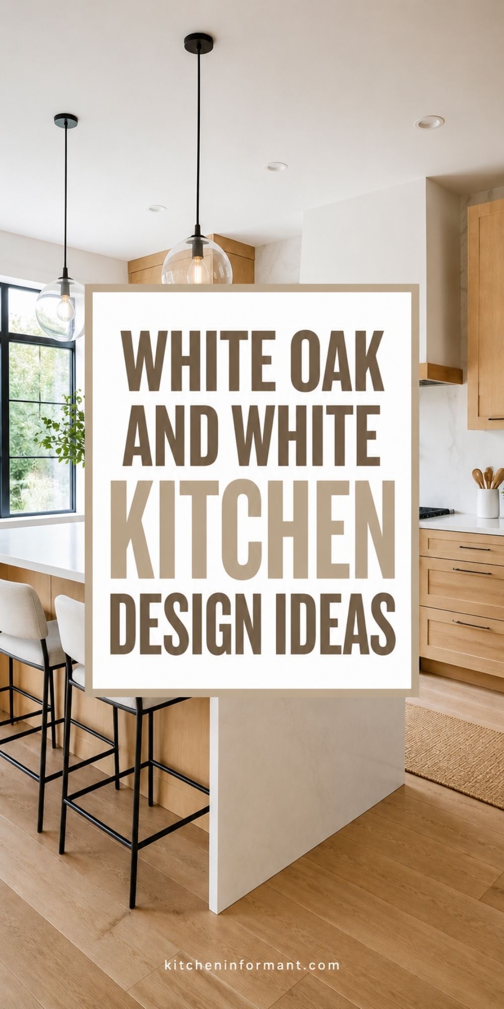
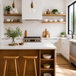
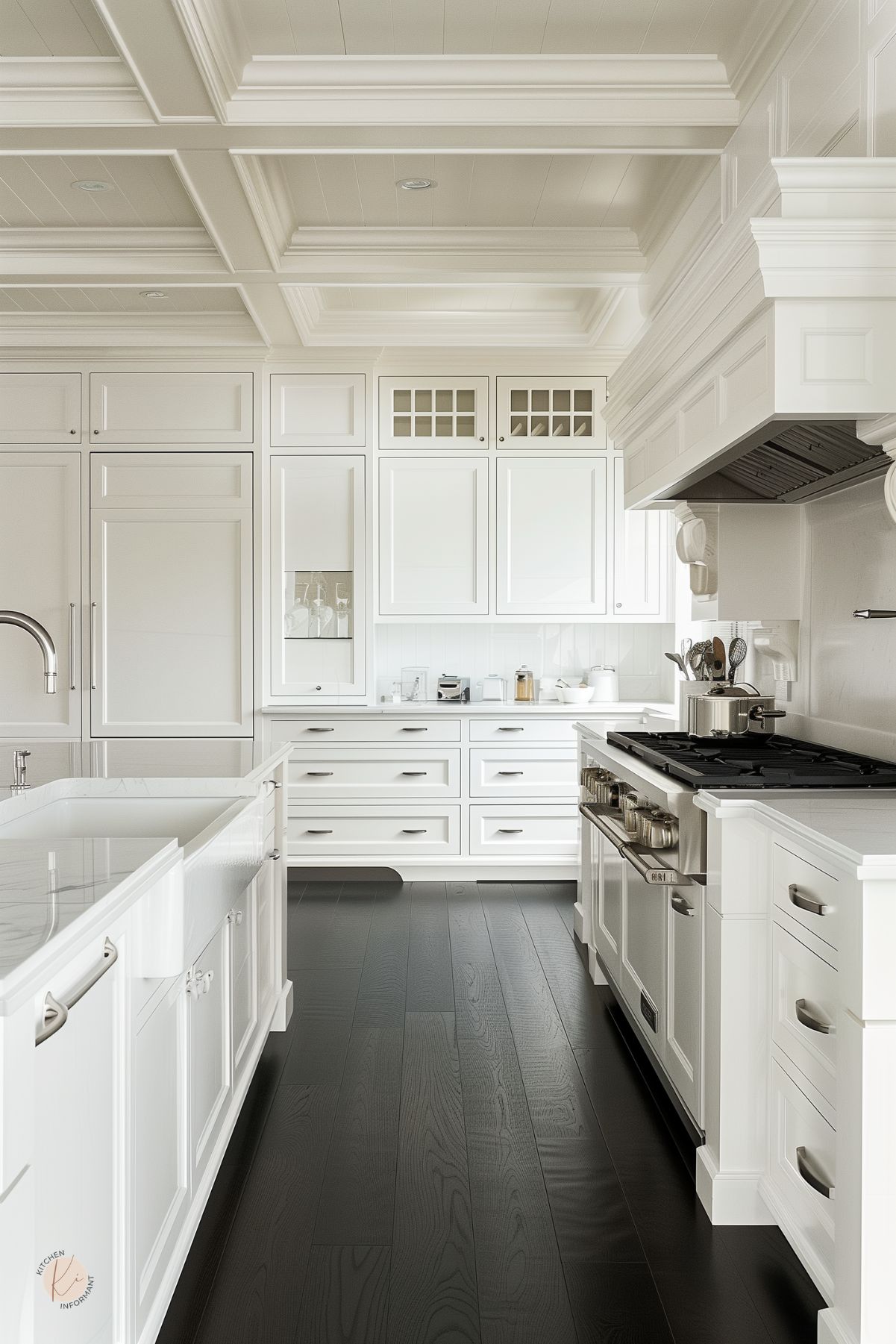
White oak and white kitchen design works well when you want both brightness and warmth in a room.
The white surfaces keep things open and clean, while white oak adds grain, texture, and a softer edge that makes the space feel lived in, not cold or stark.
The strongest versions of this look use white as the main field and oak as a grounding element. Finishes should support the wood, not fight it.
This approach is practical in real homes, especially if the cabinets are already there and you want to improve the room without gutting it.
Why This Pairing Works
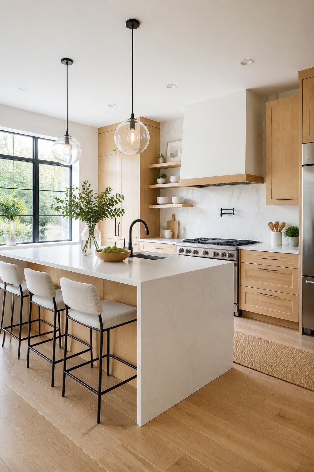
White and white oak balance each other in a way that feels clean and steady. White boosts light and makes the kitchen feel airy, while oak adds just enough texture so the room doesn’t end up flat or chilly.
Visual Warmth Versus Brightness
White kitchens can look crisp, but sometimes they feel a bit hard or sterile if every surface is cool and smooth. White oak helps by bringing visible grain and a natural tone that reads warm without making the room dark.
That mix really helps in kitchens with lots of hard surfaces like quartz, tile, and painted walls. Wood gives your eye somewhere to land.
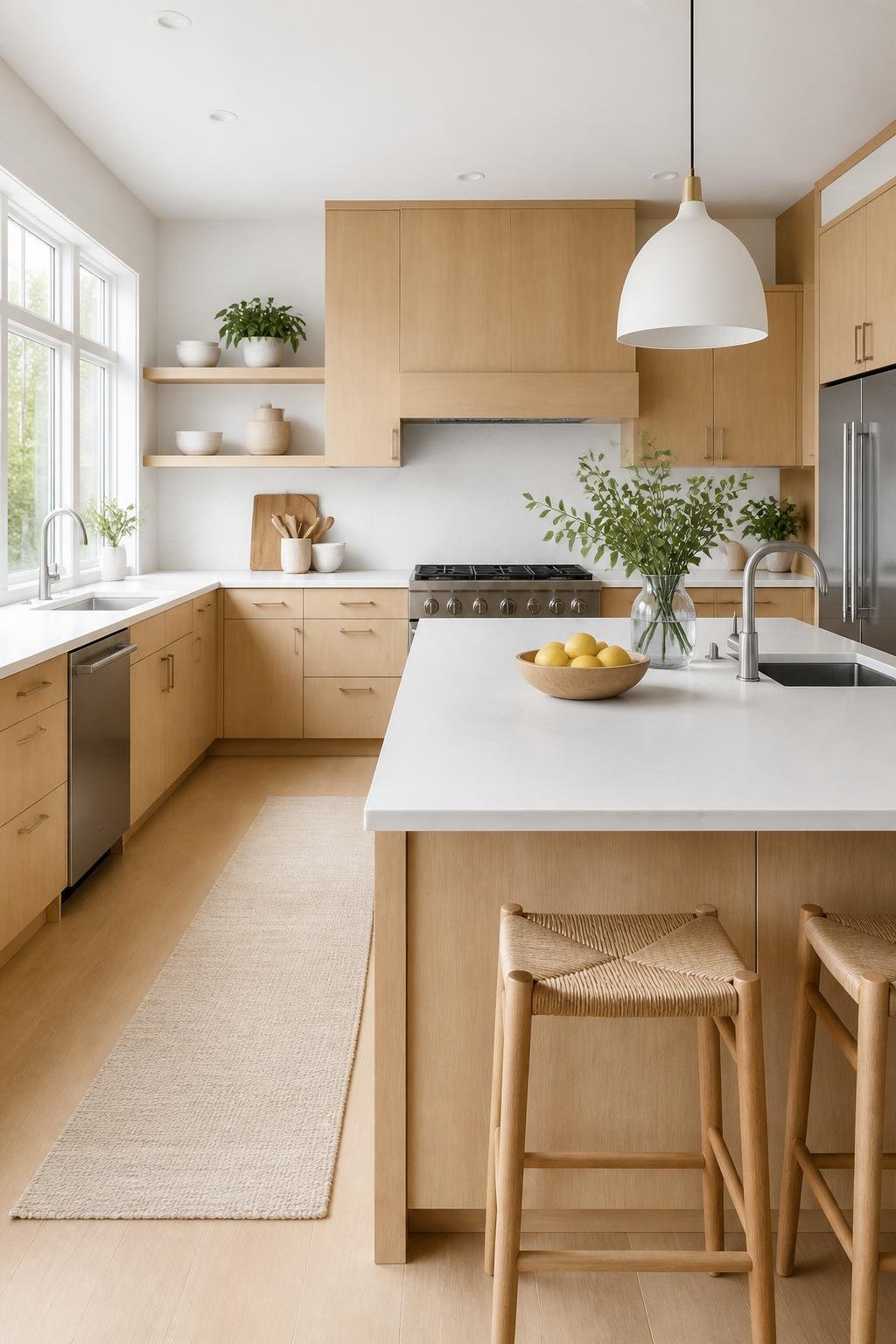
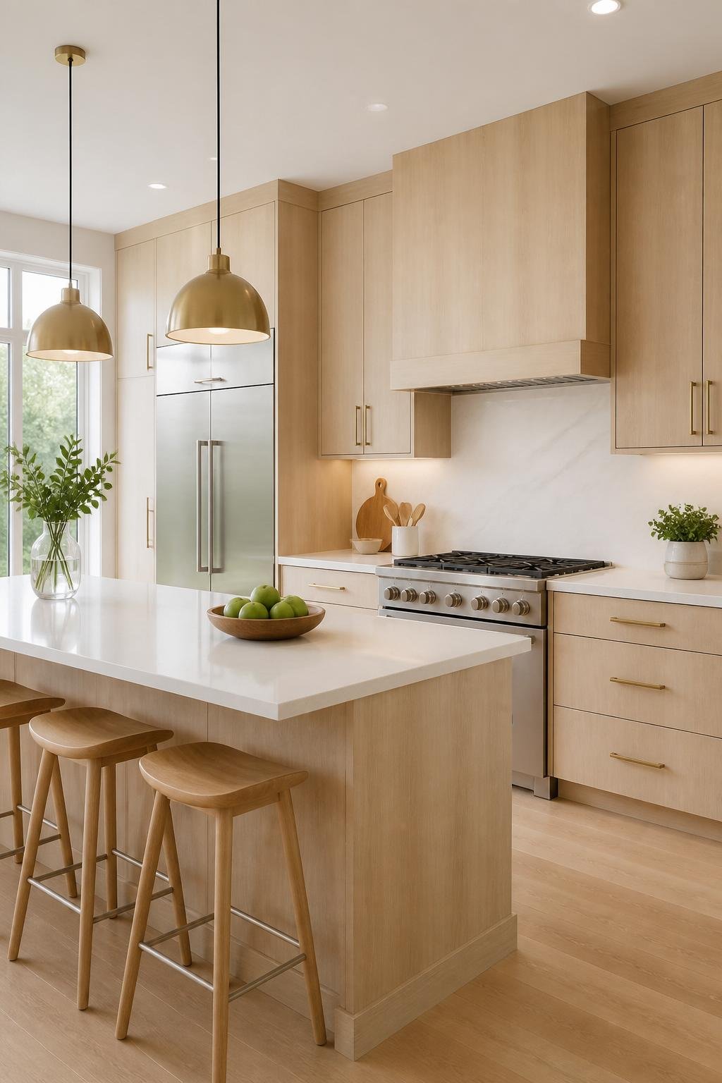
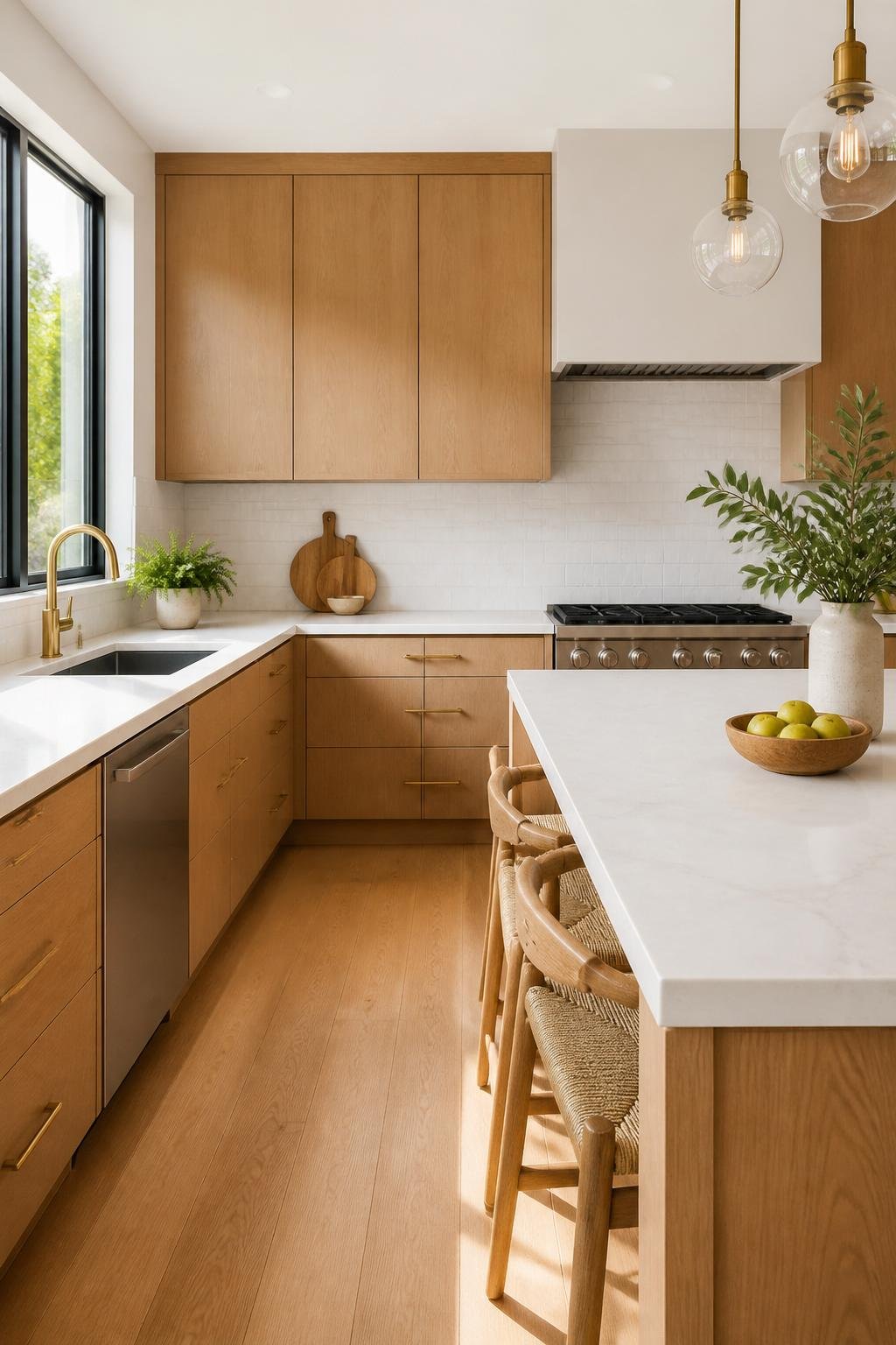
Style Range From Modern to Classic
White oak and white kitchen design don’t lock you into one style. In a modern kitchen, you can keep things simple with flat fronts, clean lines, and minimal hardware.
In a more classic setting, the same materials work with shaker doors, framed panels, and softer finishes. This pairing stays flexible because neither color pushes the room into a single era.
Assessing Existing Cabinet Conditions
Check the cabinet structure before any update. Even the best visual plan falls apart if the boxes sag, doors warp, or the wood is too uneven for a clean refresh.
Cabinet Box and Door Quality
Solid cabinet boxes and doors give you the most options. If the boxes are level and the hinges still work, you can add new hardware, fresh finishes, or even reface the doors.
Loose joints, swelling near sinks, and damaged edge banding are warning signs. If those problems show up everywhere, cosmetic fixes probably won’t last.
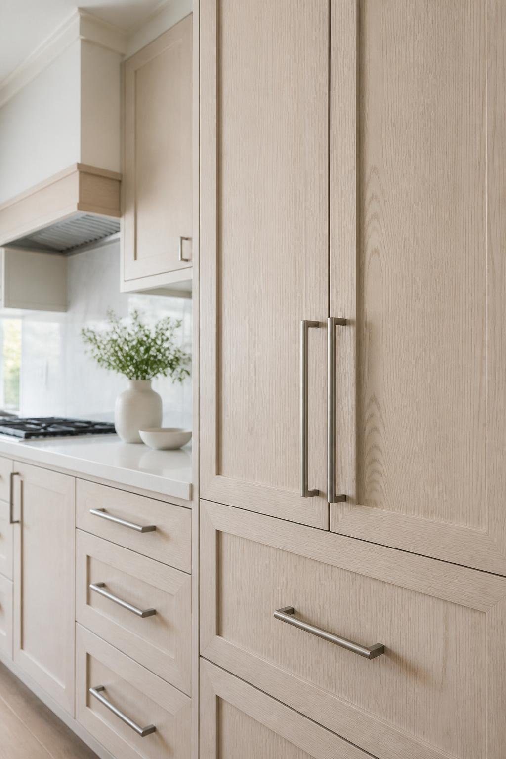
Oak Undertones and Grain Character
White oak isn’t always the same shade. Some boards look golden, others lean beige, and some have gray or taupe undertones that shift how white surfaces look next to them.
The grain matters too. Heavy grain can feel rustic, while a tighter grain looks calmer and more modern. Matching the white finish to that grain keeps the room feeling intentional.
When Refinishing Makes Sense
Refinishing makes sense if the cabinet faces are still solid and the color is close to what you want. It’s also a good move if you want to keep real wood and avoid the cost of full replacement.
If you can clean, sand, and finish the wood evenly, refinished cabinets pair well with new counters, updated lighting, or a better wall color.
Using Blue and Yellow as Supporting Colors
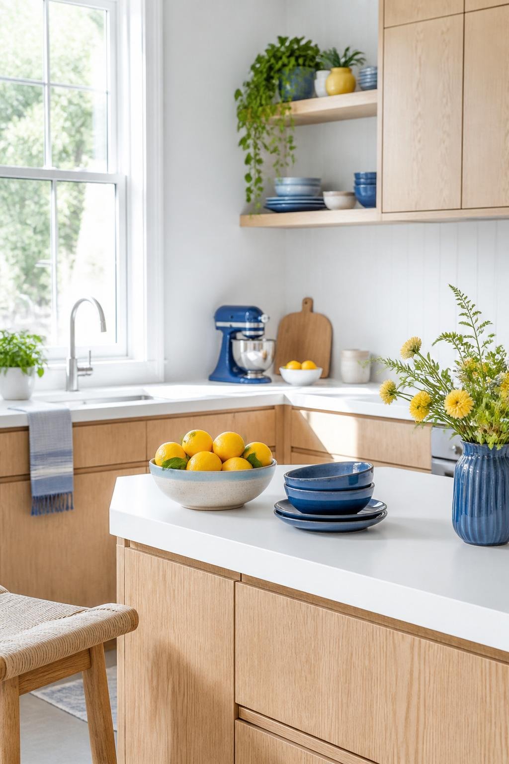
Blue and yellow can support a white oak and white kitchen if you use them in small, controlled ways. Blue adds depth and structure, and yellow brings a soft glow that keeps the space from feeling too plain.
Best Blue Paint Directions
Deep navy works when you want contrast. It pairs especially well with white walls, white counters, and oak fronts, giving the wood a strong backdrop.
Muted blue-gray feels calmer and more flexible. It’s often better in smaller kitchens or rooms with less daylight, since it adds color without making things feel crowded.
Where Yellow Adds Controlled Warmth
Yellow shines as an accent, not as the main cabinet color. Butter yellow, pale ochre, or warm golden details can show up in stools, art, bowls, textiles, or maybe a small painted island.
These shades echo the natural warmth in white oak. They’re handy if your kitchen needs a friendlier tone but you want to keep the clean look of white.
Balancing Accent Colors With Wood Texture
Accent colors should back up the grain, not fight it. Strong blue or yellow works best when the oak has some open space in cabinets, shelving, or trim.
If the wood grain is bold, keep accent colors subtle. If the oak is smooth and understated, you can get away with a bit more color.
Lighting and Finish Decisions
Lighting and finish choices really shape how white oak and white surfaces feel in daily life. A kitchen might look balanced in a showroom, but at home the details can make it feel too warm, too cool, or even too shiny if they don’t fit the space.
Natural Light Orientation
South- and west-facing kitchens get warmer light during the day. In those rooms, a cooler white can keep things from looking too yellow next to oak.
North-facing kitchens usually need more warmth in the white finish. A soft white or cream can help the space feel brighter without making the oak look dull.
Warm Versus Neutral White Surfaces
Warm whites work if the oak has golden undertones. Neutral whites fit better when the wood is pale or slightly gray.
Pure bright white can be useful, but sometimes it makes the wood grain pop more than you’d expect. Testing sample boards near your cabinets is honestly the safest move.
Matte, Satin, and Low-Sheen Choices
Matte finishes cut glare and hide small flaws. Satin and low-sheen finishes bounce a bit more light, which can make a kitchen feel cleaner and more open.
For cabinets, low-sheen is usually a practical middle ground. It’s easier to keep up than flat paint and doesn’t reflect as much as glossy finishes.
Coordinating Countertops, Backsplashes, and Hardware
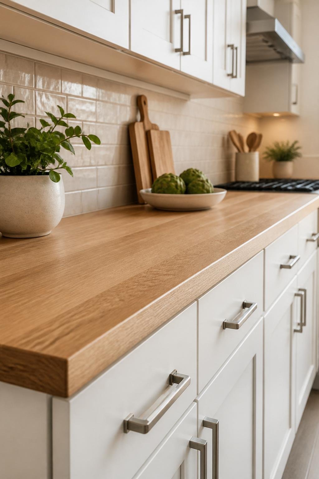
Countertops, backsplash, and hardware should back up the wood tone and help the room breathe. Simple materials usually work best, since white oak already brings plenty of visual movement.
Stone Patterns That Do Not Fight the Grain
Quiet stone patterns pair best with white oak. Soft veining, light quartz, and low-contrast marble looks complement the grain instead of competing with it.
Busy granite patterns and strong veining can overwhelm cabinet fronts. If the oak stands out, keep the countertop simple.
Backsplash Shapes and Color Restraint
Simple backsplash shapes beat complicated patterns in most white oak kitchens. Standard subway tile, thin stacked tile, or slab backsplashes keep things calm.
Color restraint helps, too. White, cream, soft gray, and pale stone tones usually support the design better than busy tile graphics.
Metal Finishes That Suit Oak and White
Brushed nickel, stainless steel, and soft brass are the easiest metals to use here. Stainless steel keeps things clean and modern, while brushed brass adds warmth that plays well with oak grain.
Very dark hardware can work, especially in modern kitchens, but it should feel like an accent, not a heavy outline on every cabinet.
Keep, Refresh, or Replace
The right move depends on your cabinet condition, budget, and how much change you want. Many kitchens look better with targeted updates, but sometimes you need structural changes for a real improvement.
Budget-Friendly Cosmetic Updates
New hardware, updated lighting, fresh wall paint, and a cleaner backsplash can make a big difference. These updates work when the cabinet boxes are solid and the doors still fit well.
A good cleanup and declutter helps, too. White oak always looks better when it’s not crowded by stuff.
Signs a Partial Replacement Is Smarter
Partial replacement makes sense if only some doors are damaged, warped, or mismatched. It also helps when the layout works but one area, like an island or pantry, needs a new look.
This route is practical if you want to keep your cabinet structure and just swap out the most visible problem spots. Sometimes it makes more impact than paint alone, especially in older kitchens.
When Full Replacement Is Justified
Full replacement makes sense if the cabinet boxes are falling apart or the layout just doesn’t work. Sometimes, the finish can’t really be improved enough to fit the design goal, no matter how hard you try.
It’s also the smarter move if you need a totally different storage plan or want to change the scale of the kitchen in a big way. When the current oak feels weak or the space just seems too cramped, starting fresh with new cabinetry might actually save money down the road.
You can still stick with that white oak and white vibe, but with better proportions and a cleaner look this time around. It’s worth considering if you want a kitchen that really feels right.