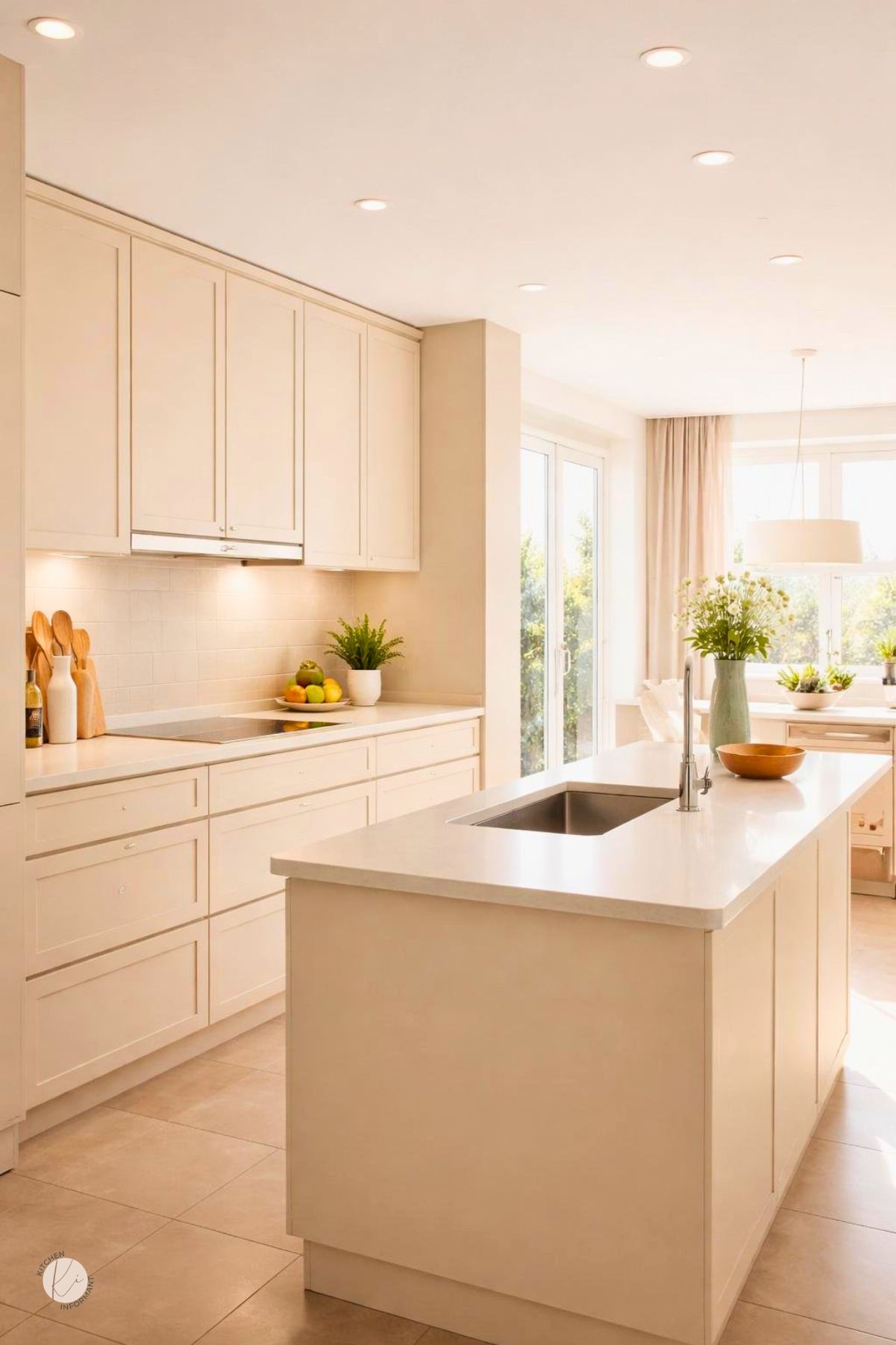
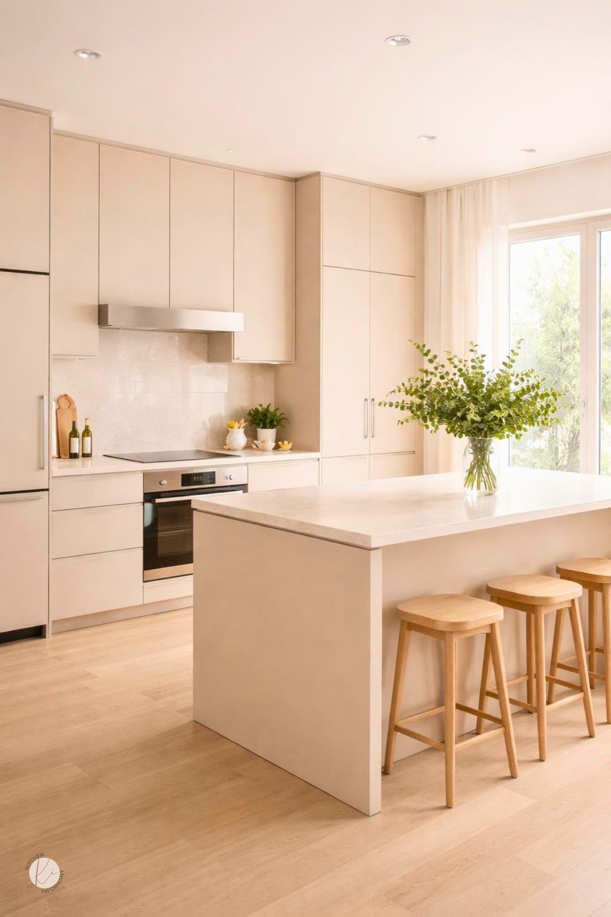
Creamy beige kitchen design works best when it is treated as a warm neutral system, not just a paint color.
It can soften older oak, lighten heavy finishes, and create a cleaner look without forcing a full remodel.
The strongest results come from matching the cabinet undertone, room light, and surface materials before choosing paint, hardware, or replacement parts.
That planning step helps the kitchen feel intentional instead of patched together.
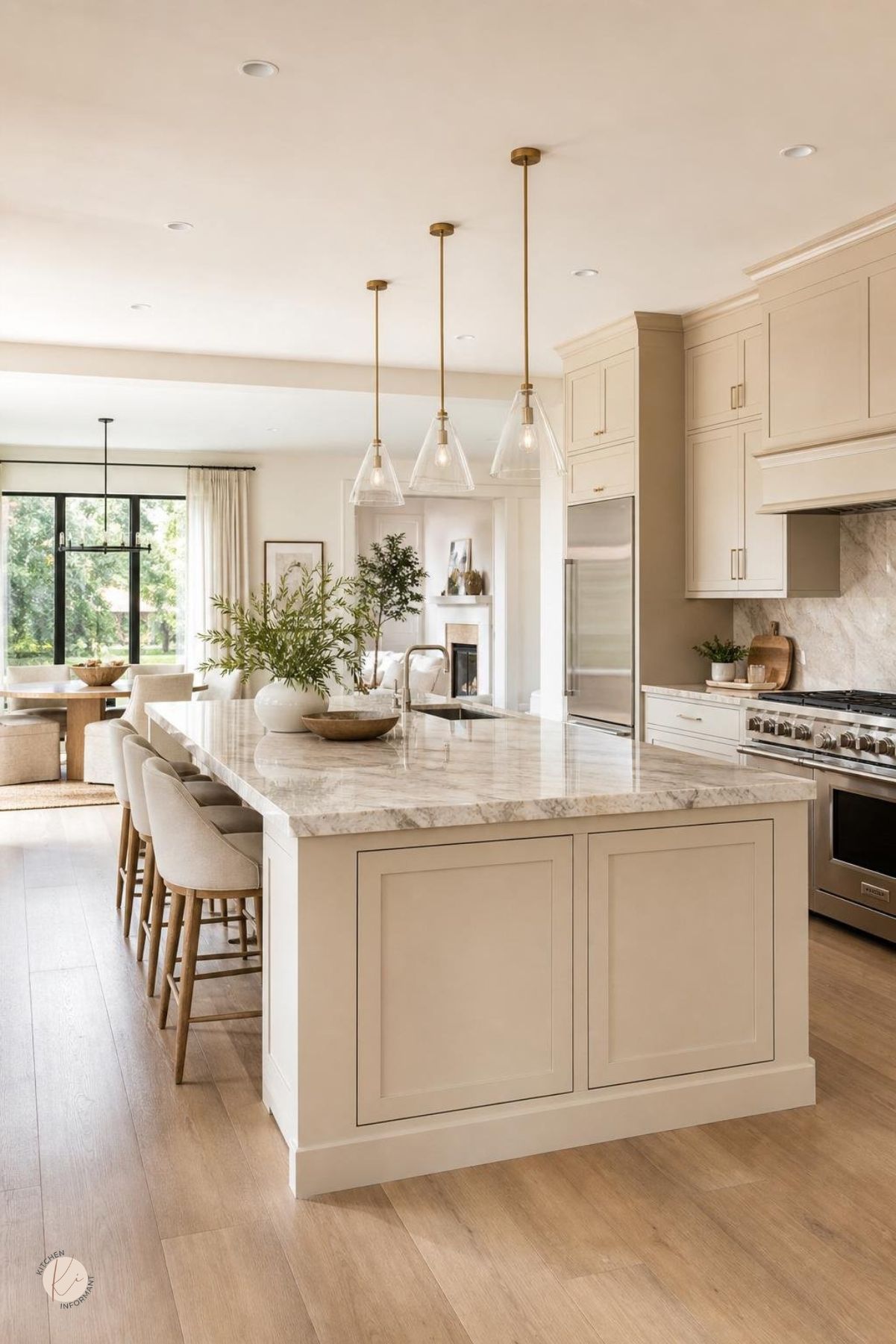
A well planned creamy beige kitchen can feel calm, bright, and timeless.
It also gives older cabinets a better chance of staying useful, especially when the boxes are solid and the layout still works.
What Makes This Palette Work
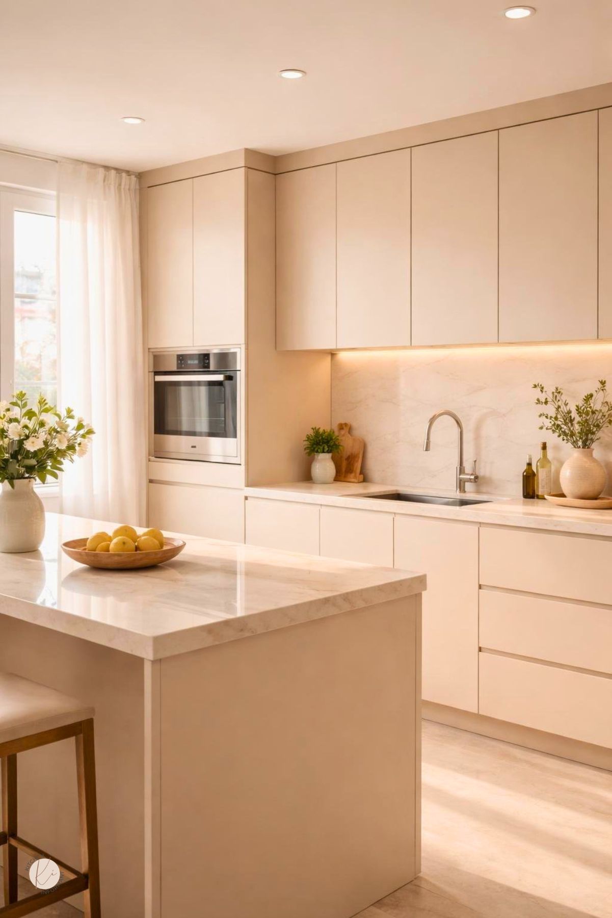
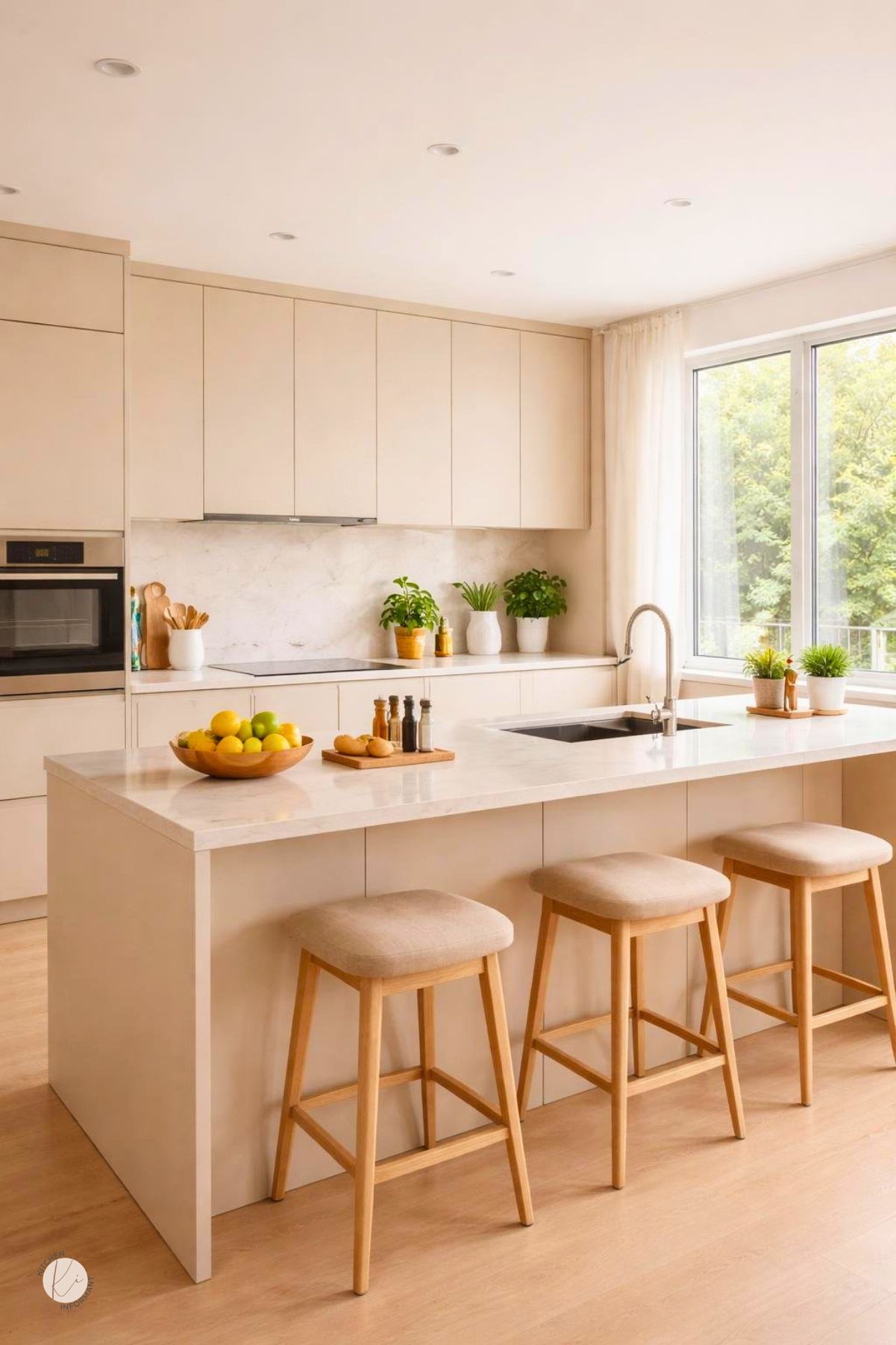
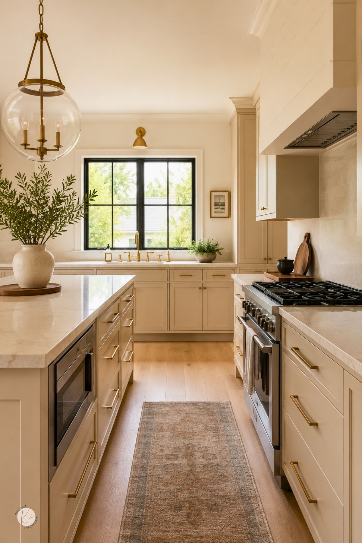
Creamy beige works because it sits between white and deeper tan, so it reflects light without feeling stark.
It also pairs well with wood, stone, metal, and many cabinet styles.
The palette stays flexible when the beige has enough warmth to support existing finishes.
That makes it useful in homes with oak cabinets, mixed materials, or kitchens that need a softer look.
Undertones That Keep the Space Warm
Creamy beige can lean yellow, pink, gray-brown, or slightly green.
The right undertone depends on the cabinet color, the flooring, and the amount of natural light.
Warm undertones help the kitchen feel inviting.
If the beige is too gray, the room can start to look dull next to oak or warm wood floors.
How Beige Differs From Greige and Ivory
Beige is warmer and more earthy than greige.
Greige often reads cooler and more muted, which can work in modern spaces, yet it may not blend as well with traditional oak.
Ivory is lighter and closer to white.
It can look fresh, though it may feel less grounded than creamy beige in a kitchen that already has warm wood tones.
Assess Existing Cabinets Before Making Changes
Before any color decision, the cabinets need a basic inspection.
The goal is to separate cosmetic issues from structural problems so time and money go where they matter most.
A cabinet that is solid, stable, and properly aligned can often support paint, new doors, or refacing.
A cabinet with swelling, broken joints, or major hardware failure may be a better replacement candidate.
Signs the Boxes and Doors Are Worth Keeping
Flat, unwarped boxes are a strong sign the kitchen can be refreshed rather than replaced.
Doors that close well, sit square, and show only surface wear usually have good life left.
Minor scratches, dated stain color, and old hardware are cosmetic problems.
Water damage near the sink, sagging shelves, or loose face frames are more serious concerns.
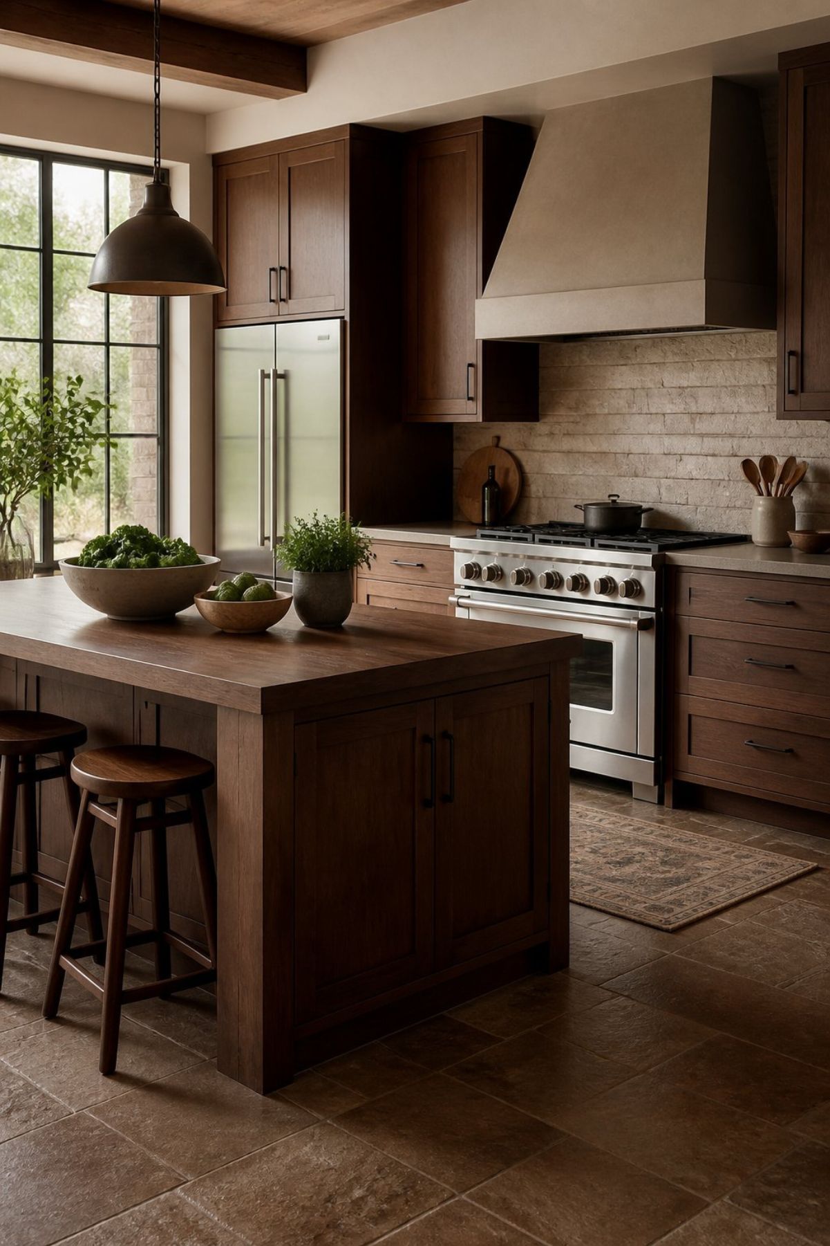
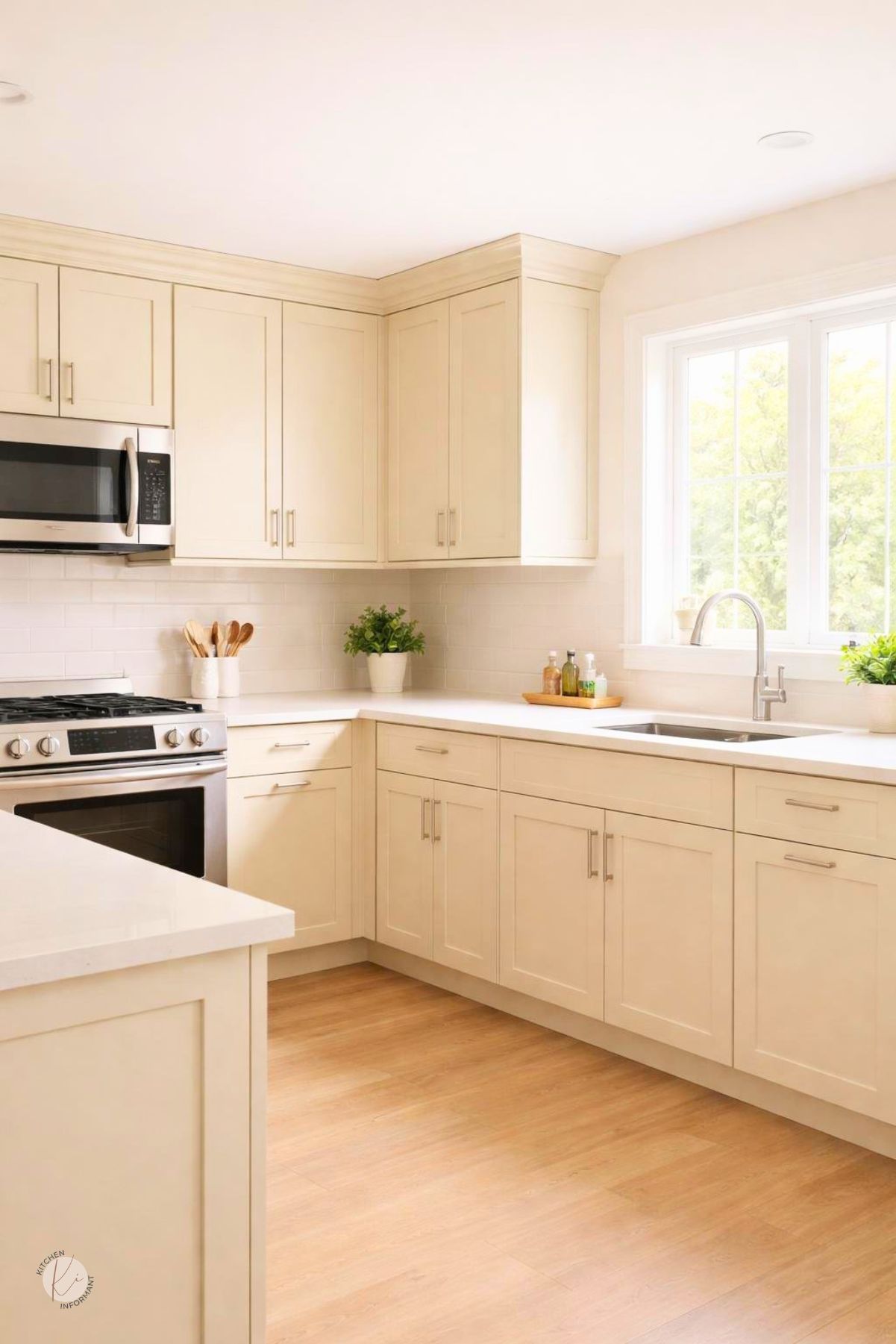
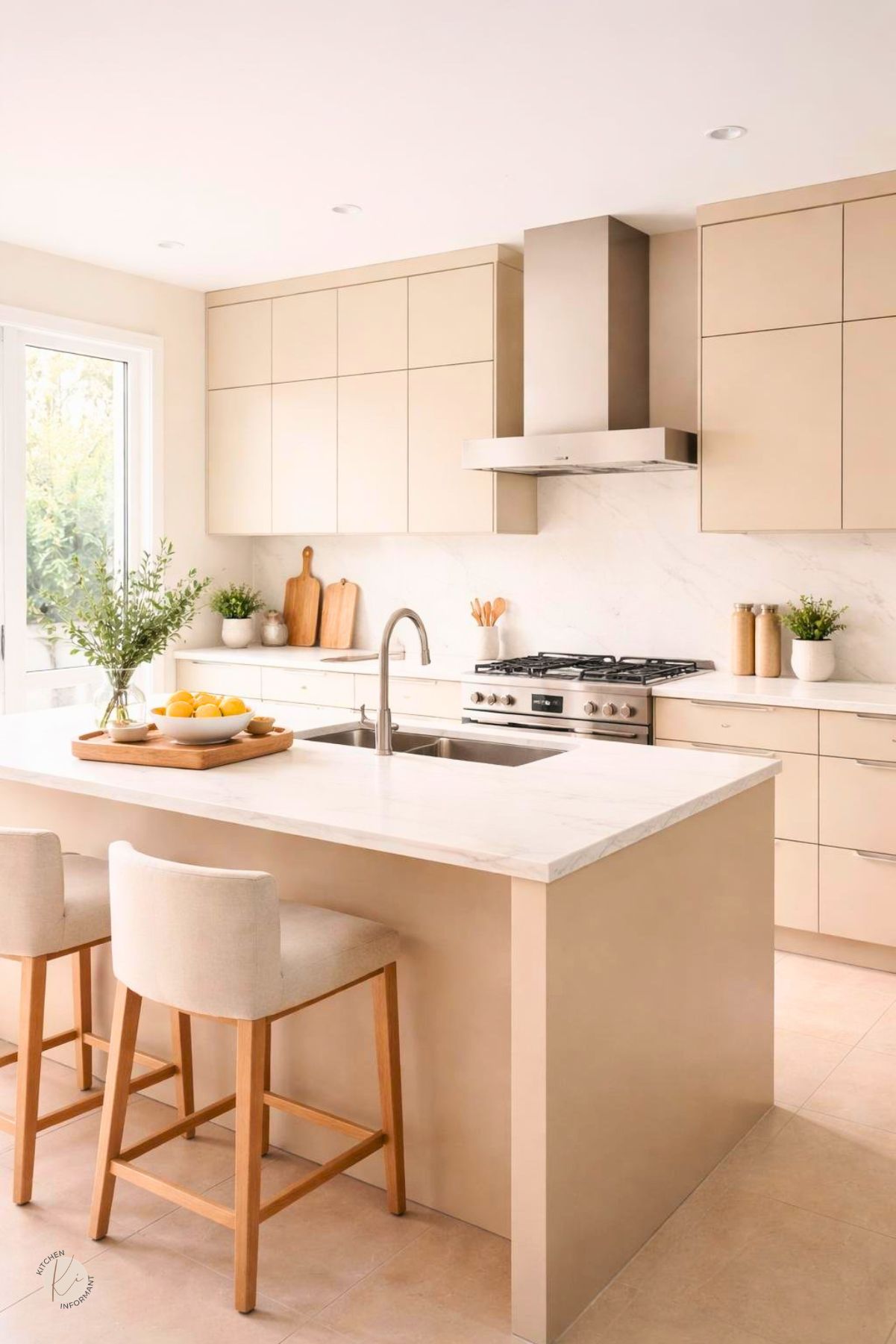
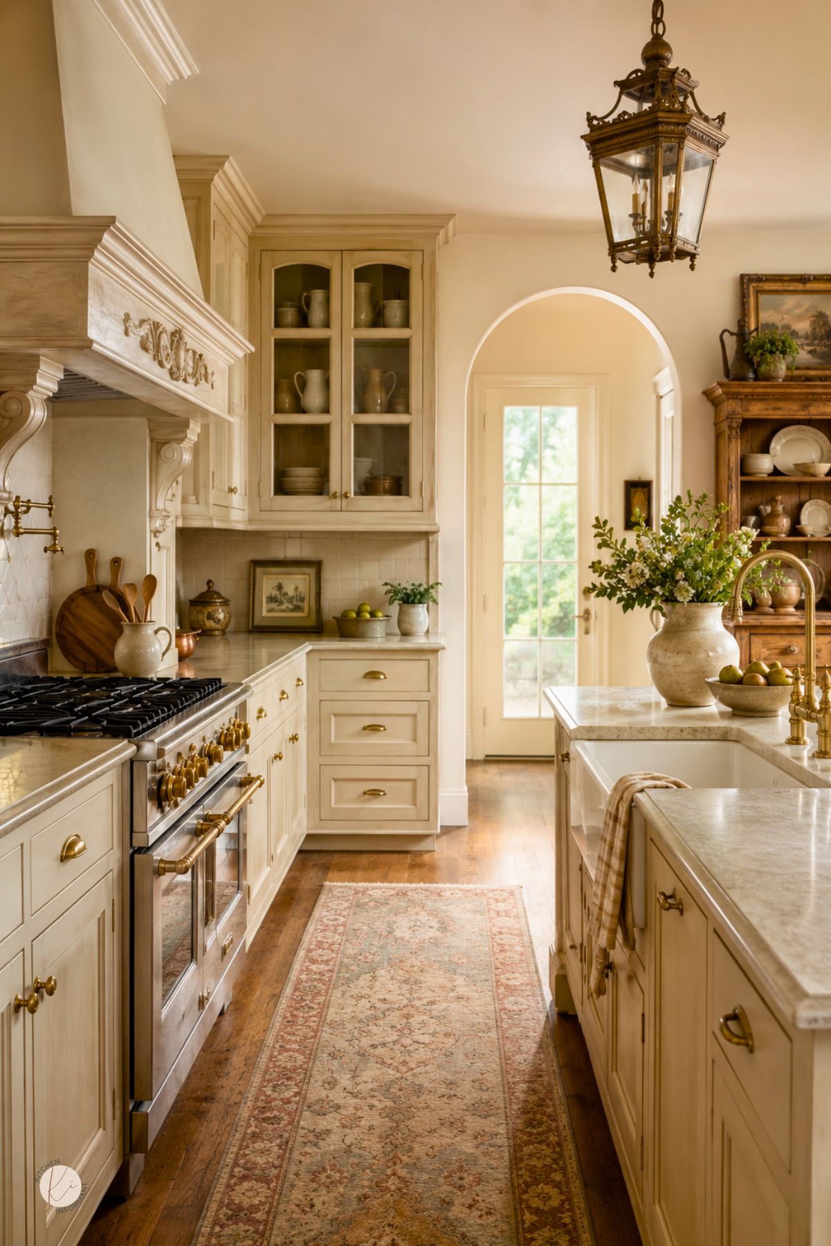
How Oak Grain and Finish Affect Color Pairing
Oak grain is visible and active, so it changes how beige reads next to the cabinets.
A strong orange or red oak tone can make a creamy beige look too yellow if the undertones are not matched well.
A lighter stain or a dull finish gives more room for beige walls, tile, or trim to work.
A shiny amber finish tends to look more dated, so it needs more careful pairing with stone and metal finishes.
Lighting and Room Orientation
Light changes beige more than many homeowners expect.
The same paint can look creamy in one kitchen and muddy in another.
Room direction shapes color choice as much as the cabinet style.
Natural light, bulb temperature, and shadow level all affect how warm the palette feels during the day.
North- and East-Facing Rooms
North-facing kitchens often get cooler light, so beige can appear flat if it is too gray.
A warmer cream with a soft yellow or peach base usually performs better.
East-facing rooms can look bright in the morning and cooler later in the day.
In those spaces, sample boards should be checked at both times before any final choice is made.
South- and West-Facing Rooms
South-facing kitchens receive strong warm light, which can intensify yellow undertones.
A balanced creamy beige with moderate warmth often works better than a very golden shade.
West-facing rooms can shift from neutral to warm as the sun lowers.
That change makes it important to test beige next to cabinets, counters, and backsplash tile at dusk, not just at noon.
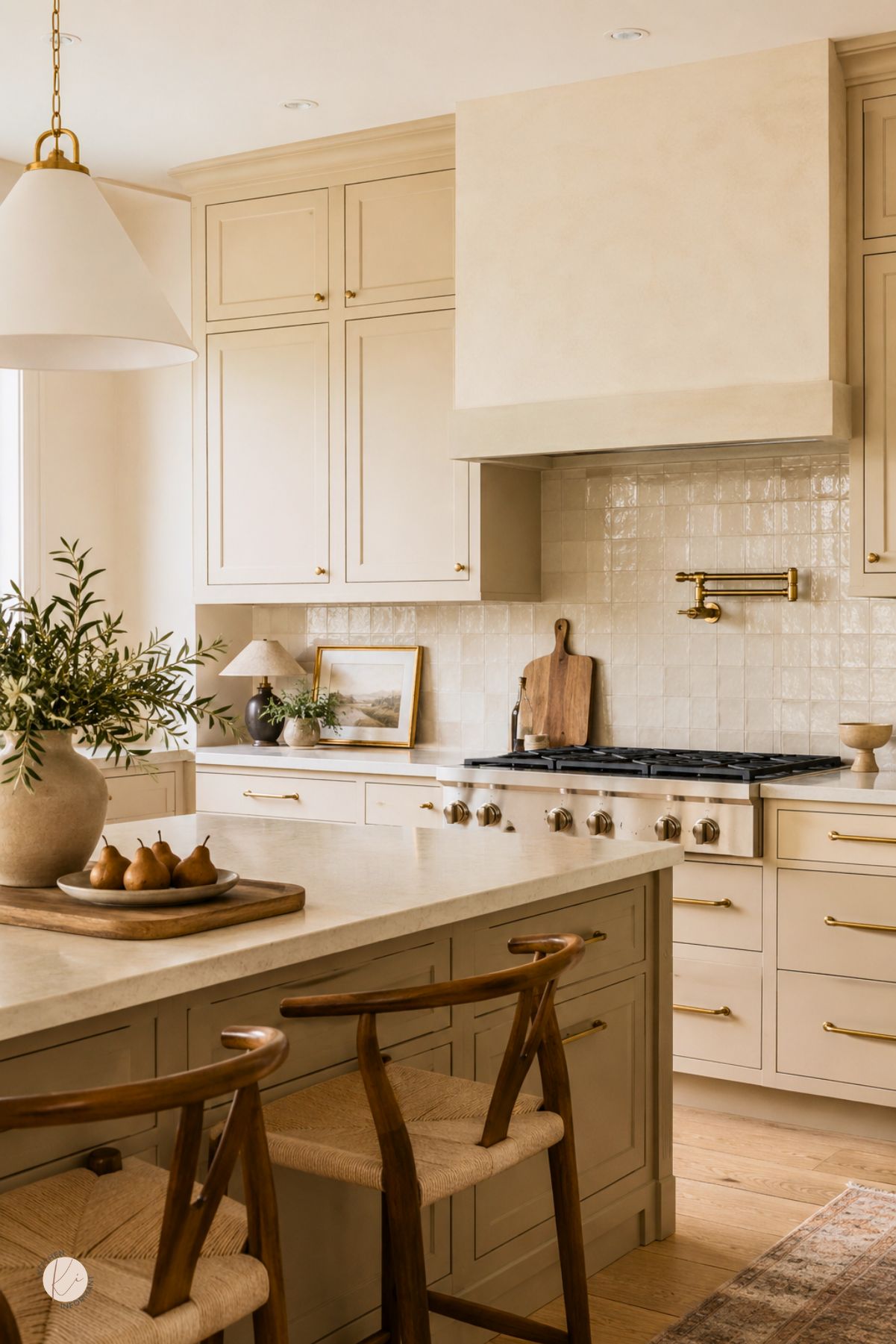
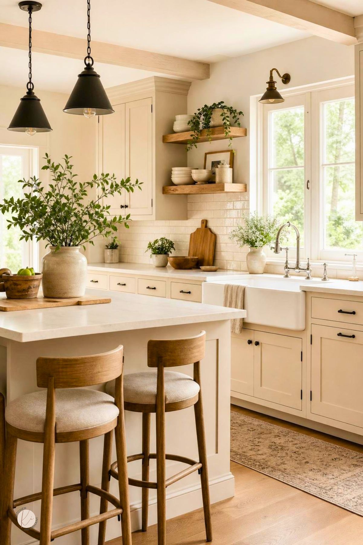
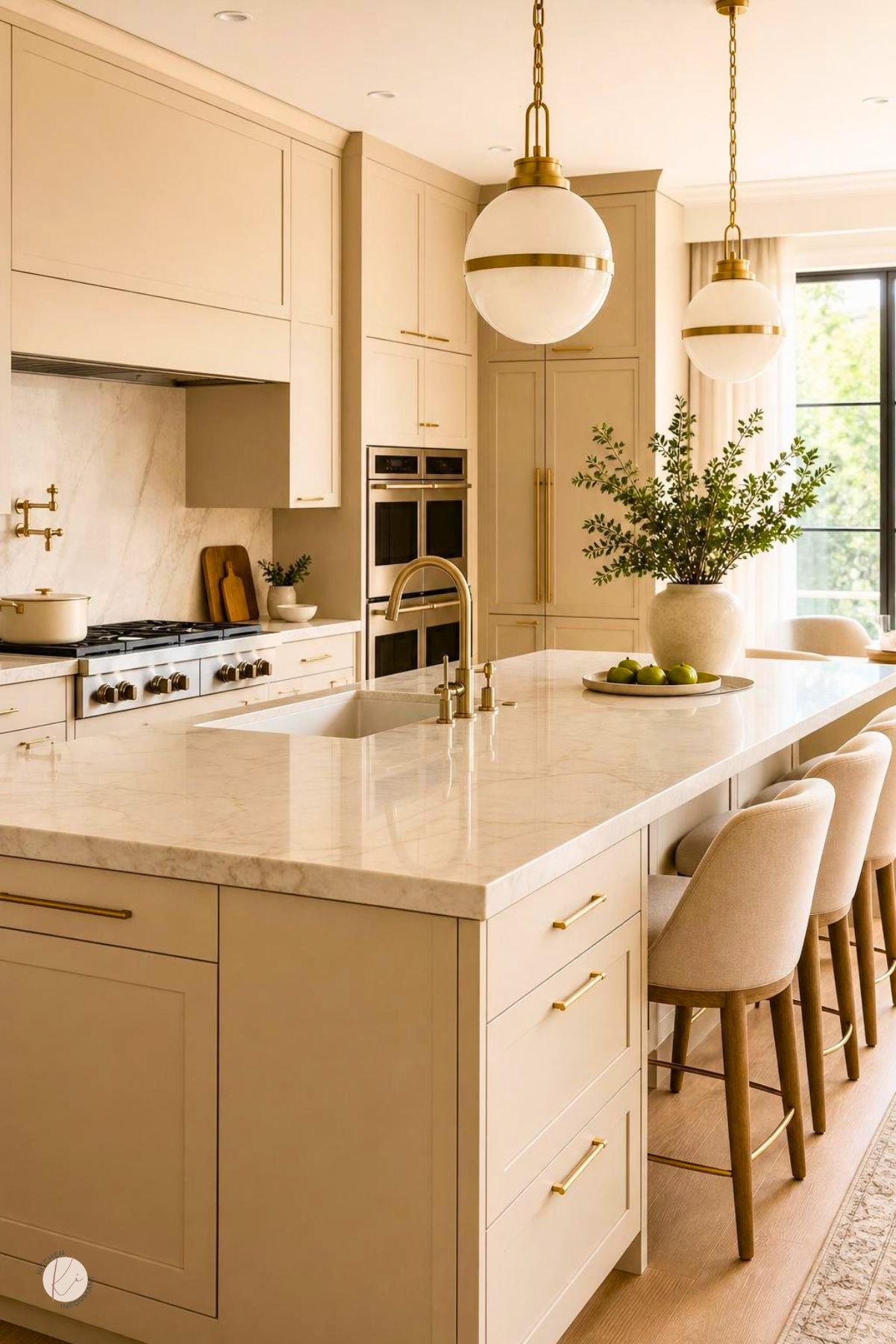
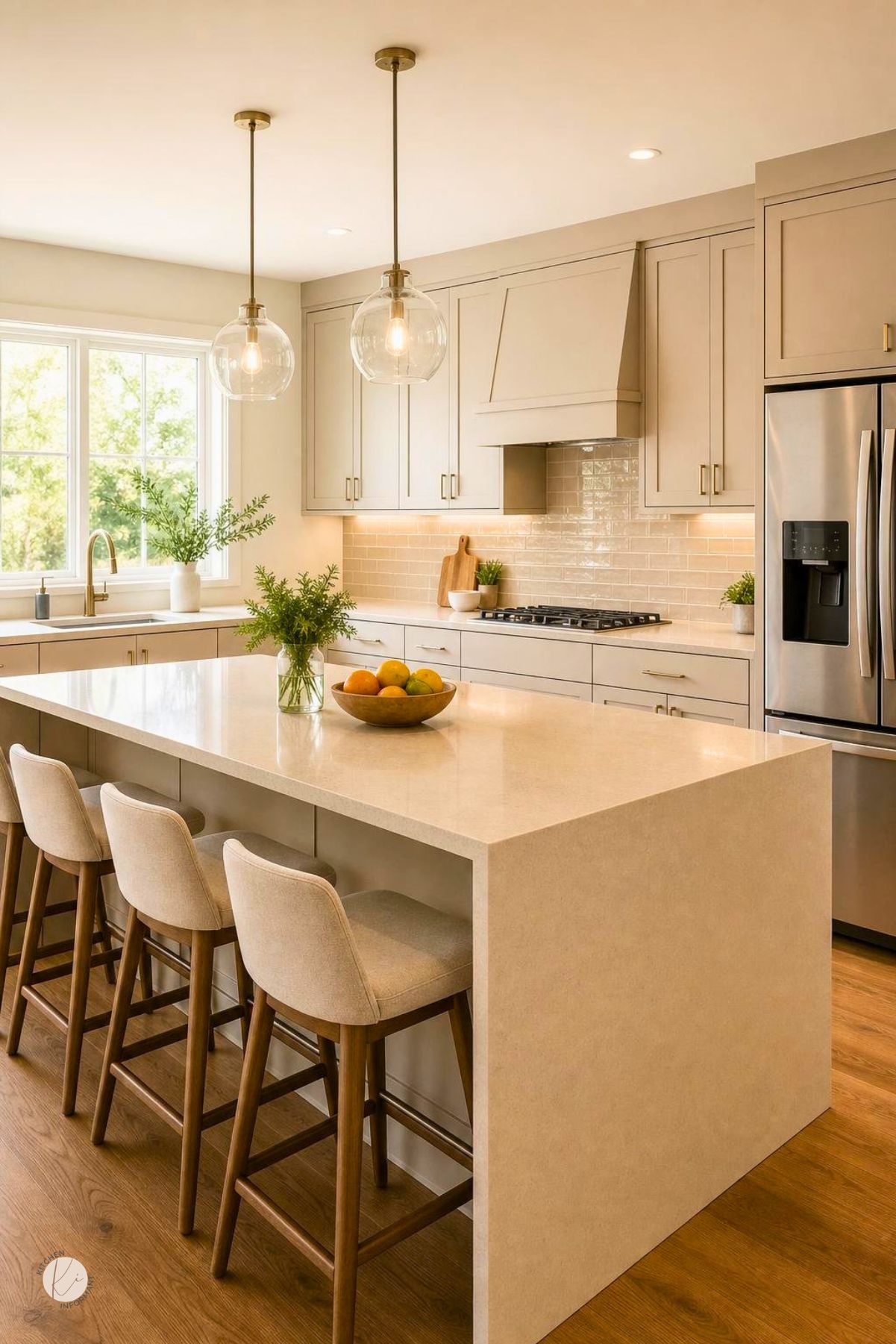
Best Complementary Colors and Materials
Creamy beige gains depth when it is paired with a few stronger accents and real texture.
Blue brings contrast, yellow adds lift, and natural materials keep the palette from feeling flat.
The best pairings use one or two clear supporting colors, then repeat them in small ways through hardware, textiles, or decor.
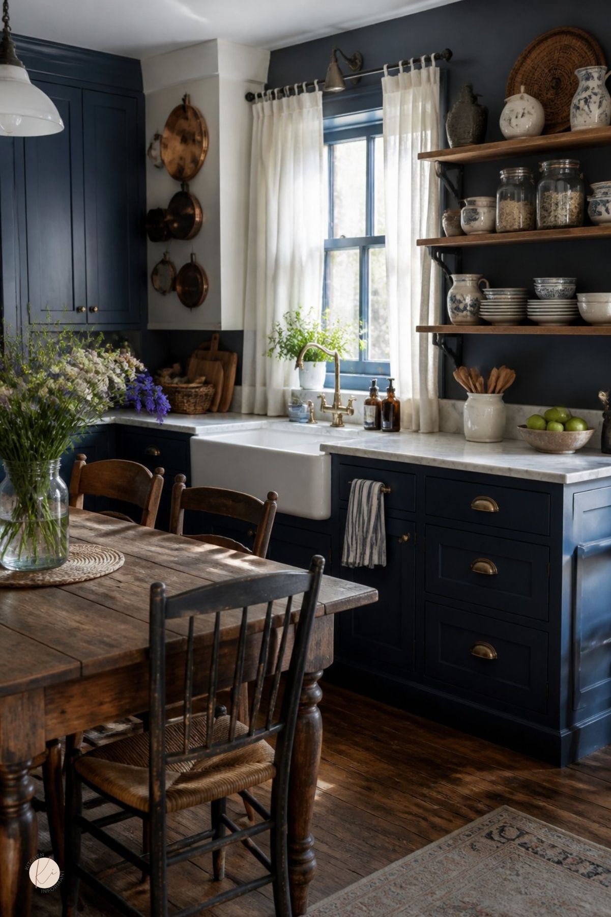
Blue Accents That Add Contrast
Blue works because it balances the warmth of beige and oak.
Soft navy, slate blue, and dusty blue can cool down an overly yellow kitchen without making it feel cold.
Blue is useful in dishware, bar stools, runner rugs, and smaller appliances.
It also works well when the cabinets and walls are both warm, since it gives the eye a place to rest.
Yellow Notes That Brighten Without Overpowering
Small yellow notes can make creamy beige feel sunny rather than tired.
The key is restraint, since too much yellow can push the room toward a dated look.
Muted mustard, pale gold, or wheat tones work better than bright primary yellow.
These shades can appear in art, pottery, linen, or a single accent chair.
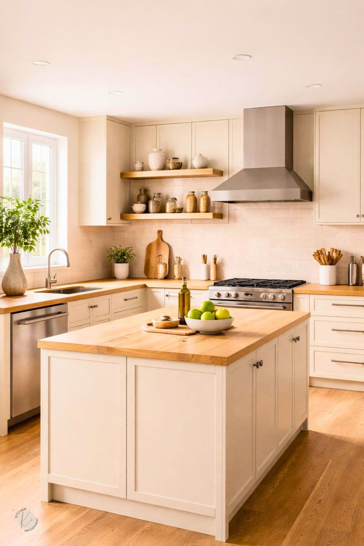
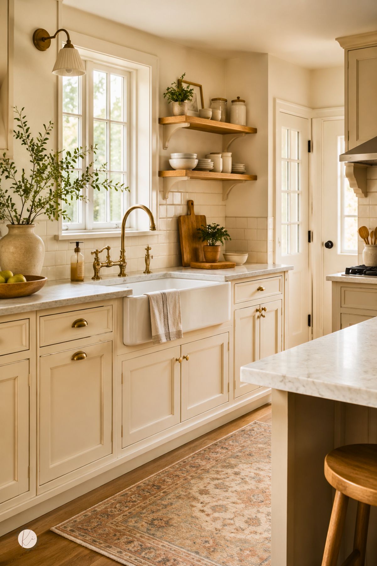
Countertops, Backsplashes, and Flooring Pairings
A successful creamy beige kitchen usually needs contrast in at least one major surface.
Light stone with visible veining, warm quartz, or honed marble can give the cabinets more definition.
Backsplashes in zellige, handmade-look tile, or soft stone add texture.
Flooring should support the cabinets, not match them exactly, so wood, limestone-look tile, or a medium neutral plank often works better than an all-beige floor.
Refresh Vs. Replace Decision Guide
The right choice depends on cabinet condition, layout, and budget.
A smart refresh can improve a kitchen quickly, while replacement makes more sense when the base structure is weak or the plan no longer fits daily use.
A beige color strategy can work in either path.
The difference is how much of the existing kitchen still earns a place in the final design.
Low-Commitment Cosmetic Updates
Paint, new pulls, updated lighting, and a better backsplash can change the feel of the room without touching the cabinet boxes.
These updates are useful when the layout works and the doors are in good shape.
A change in wall color or trim can also shift how beige reads.
Small updates often deliver the biggest visual improvement for the least disruption.
When Refacing Makes Sense
Refacing fits kitchens with sound boxes but dated doors and drawer fronts.
It allows the homeowner to keep the layout while changing the visible finish to a more cohesive creamy beige look.
This path is especially practical when oak grain is the main issue and the cabinet structure is still strong.
New doors, veneer, and hardware can create a cleaner result than paint alone.
When Full Replacement Is Justified
Replacement is justified when the cabinets are warped, badly damaged, or poorly sized for how the kitchen is used.
It also makes sense when the layout creates storage problems that cosmetic work cannot solve.
If the sink base is damaged, the cabinet lines are uneven, or the room needs a different footprint, new cabinetry may save frustration later.
That choice also opens the door to better moisture resistance, better storage, and more precise material matching.
Common Mistakes to Avoid
Creamy beige is forgiving, yet it still needs careful planning.
Most problems come from ignoring undertones, skipping sample testing, or making every surface too similar.
A kitchen can look soft and warm without becoming washed out.
The goal is to keep enough contrast and texture so the design feels finished.
Ignoring Wood Undertones
Oak cabinets can lean orange, red, or honey gold.
If the beige choice does not match that warmth level, the kitchen can look mismatched even when each color looks good on its own.
The same issue can show up in flooring and trim.
Every warm finish needs to be checked together before paint or tile is chosen.
Choosing Finishes Without Testing Samples
Paint chips are not enough in a kitchen with changing light.
A sample can look creamy in a store and too yellow next to a west-facing window.
Samples should be tested on multiple walls and viewed in morning, afternoon, and evening light.
The same rule applies to tile, hardware, and countertop samples.
Overusing Flat Monochrome Surfaces
Too much beige in one finish level can make the room feel flat.
If the cabinets, walls, counters, and floor all match closely, the eye loses contrast.
Texture solves that problem.
Grain, veining, matte metal, woven seating, and a patterned backsplash all help a creamy beige kitchen feel balanced.
You May Also Like: