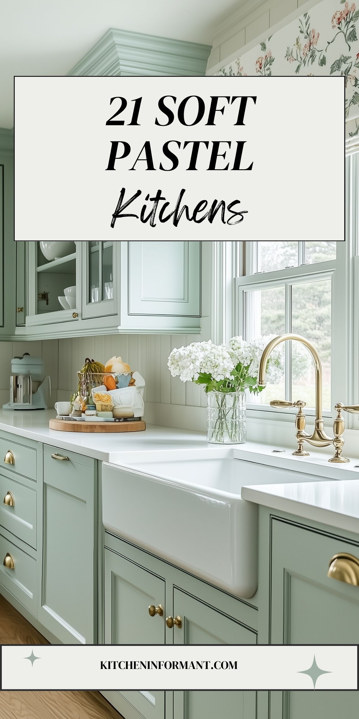
Soft pastels have become a popular choice in kitchen design, creating a serene and inviting atmosphere.
These gentle colors, such as blush pink, pale mint green, and light blue, bring a fresh and airy feel to the heart of the home.
Incorporating soft pastel tones can transform a kitchen into a bright and elegant space that feels both modern and welcoming.
Many designers suggest that the use of pastels can enhance not only the aesthetic of the kitchen but also the mood of those who spend time there.
These colors pair beautifully with natural materials and can be easily incorporated into cabinets, walls, and decor.
By choosing the right pastel shades, it’s possible to create a harmonious and stylish environment that invites creativity and comfort.
Soft pastels are not just about appearance; they foster a calm environment that encourages relaxation and enjoyment during meal prep and gatherings.
For anyone looking to refresh their kitchen, exploring pastel options could lead to delightful design possibilities that breathe new life into the space.
Embracing Soft Pastels
Soft pastels in kitchen design are becoming increasingly popular. Their calming shades can transform a kitchen into an inviting space.
These colors are not just about aesthetics; they also affect mood and perception.
The Rise of Pastel Tones in Kitchen Design
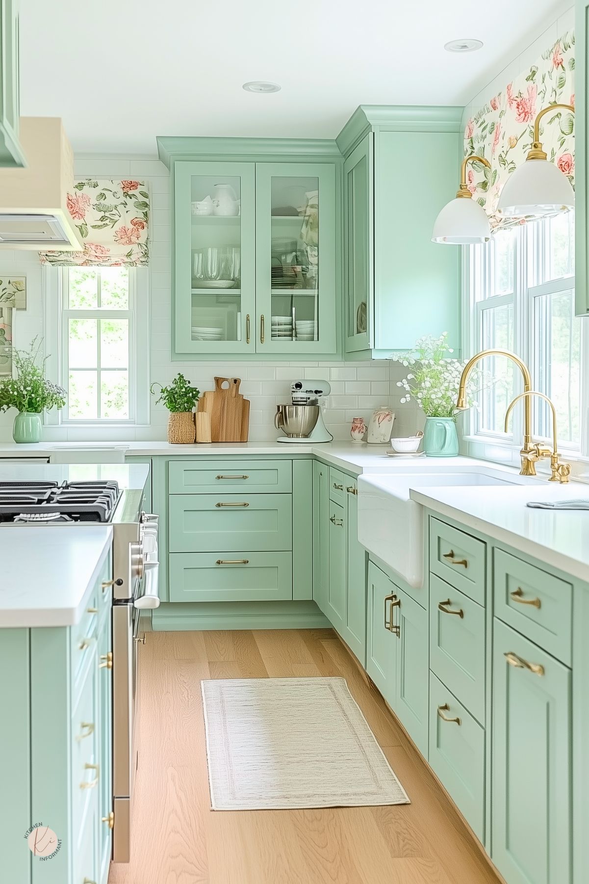
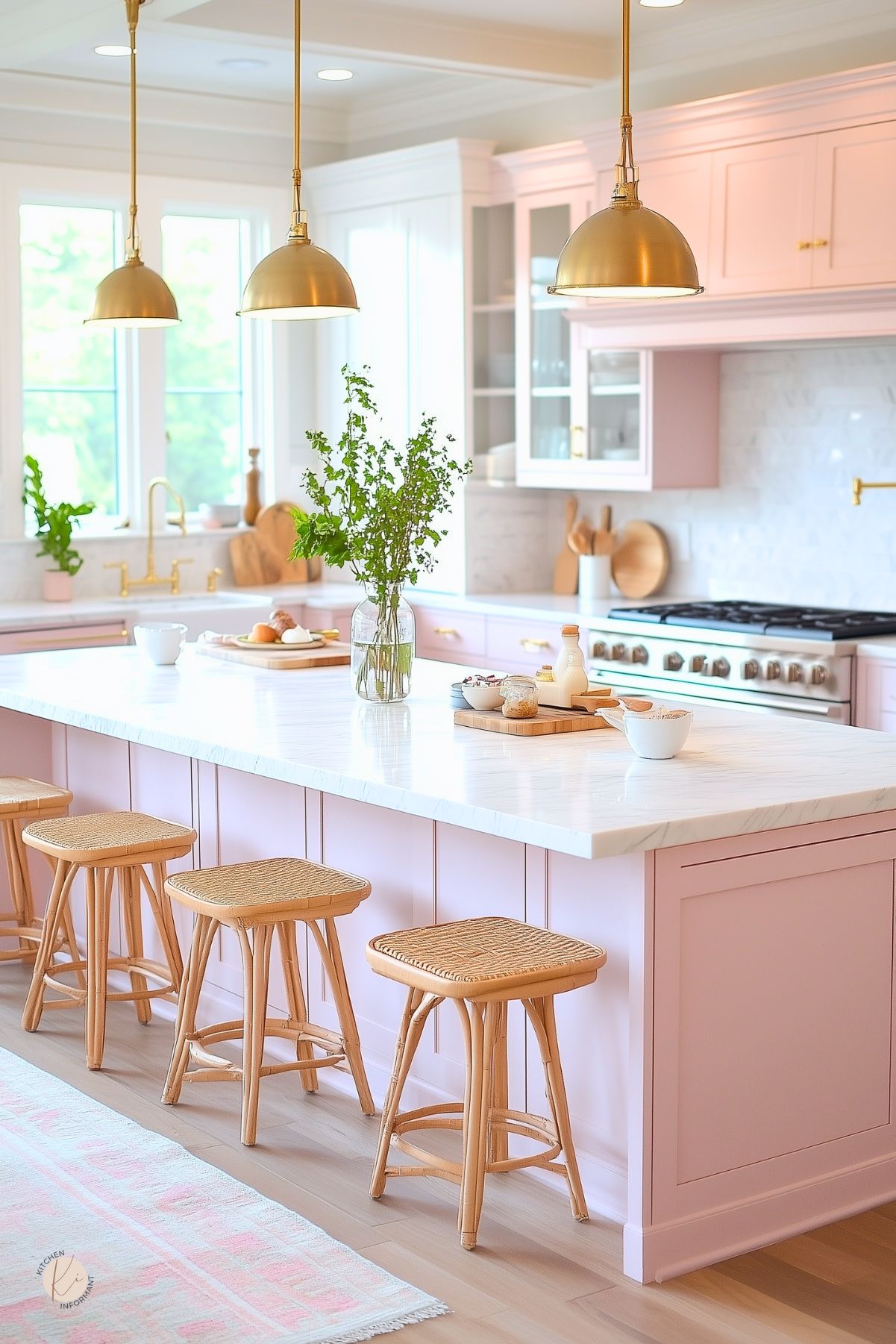
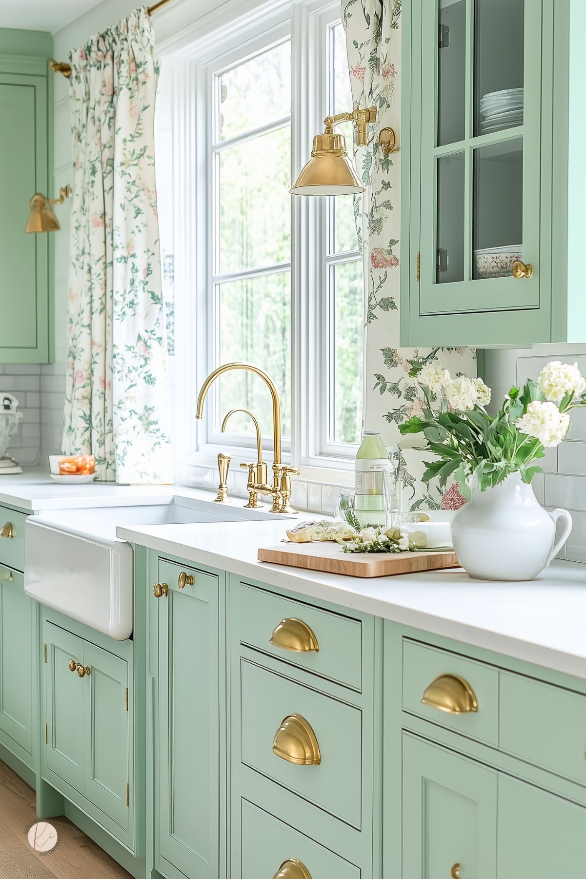
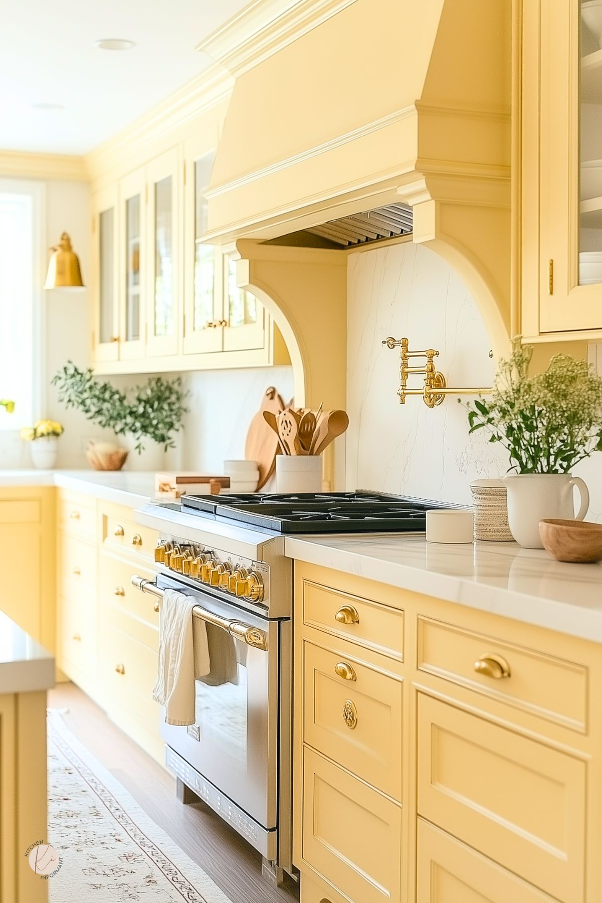
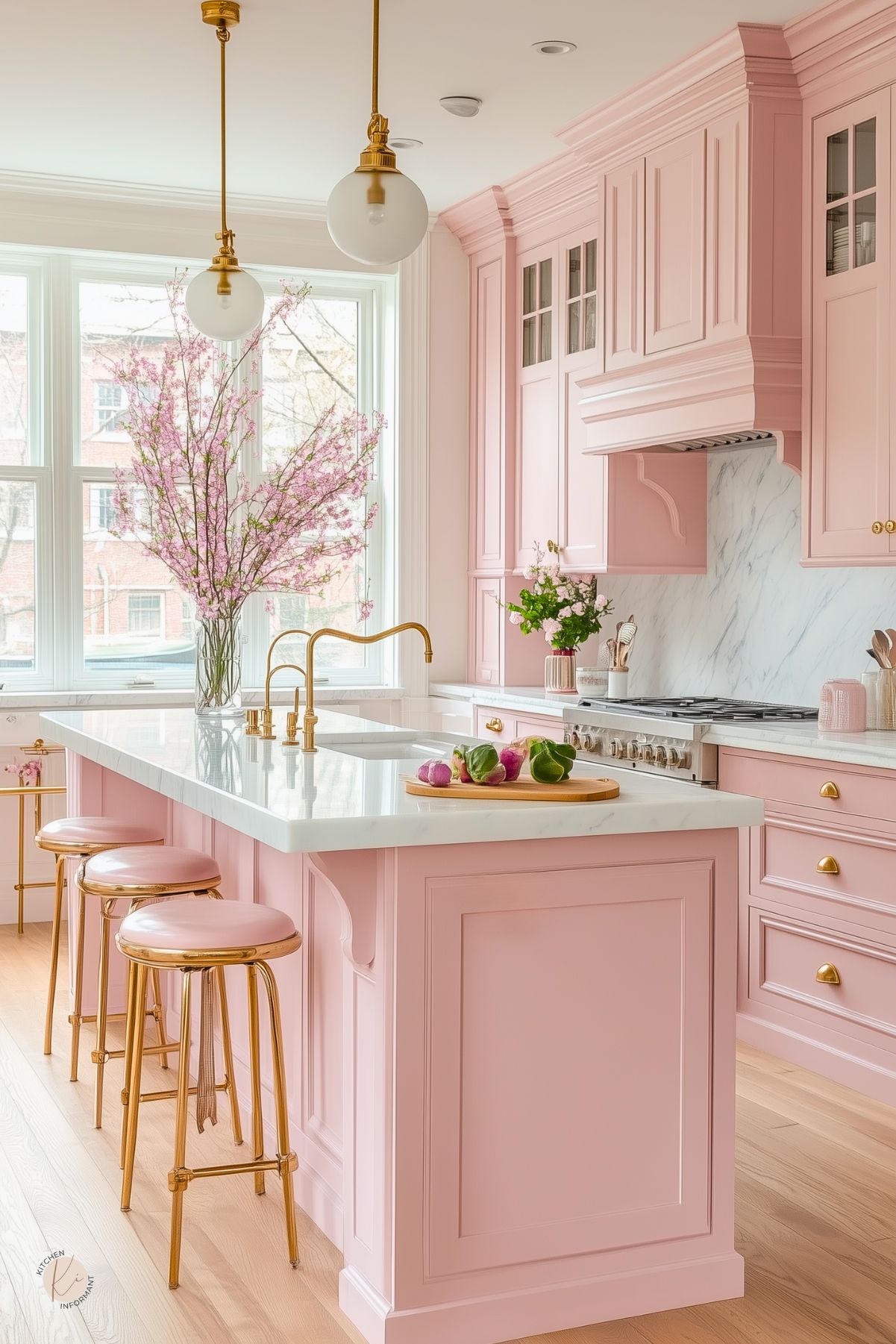
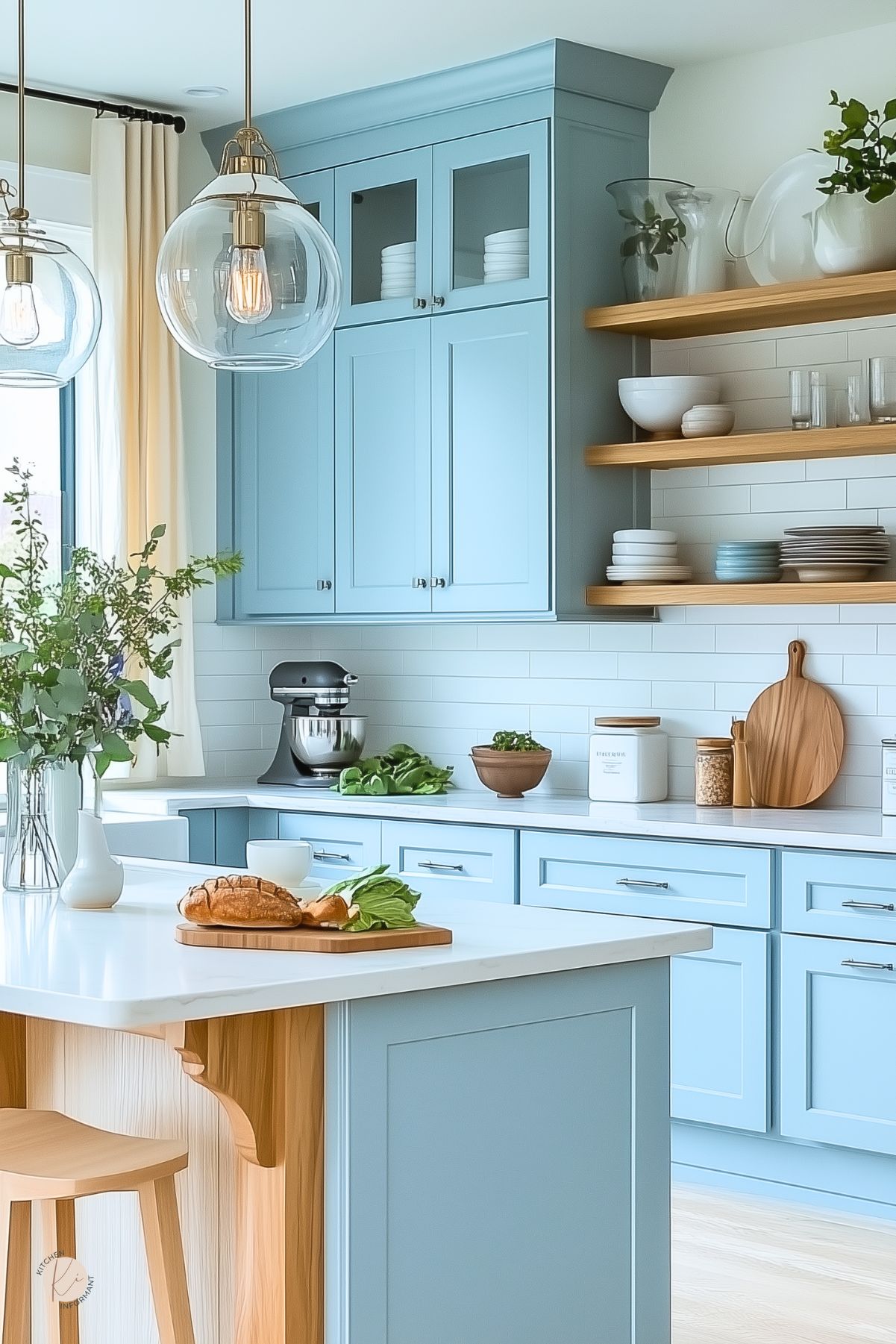
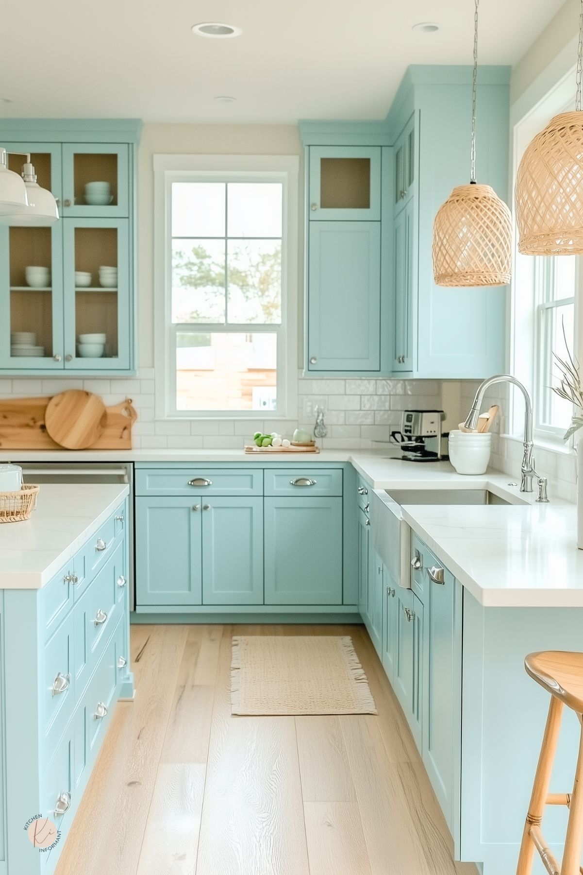
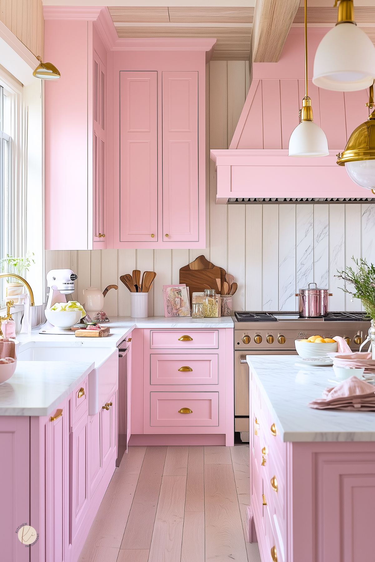
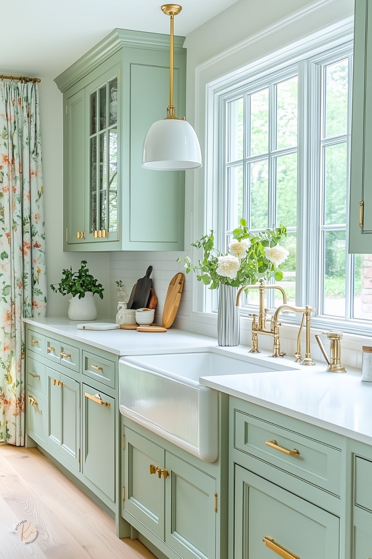
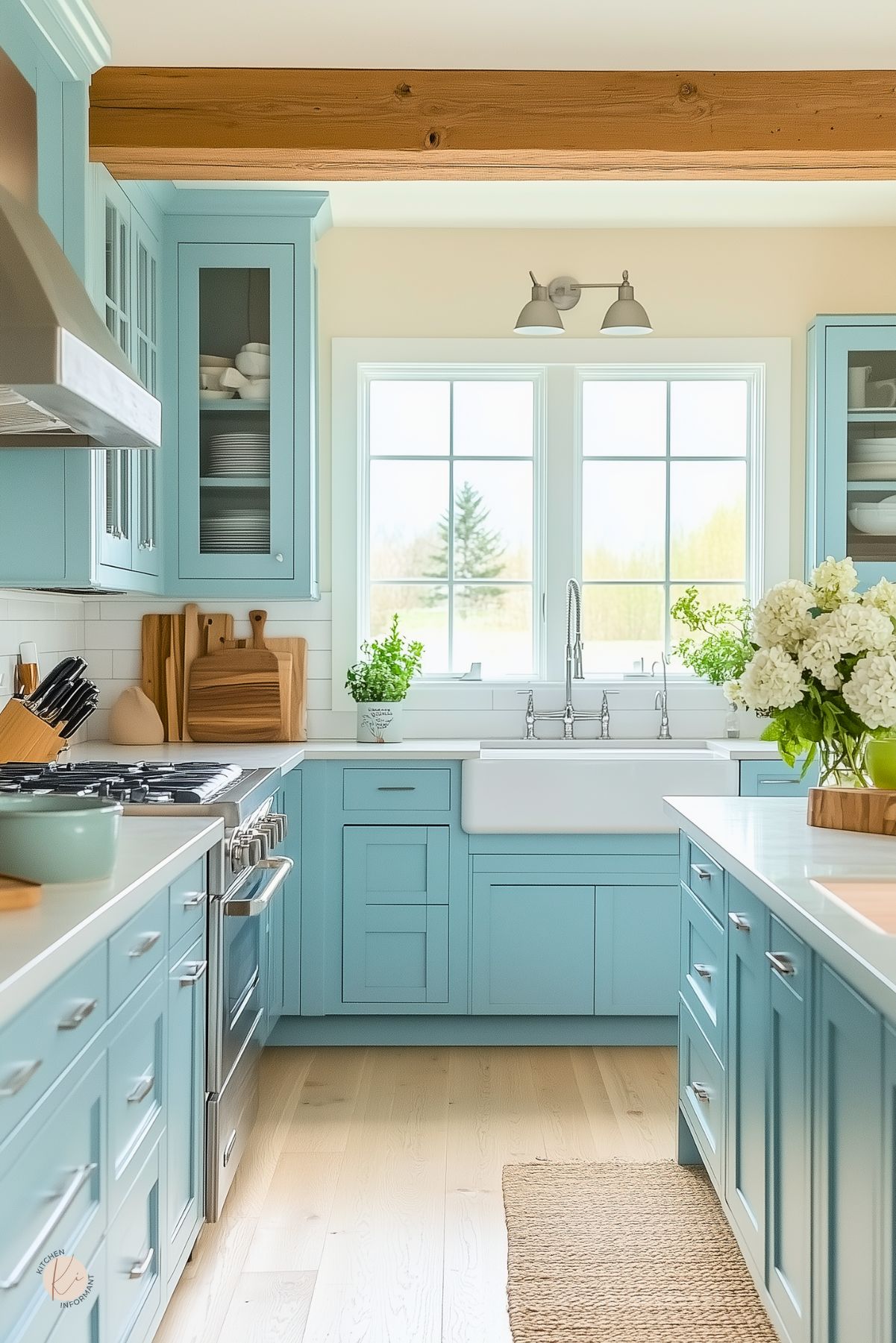
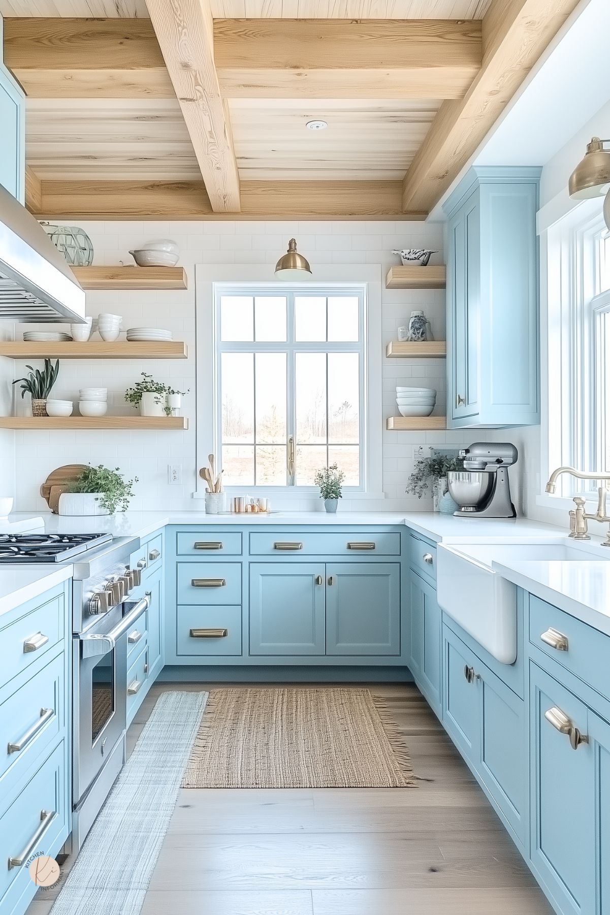
Pastel colors like blush pink, mint green, and light blue are making waves in kitchen design. These colors bring a fresh and airy feel, making spaces feel larger and more open.
Many homeowners choose pastels for cabinets, walls, and accents, creating a soothing atmosphere. Pairing pastels with white or natural wood can enhance their brightness.
A pastel color scheme adds a modern touch, ensuring the kitchen feels both contemporary and warm.
Additionally, trends show that pastel kitchens are versatile, appealing to various design styles from minimalist to farmhouse. This makes it easier for anyone to incorporate soft hues into their home.
Psychology of Pastel Colors
The colors chosen for a space can impact emotions and behavior. Pastels are known to evoke feelings of tranquility and joy.
Blush pink, for example, is often associated with love and warmth, while soft blue can instill a sense of calm.
These hues can foster a pleasant cooking and gathering experience, making the kitchen a central hub for families.
Furthermore, pastels encourage creativity. A kitchen adorned in gentle colors can inspire cooking and socializing.
It allows individuals to feel comfortable and relaxed, enhancing the joy of preparing meals and entertaining guests.
Incorporating pastel colors can turn a kitchen into a cheerful and welcoming environment, making it a great choice for any home.
Design Principles for Soft Pastel Kitchens
Creating a soft pastel kitchen involves careful consideration of color balance, natural light, and contrasting elements.
Each of these design principles plays a crucial role in achieving an inviting, peaceful, and stylish space.
Color Balance and Harmony
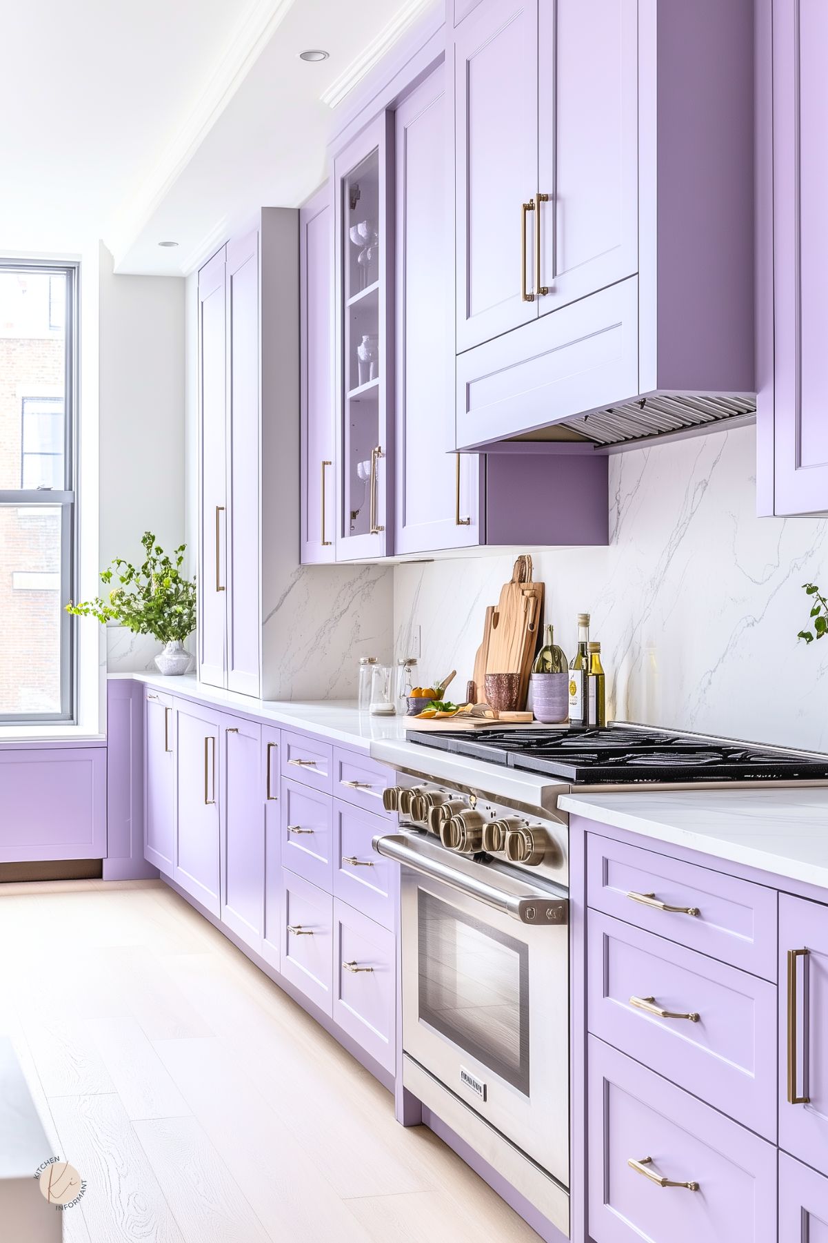
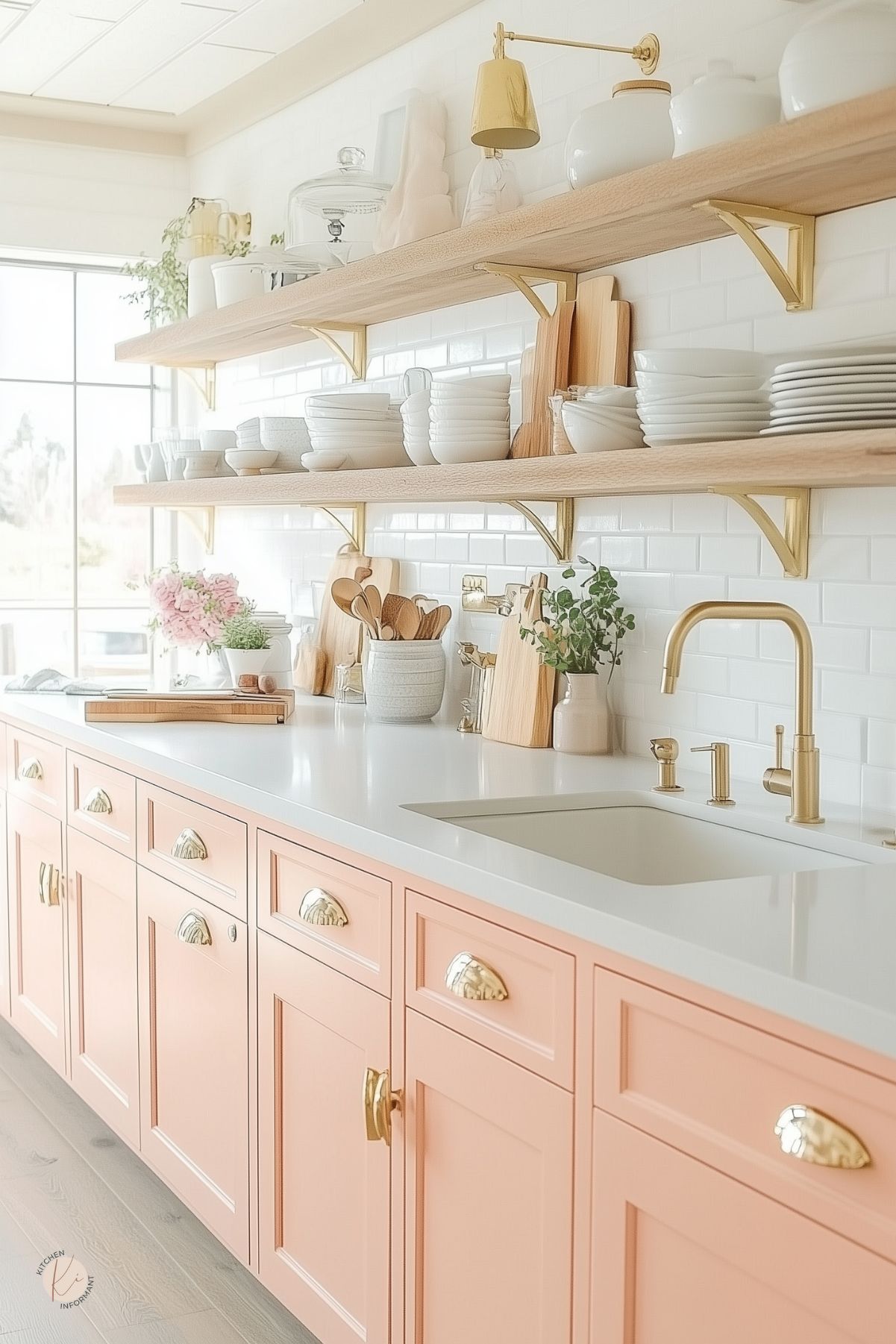
Color balance is vital in pastel kitchens. To achieve harmony, it’s best to select a limited palette of soft hues like blush pink, pale mint green, and light blue.
These colors should complement each other while maintaining a soothing atmosphere.
Designers often recommend choosing one main color to dominate the space, with others serving as accents.
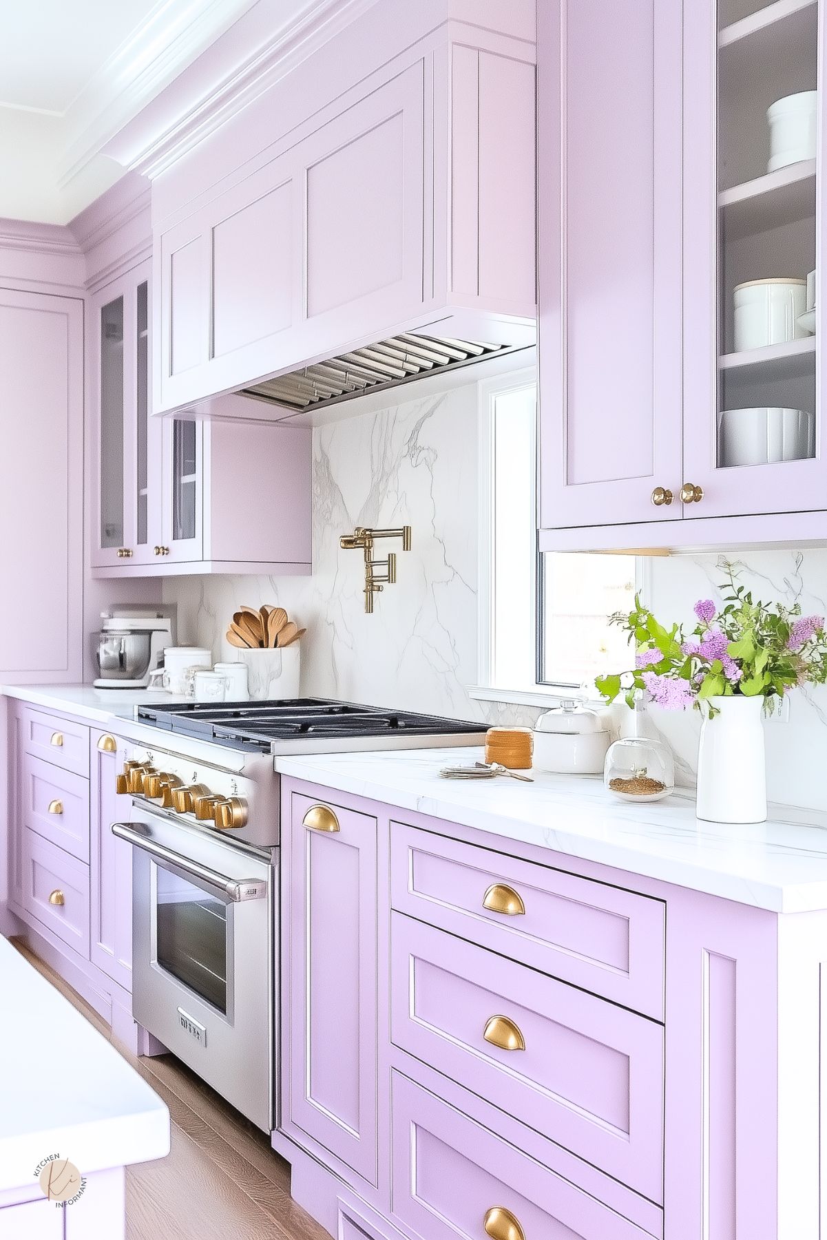
For example, if pale lavender is the primary color, light gray or white can serve as a backdrop.
Using different shades of the same color can also create depth while keeping the look cohesive.
Using Pastels to Enhance Natural Light
Natural light can make pastels shine and appear more vibrant. Large windows and light-colored window treatments allow sunlight to flow into the kitchen.
This light enhances pastel colors, making them feel fresh and airy.
To maximize natural light, opt for lighter shades on walls and cabinets. Soft whites or pale yellows reflect light better than darker colors.
Accessories and decor items can also be in pastel shades that complement the overall design while maintaining an open feel.
Contrast and Accents
Adding contrast makes pastel colors pop. Deep gray or charcoal can be effective as a contrasting shade, creating a striking balance.
For instance, pairing pale blue cabinets with dark countertops draws attention and adds sophistication.
Accent pieces such as bar stools, pendant lights, or dishware in deeper colors can add interest without overpowering the soft pastels.
It’s crucial for these contrasts to blend well with the overall theme, ensuring that they enhance, rather than distract from, the calming effect of the pastels.
Pastel Color Palettes
Pastel colors can transform a kitchen into a serene space. Thoughtful combinations and pairings ensure a cohesive and inviting look.
Let’s explore how to create a harmonious pastel palette, blend pastels with neutrals, and make seasonal adjustments.
Creating a Cohesive Pastel Palette
Choosing the right pastel colors is key to a successful kitchen design. Start by selecting a few main colors that complement each other.
For example, a combination of soft pink, mint green, and sky blue works well together.
Using a color wheel can help visualize these relationships. To maintain balance, use a dominant color for larger surfaces, like walls or cabinets, and accent with the others.
Tips for creating a cohesive palette:
- Limit to three or four primary colors.
- Mix warm and cool tones for depth.
- Consider the effect of natural light on colors.
Pairing Pastels with Neutrals
Pastel colors shine when paired with neutral shades. White, beige, and gray can enhance the light, airy feel of pastels while preventing a space from becoming too colorful.
Using a neutral base for cabinet colors or countertops allows pastel accents to stand out.
For instance, light gray cabinets paired with pastel blue decorations create a fresh and inviting kitchen.
Popular neutral combinations include:
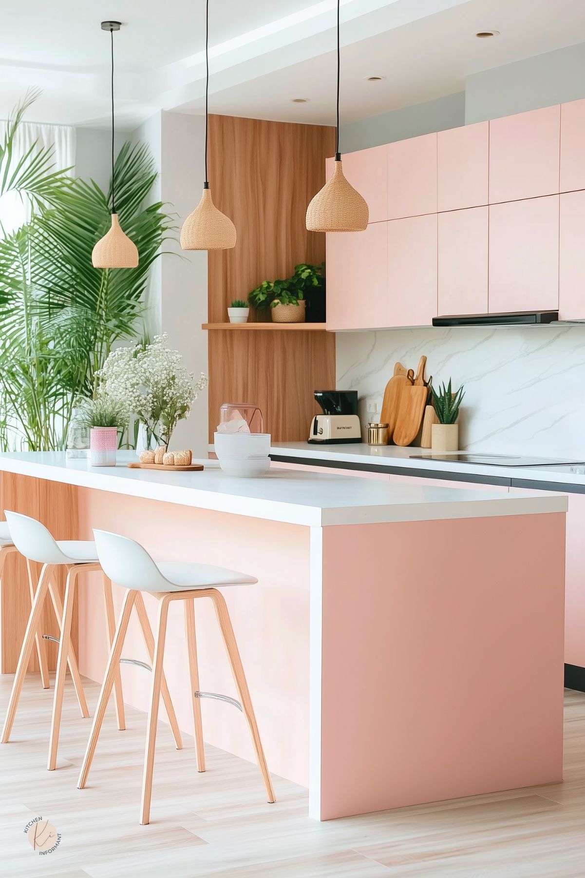
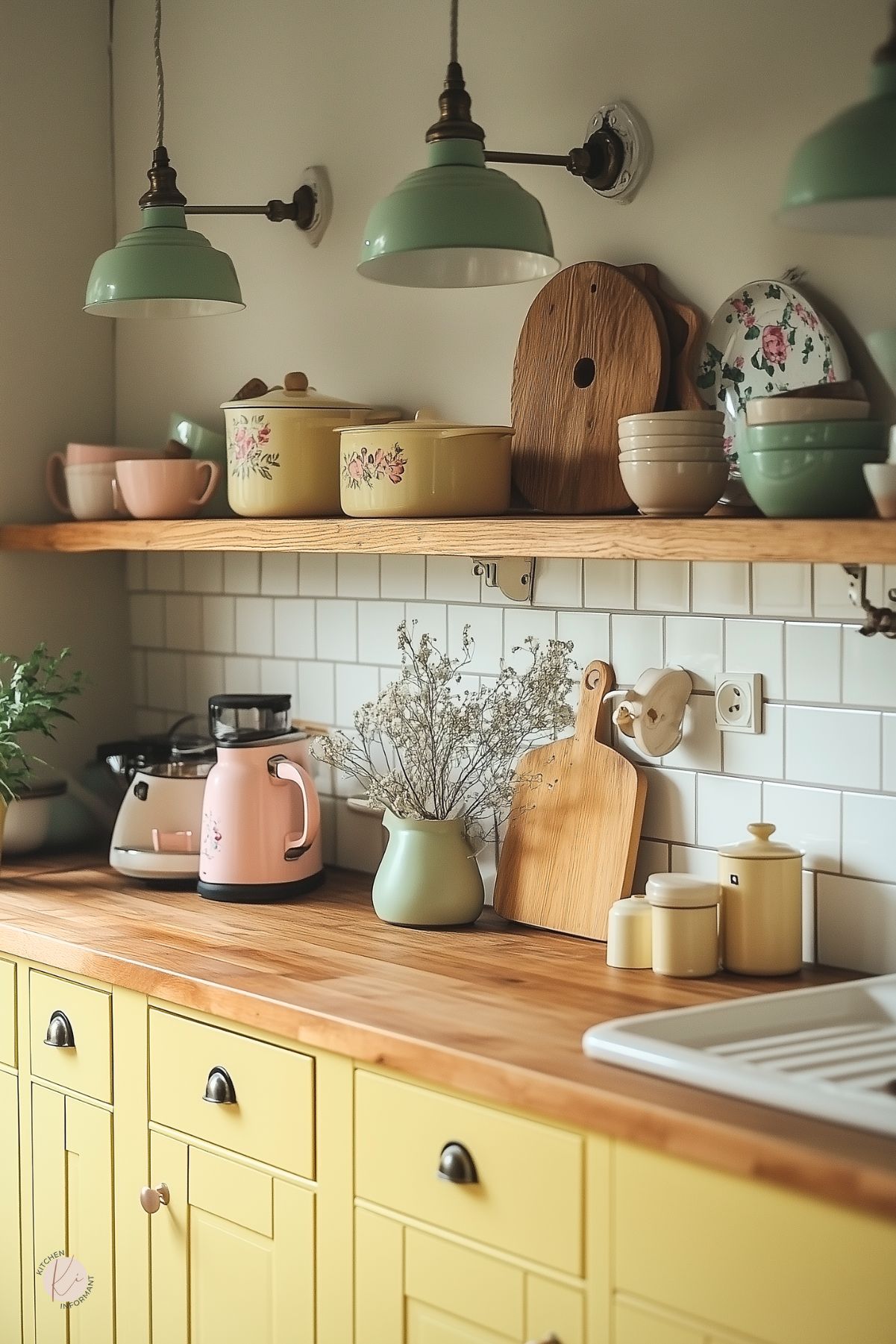
- Soft white with blush pink.
- Warm beige with mint green.
- Light gray with pastel yellow.
This balance between vivid pastels and soft neutrals creates an elegant look that feels modern yet calming.
Seasonal Pastel Variations
Changing pastel shades with seasons can refresh a kitchen. In spring, lighter tones like soft lilac and pale yellow can bring a cheerful vibe.
During summer, consider mint green and light lavender for a cool atmosphere.
For autumn, warm pastels such as peach and soft coral add warmth without feeling overwhelming. Winter can embrace icy pastels like pale blue and soft silver for a crisp feel.
Seasonal pastel ideas:
- Spring: Light pinks and greens.
- Summer: Cool blues and lavenders.
- Autumn: Warm peaches and corals.
- Winter: Icy blues and silvers.
These variations allow for easy updates that keep the kitchen feeling fresh and inviting throughout the year.
Materials and Textures
Choosing the right materials and textures can make a pastel kitchen design shine. Each element plays a role in creating a light and elegant atmosphere.
From countertops to textiles, the right combinations enhance the overall look and feel.
Countertops and Cabinetry
Countertops in soft pastels can transform a kitchen. Marble in light hues adds a luxurious touch. Options like pale pink or mint green countertops are popular choices. They offer both beauty and practicality.
Cabinetry should complement these surfaces.
White cabinetry paired with pastel colors creates a fresh contrast.
This combination prevents the space from feeling too sweet. It also enhances the modern feel.
Materials like wood can also be painted in pastel tones. Soft blue or pale yellow cabinets provide a cheerful vibe. Durable finishes ensure that these surfaces stand up to daily use.
Backsplash and Flooring Choices
A stylish backsplash can add depth to a pastel kitchen. Subway tiles in pastel shades offer a classic yet playful look.
For example, a light lavender tile creates a calming effect.
Glass tiles can also be a stunning choice. They reflect light and add a touch of elegance.
Choose colors that blend well with the countertops and cabinetry.
For flooring, consider light-colored woods or tiles.
Pale oak or whitewashed options can match pastel themes beautifully. These choices keep the room feeling airy and spacious.
Patterns, like subtle herringbone, can add interest without overwhelming the space.
Textiles and Accessory Layers
Textiles play an essential role in a pastel kitchen.
Curtains in soft cotton or flowing linen can soften hard surfaces. Light patterns or solid pastel colors work well, maintaining the kitchen’s freshness.
Rugs can also encourage comfort. A light-colored area rug can add warmth underfoot.
Accessories like dishes and decorative items can incorporate pastel colors too.
Think about soft pink bowls or light blue vases. These accents contribute to a cohesive look while adding personality.
Lastly, consider using aprons or tea towels that feature pastel designs. They are practical and enhance the kitchen’s color palette.
Appliances and Fixtures
Incorporating pastel colors into appliances and fixtures can enhance the light and fresh feel of a kitchen.
This section highlights how to select the right pastel-colored appliances and the benefits of adding metallic finishes.
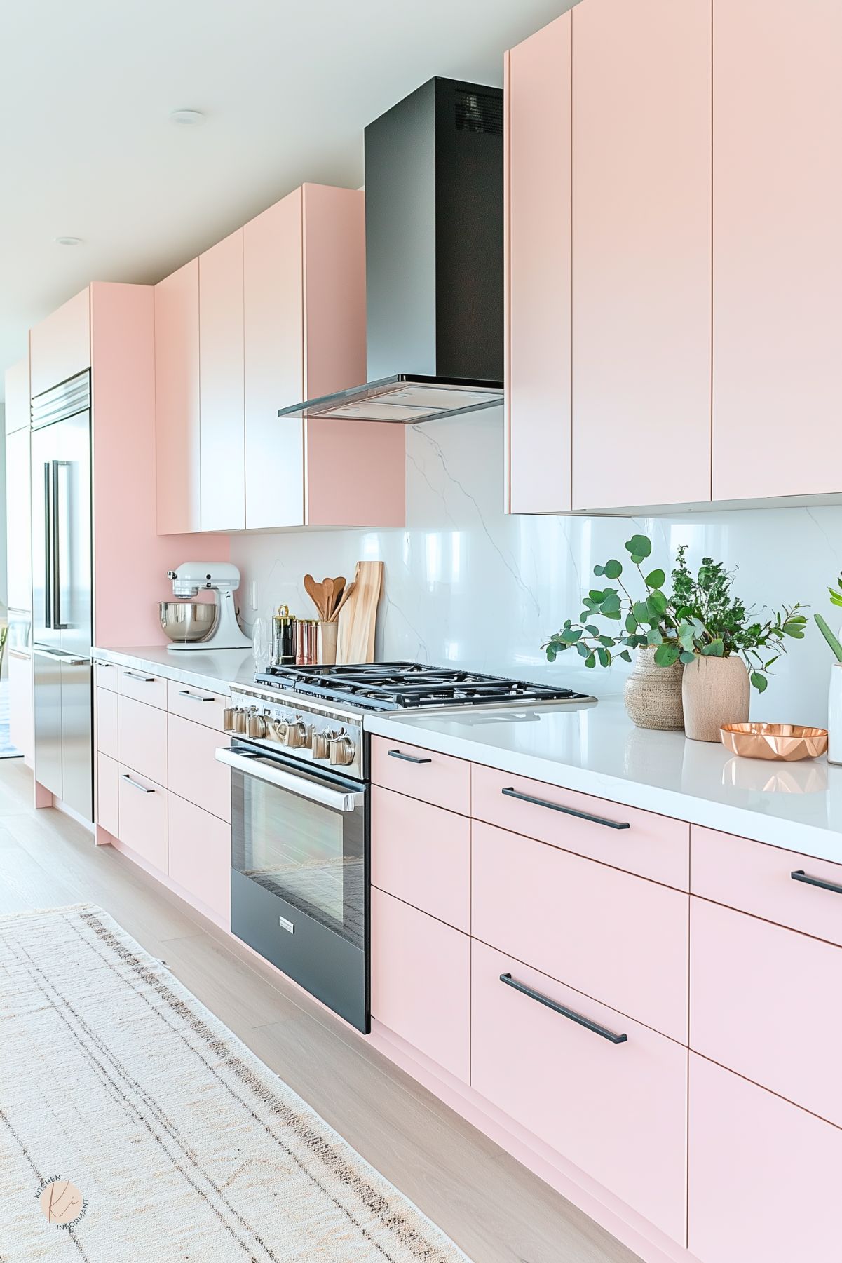
Selecting Pastel-Colored Appliances
When choosing appliances, pastel colors like soft pinks, mint greens, and pale blues can blend beautifully into a kitchen design. These gentle hues not only add charm, but also align with a modern aesthetic.
Tips for Choosing:
- Refrigerators: Look for models that come in pastel shades. These stand out and can serve as a focal point.
- Ovens and Cooktops: Some brands offer pastel-colored options that complement cabinetry, enhancing the kitchen’s overall theme.
- Small Appliances: Consider adding pastel to toasters, mixers, and kettles. These small touches can brighten up countertops.
Pastel appliances work well with neutral walls and decorations. They create an inviting atmosphere and reflect a personalized style.
Metallic Finishes with Pastels
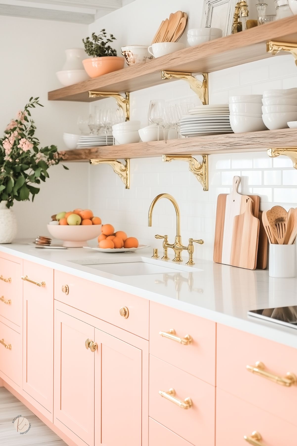
Metallic finishes can add a sleek contrast to pastel appliances, elevating the design. Mixing finishes like brass, copper, or stainless steel with pastel colors can create a sophisticated look.
Benefits of Adding Metallics:
- Visual Contrast: Metallics provide a striking contrast to soft hues, enhancing the elegance of the space.
- Functional Elements: Faucets and light fixtures in metallic finishes can draw the eye and serve as stylish accents.
- Timeless Appeal: Metallic finishes are durable and can easily adapt to changing design trends.
Incorporating these elements carefully can accentuate the cheerful vibe of a pastel kitchen. They create interest while maintaining a fresh, modern feel.
Decorating with Pastel Accessories
Pastel accessories can add charm and a fresh vibe to any kitchen. They bring subtle color without overwhelming the space.
Choosing the right pieces can enhance the overall warmth and comfort of the kitchen.
Artwork and Decor Pieces
Incorporating artwork with pastel colors is a great way to brighten up the kitchen. Framed prints or canvas paintings in soft hues like blush pink or pale mint green can create a calming atmosphere.
Decor pieces, such as vases and bowls, also work well. Select items that feature pastel shades, like light blue or soft yellow, to complement the kitchen’s design. These pieces can be placed on countertops or shelves for visual interest.
Tip: Mixing pastel accessories with white or neutral backgrounds makes the colors pop even more. This contrast enhances the elegance of the decor and keeps the kitchen feeling fresh and inviting.
Pastel Kitchens in Different Styles
Pastel colors can enhance various kitchen styles, creating unique atmospheres that appeal to many tastes.
From modern designs to rustic charm and vintage flair, soft pastel hues can bring warmth and style to any kitchen.
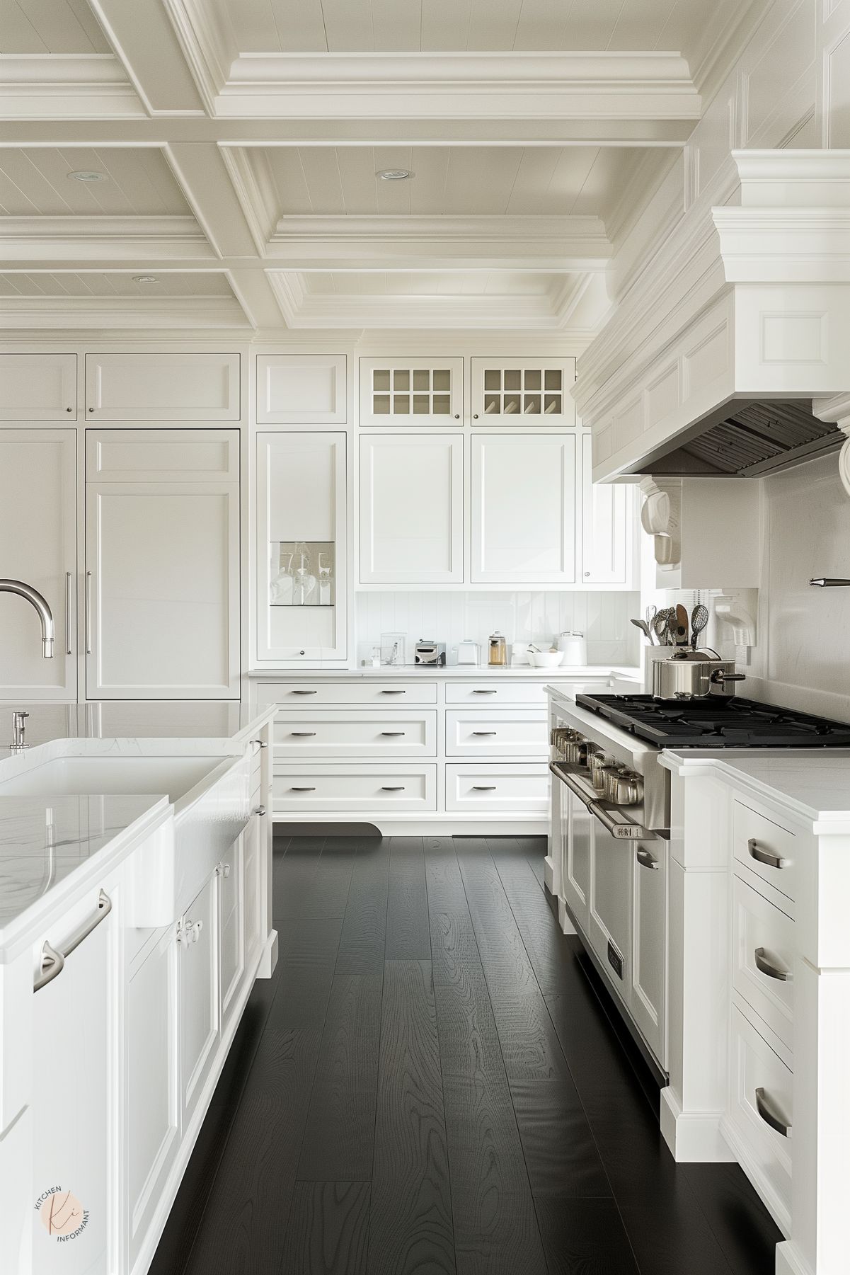
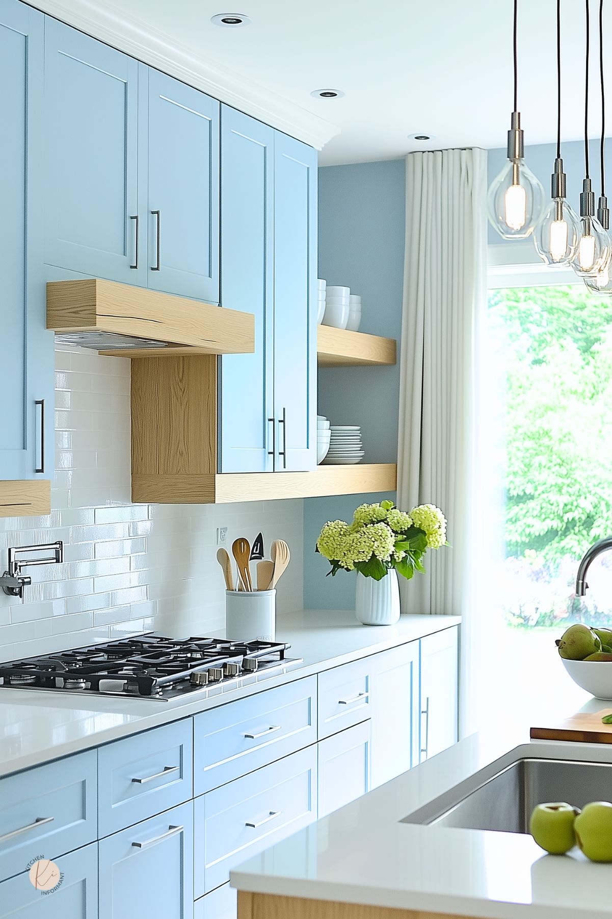
Modern and Minimalist Pastel Kitchens
In modern and minimalist kitchens, pastel colors work wonders by creating a clean and fresh look. Soft shades like pale mint or blush pink can be used on cabinets and walls, adding a subtle touch without overwhelming the space.
White countertops and stainless steel appliances often complement these colors, maintaining a sleek appearance. Open shelving displaying pastel dishware adds functionality and maintains minimalism.
This combination allows for easy cleaning and brightens the area, making it feel more spacious. With a focus on simplicity, pastel accents can create a welcoming and stylish environment.
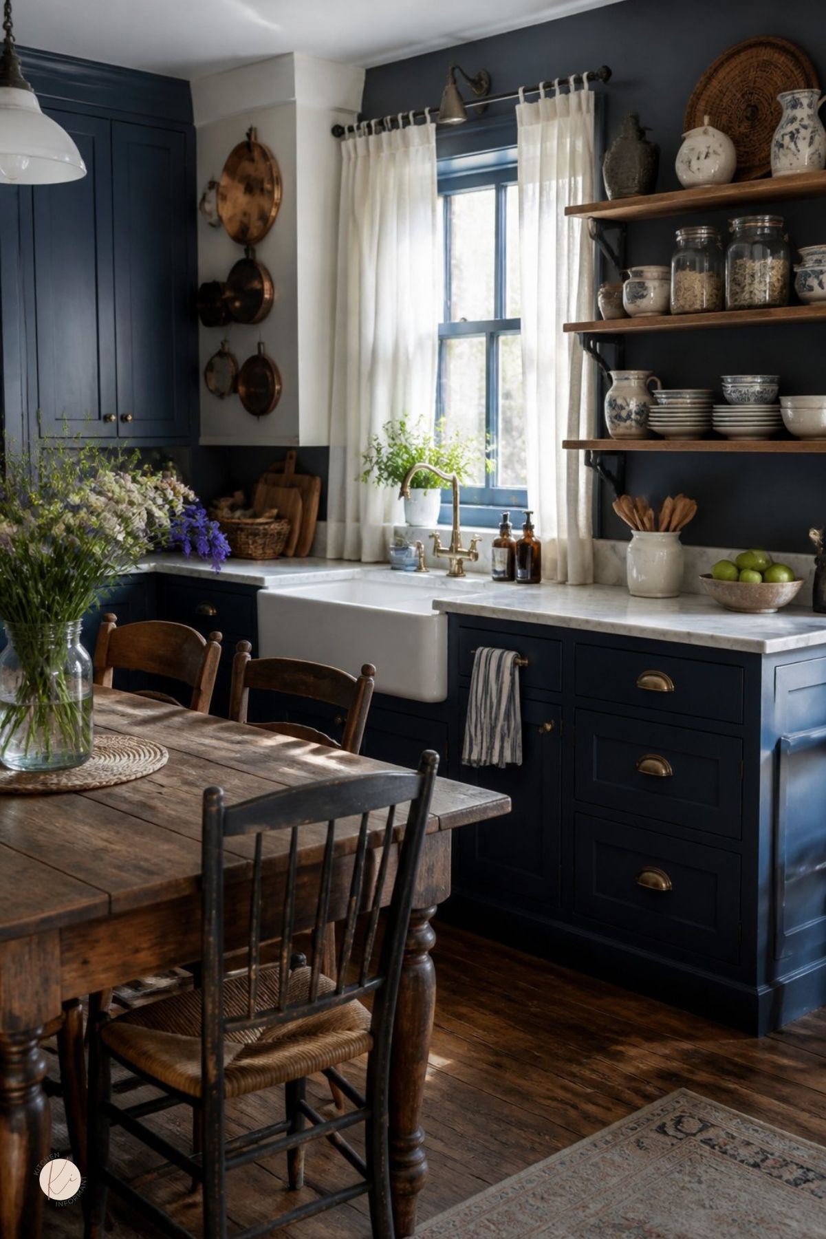
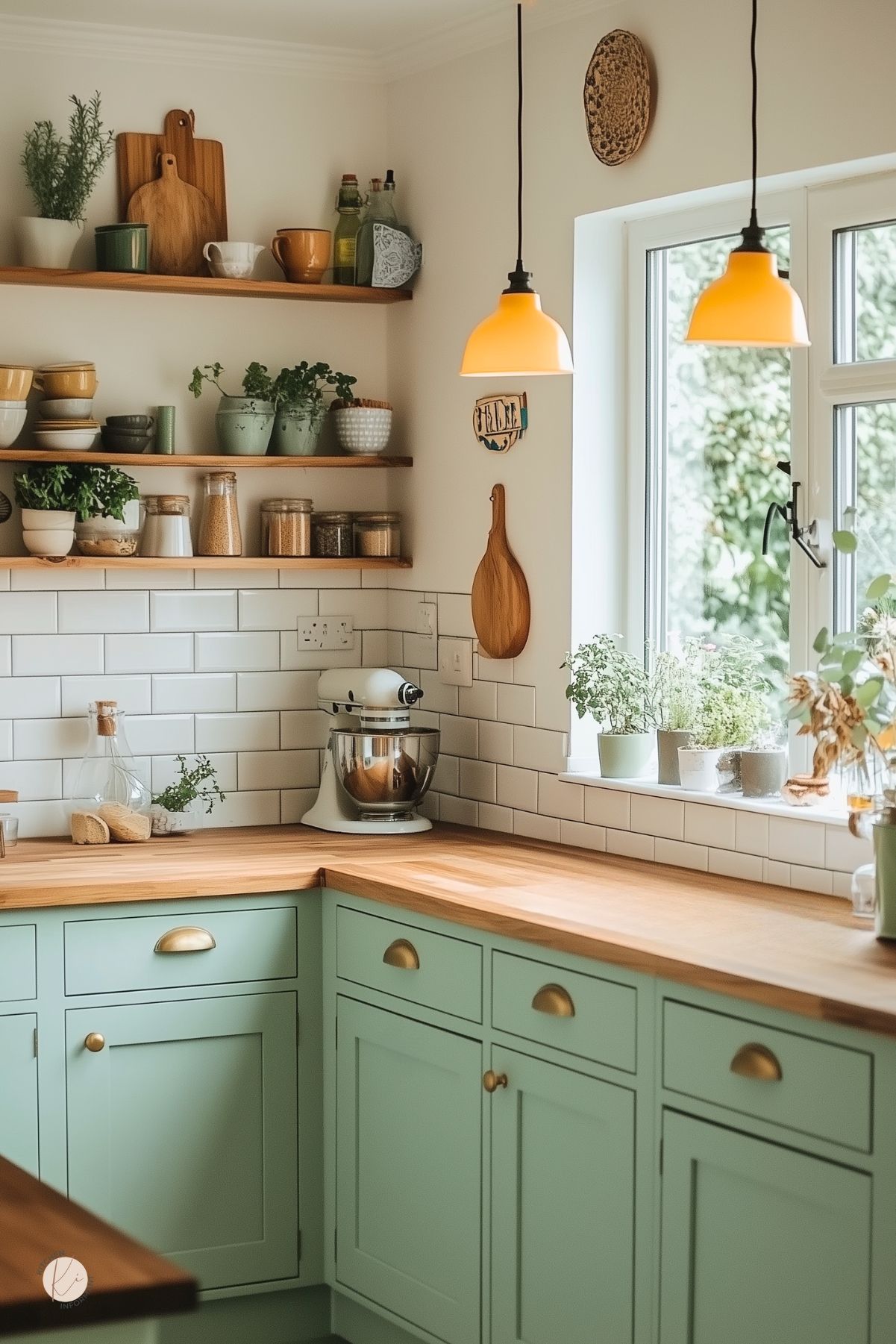
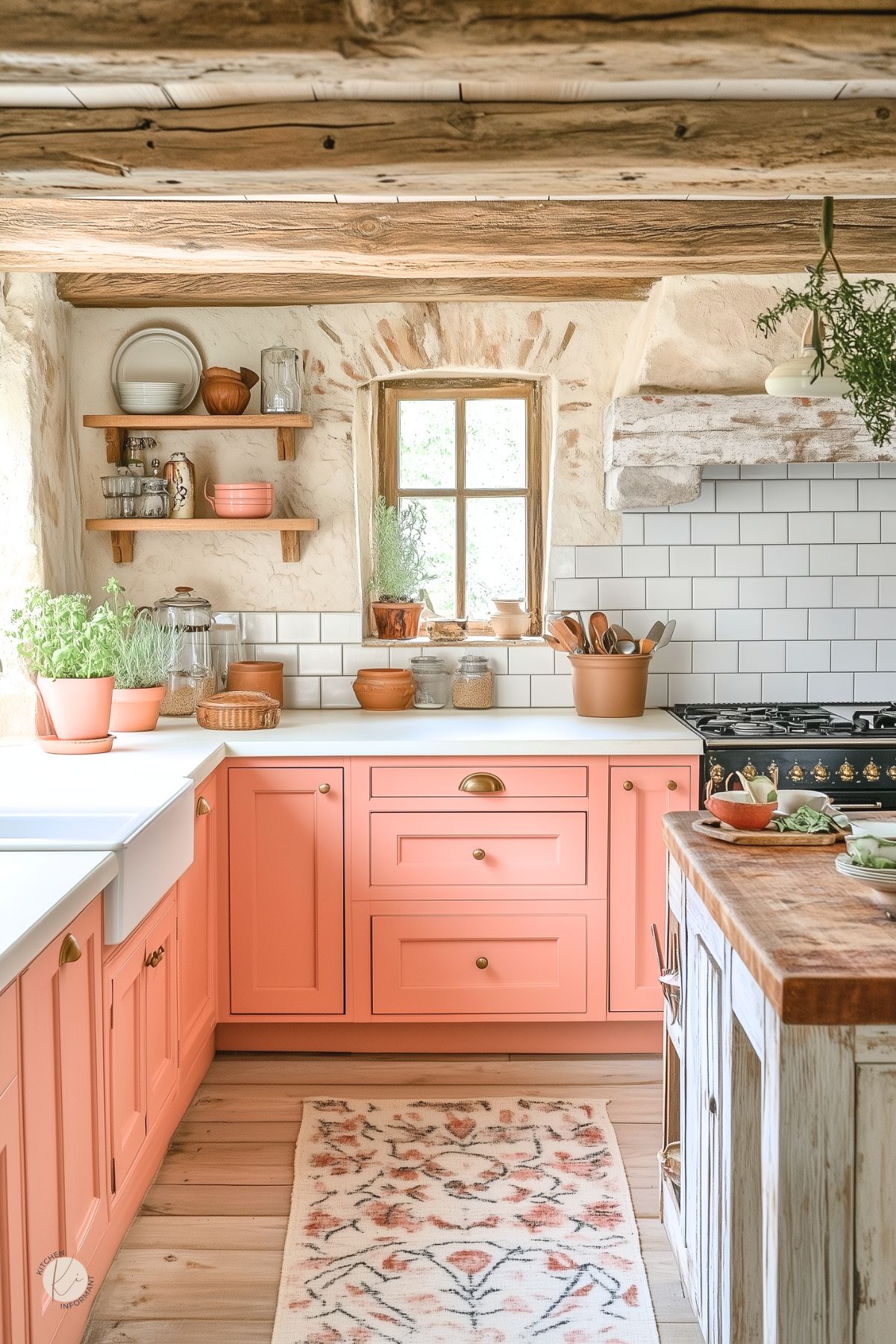
Rustic Charm with Pastels
Rustic kitchens embrace a cozy atmosphere, and pastels introduce a soft touch. For wooden cabinets, colors like creamy yellow or sky blue enhance natural textures while keeping the space feeling light.
Adding vintage-inspired decor, such as farmhouse pottery or soft linens, pairs well with pastel shades. They bring warmth to traditional wooden elements, creating a charming contrast.
Using pastels in this style helps balance the sturdiness of rustic materials. Soft colors can make the kitchen feel inviting, perfect for family gatherings or cozy dinners.
Vintage Flair Using Pastels
Vintage kitchens often feature bold patterns and nostalgic elements. Pastel hues can enhance this look beautifully. Colors like pale lavender or soft seafoam green can be used for cabinets or tile backsplashes.
To create a vintage feel, incorporating retro appliances in matching pastel colors adds authenticity. Decorative details like scalloped edges or floral patterns further elevate the charm.
This combination of pastels and vintage touches brings a delightful throwback feel. It creates a homey environment that is both stylish and functional.
You May Also Like: