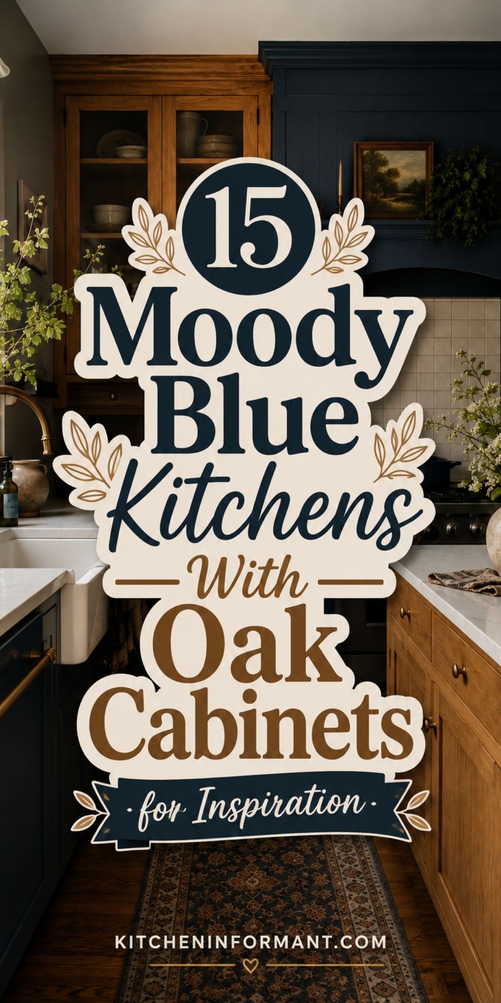
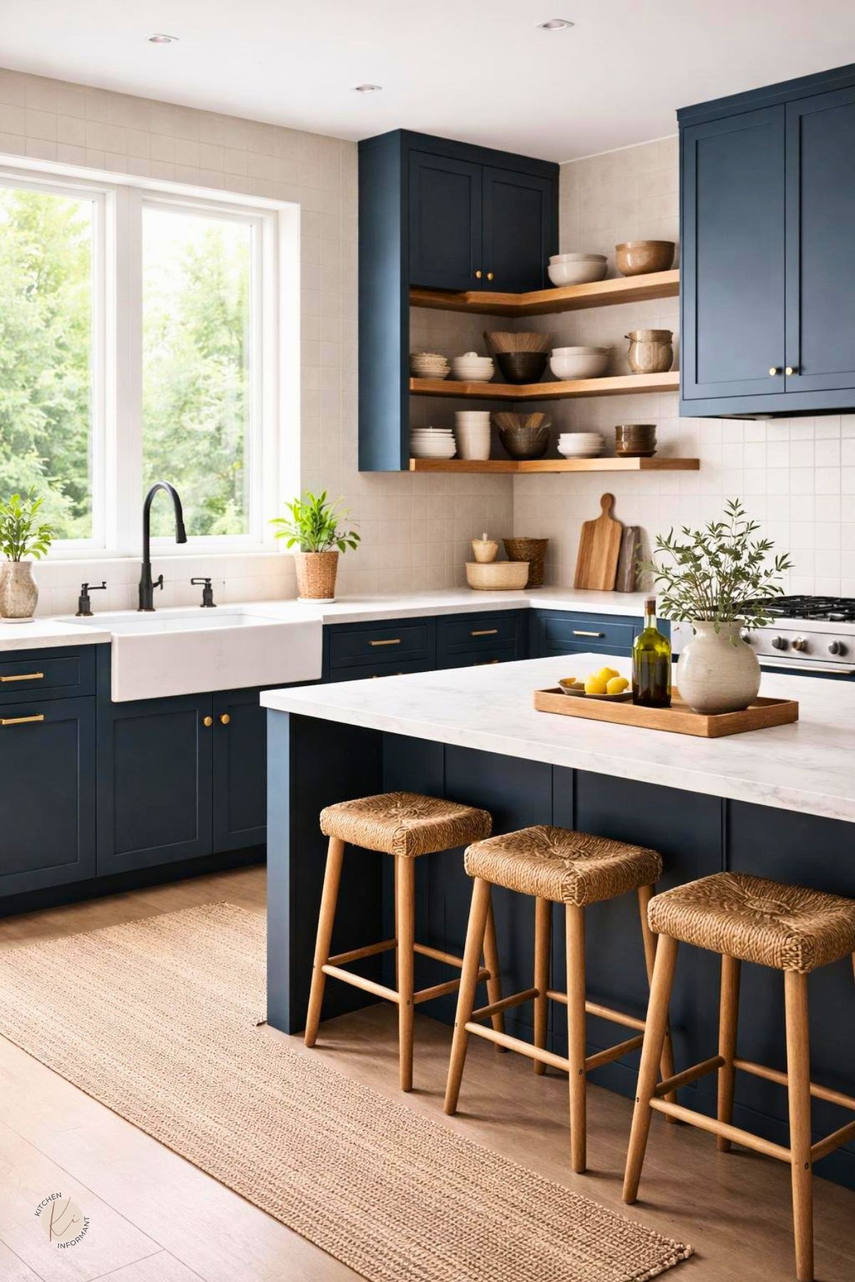
Moody blue kitchens with oak cabinets work best when the blue is treated as a design tool, not just a color choice.
The goal is to make older oak feel intentional by balancing its warmth with deeper blue tones, clear contrast, and finishes that match the room’s light and condition.
When the cabinet boxes are sound and the oak has good grain, this style can update a kitchen without a full replacement.
The result can feel calmer, richer, and more current, especially when the room uses the right countertop, backsplash, hardware, and lighting choices.
What Defines the Look

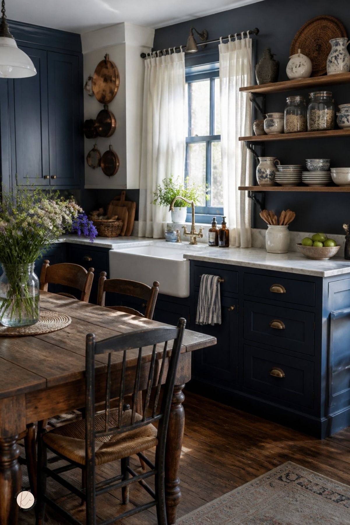
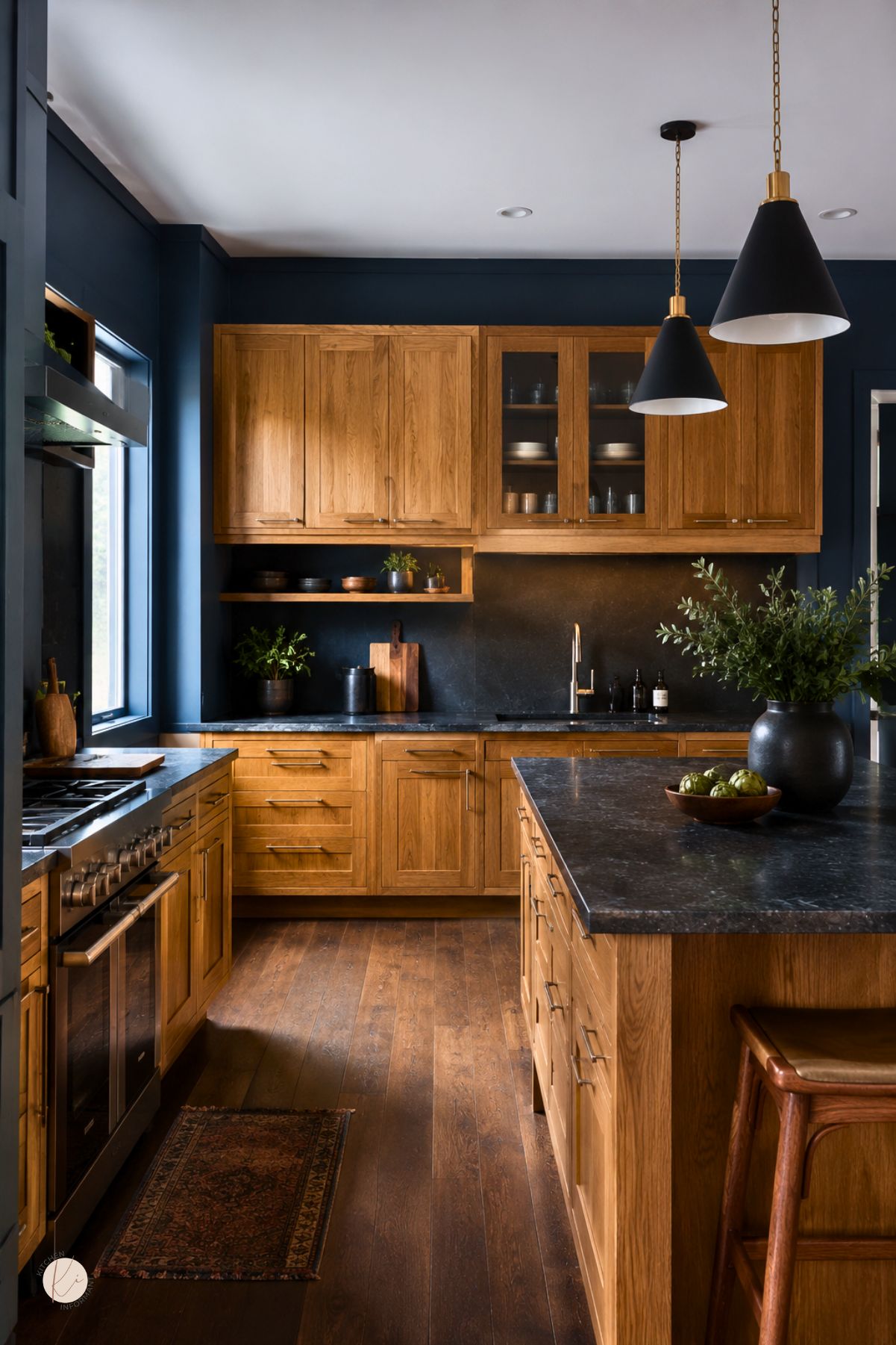
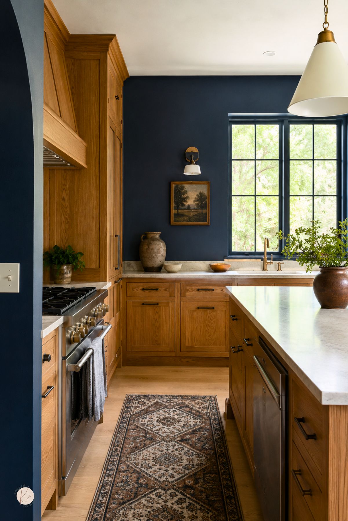
Moody blue kitchens use depth, not brightness, to create interest.
With oak cabinets, the look depends on how the blue handles the wood’s warmth and how much contrast the room can support.
Core Color Characteristics
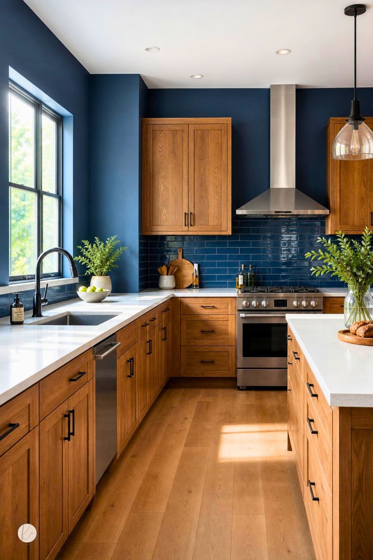
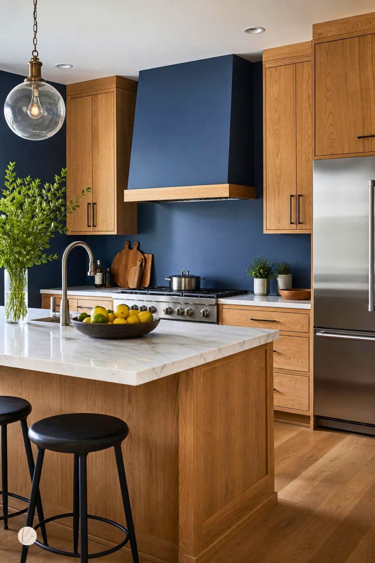
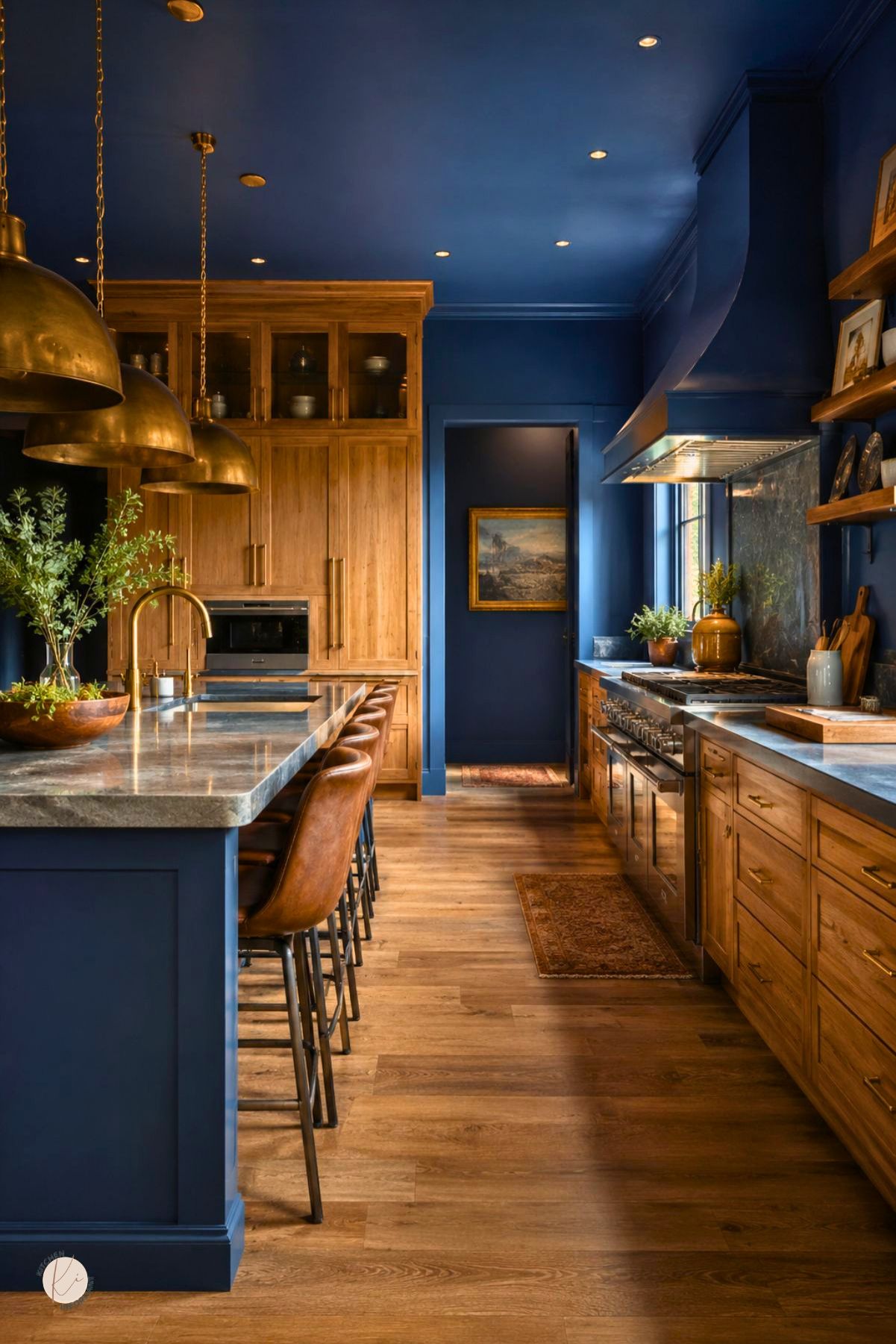
The best shades are usually navy, indigo, slate blue, or blue with gray undertones.
These colors feel grounded and mature, which helps them sit well next to golden or honey oak.
A cleaner, brighter blue can look too sharp against oak.
A deeper tone gives the room more balance and makes the wood read as a design feature instead of a leftover finish.
Why Oak Changes the Outcome
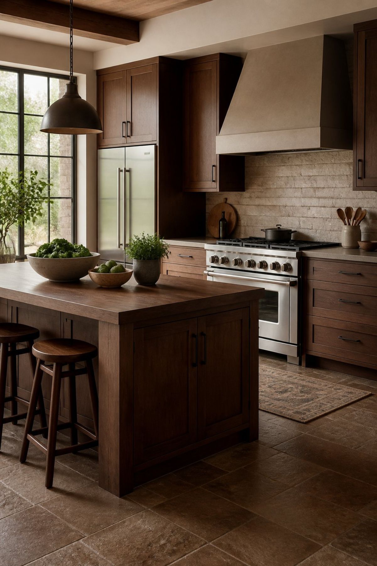
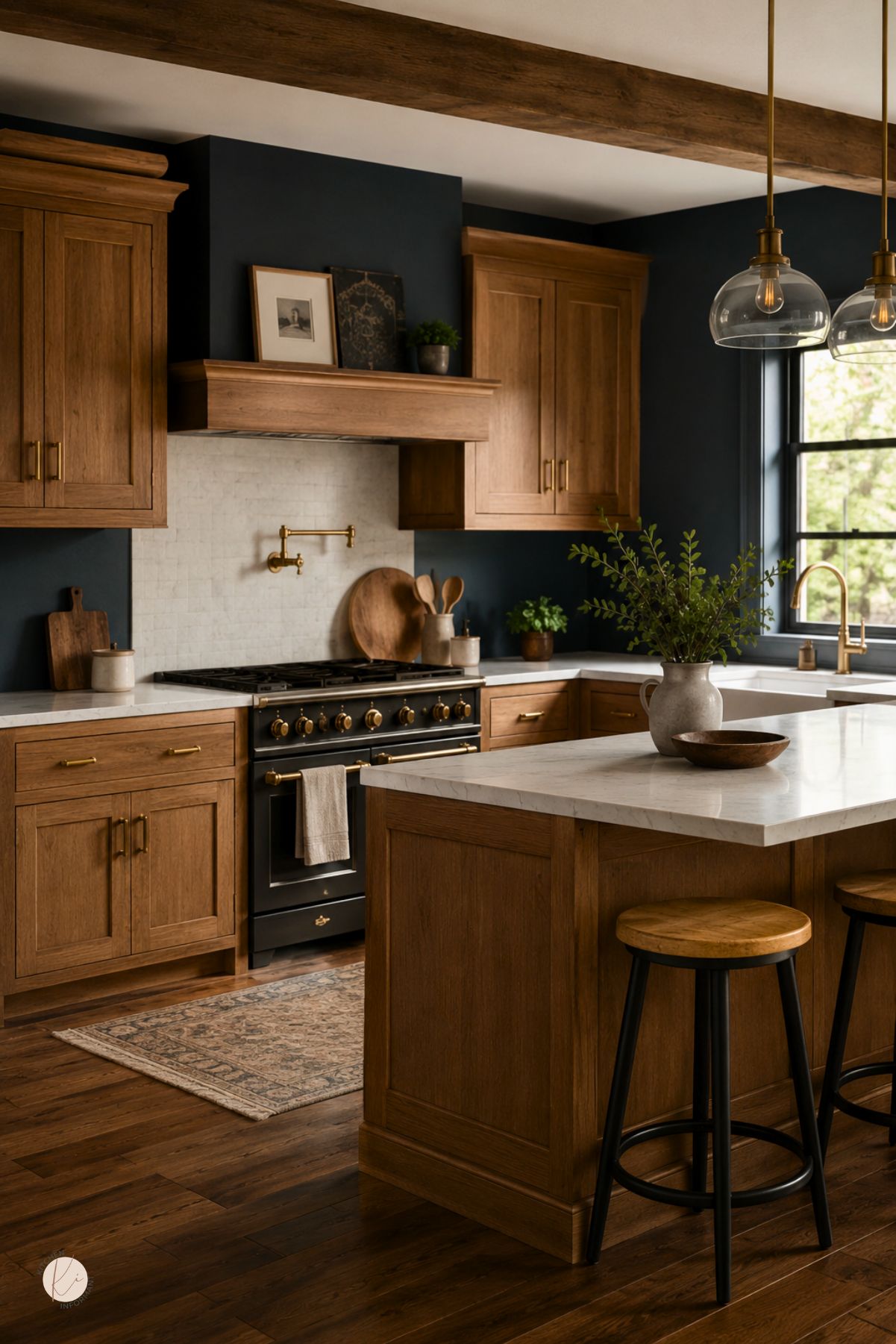
Oak has visible grain and warm undertones, so it affects how blue appears in the room.
A cool blue can look harsher beside strong yellow-orange wood, while a softened blue usually feels more natural.
The finish on the oak matters too.
Shiny amber oak reflects more warmth, while matte or lightly stained oak is easier to pair with deep blue walls, islands, or accents.
When the Style Works Best
This style works well when the kitchen has enough light to keep the room from feeling flat.
It also performs well in homes where the cabinets are solid and worth keeping, since oak can provide texture that painted surfaces sometimes lack.
It tends to suit kitchens that need more depth, more structure, or a less generic look.
In homes with older millwork, the blue can make the space feel deliberate rather than dated.
Assessing Existing Oak Cabinetry
Before choosing paint or new materials, the cabinet structure should be checked first.
A good finish cannot fix warped doors, weak boxes, or damage that affects function.
Cabinet Condition and Build Quality
Solid cabinet boxes, tight joints, and doors that close properly are good signs.
If hinges fail, drawers stick, or panels are swollen from moisture, the project may need more than a color update.
Surface wear is less important than structure.
Scratches, faded finish, or dated hardware can often be improved, while damage near sinks or dishwashers needs closer attention.
Reading Oak Undertones
Oak is not one color.
Some cabinets lean yellow, some lean orange, and some carry a slightly red cast, and each one changes how moody blue will look nearby.
Warm oak usually pairs best with blue-gray or navy shades.
Strong yellow oak may need a more muted blue and more controlled accents so the room does not feel busy.
Deciding What Is Worth Keeping
Keeping the cabinets makes sense when the boxes are sound and the door style still fits the home.
Many oak kitchens can be improved with paint, stain, new hardware, or better surrounding finishes.
Replacement makes more sense when the layout is poor, the cabinet style is failing, or the wood is too damaged to refinish cleanly.
The right call depends on both condition and design value, not age alone.
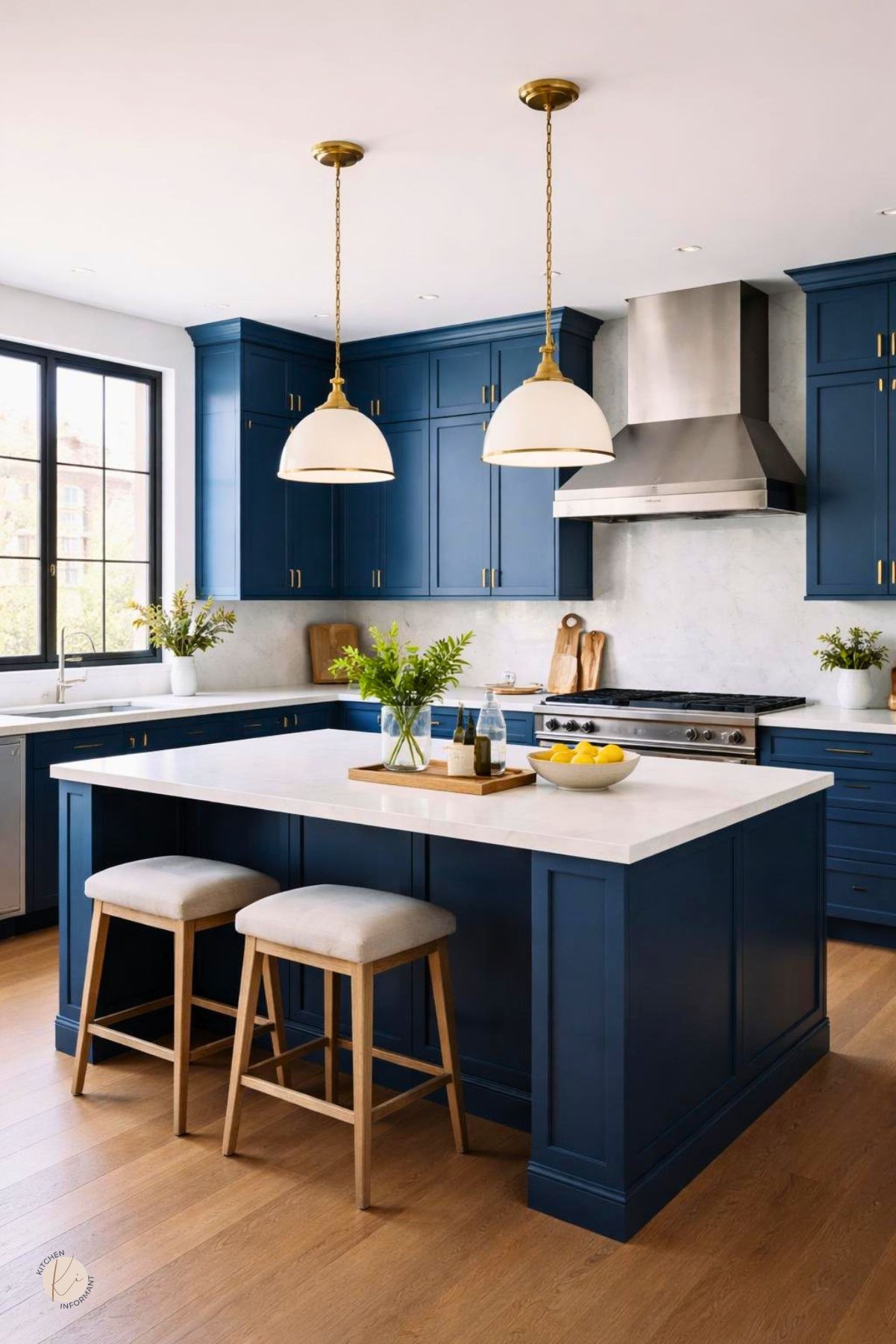
Balancing Blue With Yellow and Wood Warmth
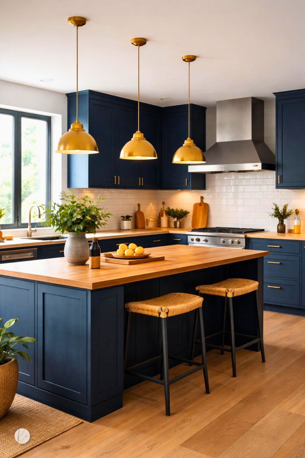
Blue and yellow can work together, especially when yellow is used in small, measured amounts.
The key is to let oak provide the natural warmth while blue supplies depth and structure.
Using Yellow as a Controlled Accent
Yellow works best in limited spots, such as a runner, art, pendant shades, dishware, or a small tile detail.
Soft mustard, ochre, or muted gold usually feels more stable than bright primary yellow.
These accents can echo the warmth in oak without making the room feel overly busy.
A little yellow helps the space feel lived in and keeps the blue from becoming cold.
Avoiding Muddy Color Pairings
Problems often start when too many warm tones compete at once.
Golden oak, bright yellow, orange-beige walls, and warm beige counters can make moody blue look dull instead of rich.
A cleaner palette works better.
Blue needs some room around it, so nearby finishes should either support the warmth of the wood or calm it with neutral contrast.
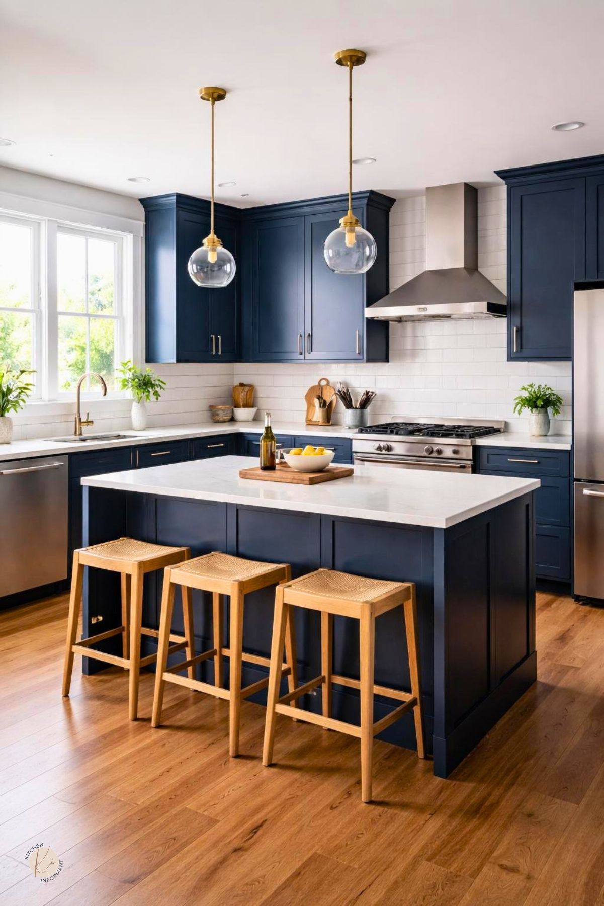
Creating Contrast Without Harshness
The goal is contrast that feels soft, not severe.
White, cream, taupe, black, and brushed metals can separate the blue from the oak without making the kitchen feel split in two.
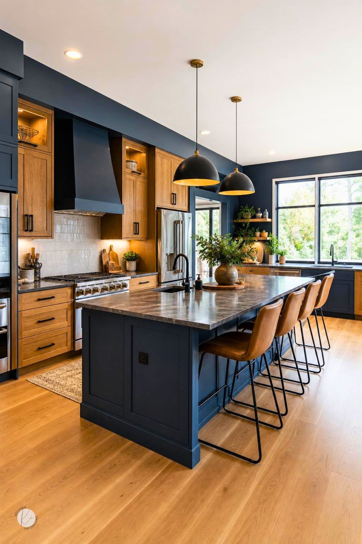
If the oak stays visible, the blue should usually appear on walls, a lower cabinet run, an island, or selected built-ins.
That approach keeps the room balanced and helps the wood and color read as part of one plan.
Light, Exposure, and Room Size
Lighting changes moody blue more than almost any other factor.
Room direction, window size, and fixture quality all affect whether the color feels rich or heavy.
North- Versus South-Facing Spaces
North-facing kitchens often receive cooler light, which can make blue look darker and oak look flatter.
In those rooms, the blue may need more warmth in the undertone, or the room may need lighter counters and walls.
South-facing spaces usually handle moody blue more easily because the warmer daylight brings out depth.
East and west exposures change through the day, so it helps to test samples at different times.
Natural and Artificial Lighting Effects
Daylight reveals undertones, while artificial light can shift them.
Warm bulbs can soften oak and make blue feel more inviting, while cooler bulbs may push the room toward a sharper look.
Layered lighting matters.
Under-cabinet lights, ceiling fixtures, and task lighting help blue cabinetry feel intentional instead of dim.
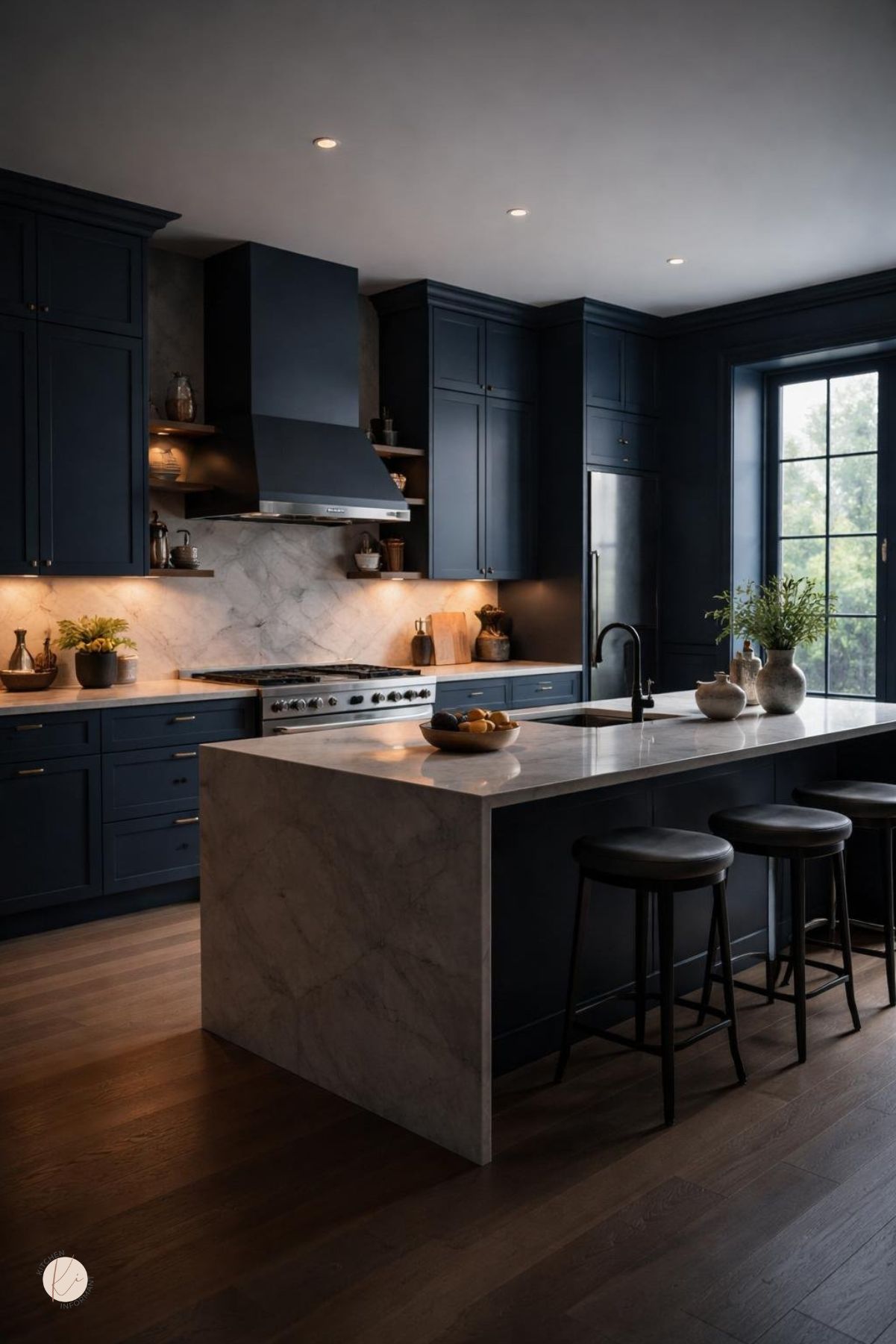
Making Dark Colors Feel Intentional
Dark colors feel deliberate when the room has clear contrast points.
Light counters, reflective tile, glass, or metal accents can keep the kitchen from reading as closed in.
Scale matters too.
In a smaller kitchen, using moody blue on one wall or one cabinet zone can give the room depth without taking away too much light.
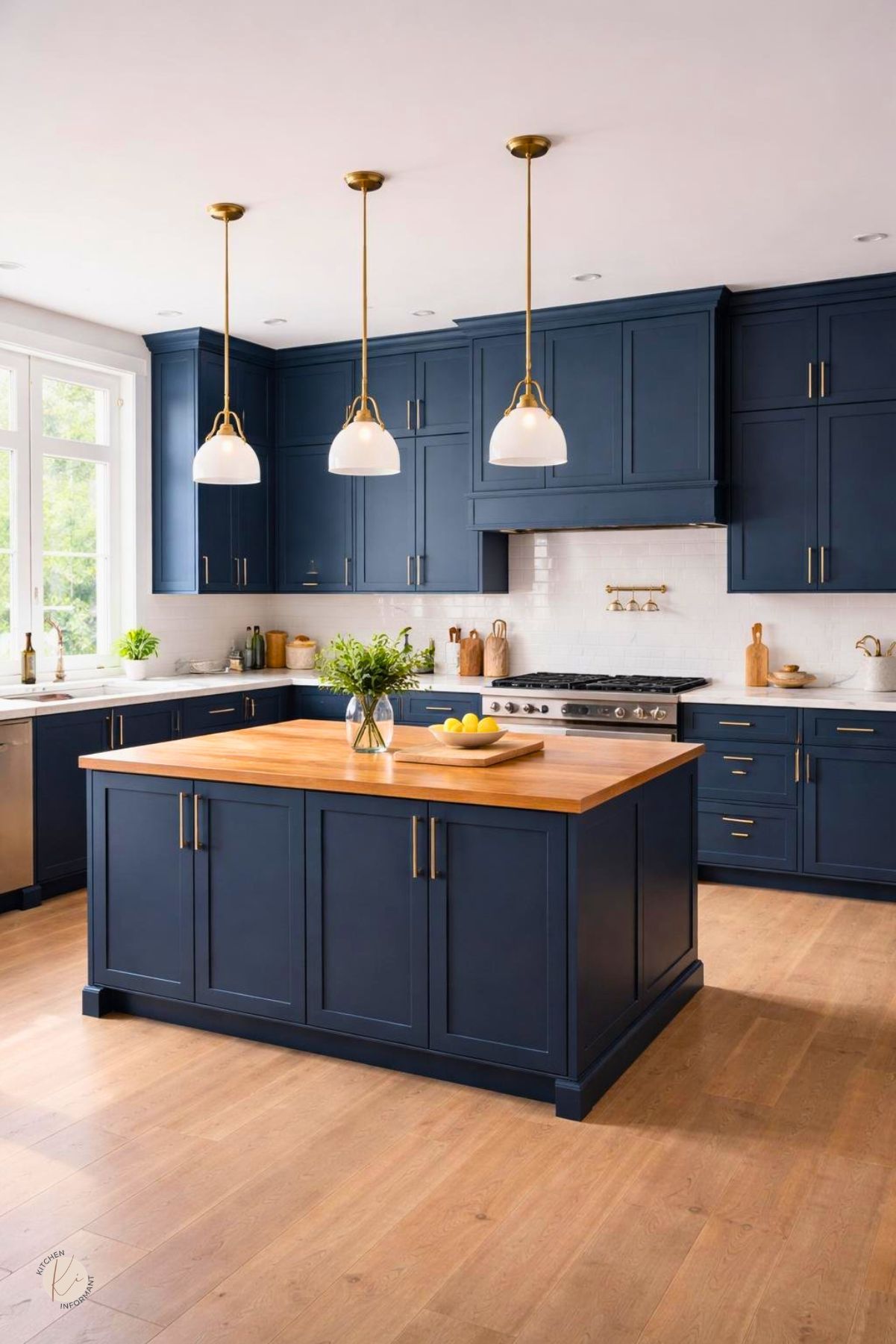
Materials That Support the Palette
The right materials keep moody blue from feeling heavy and keep oak from looking dated.
Countertops, backsplash, hardware, flooring, and metal finishes should all work together.
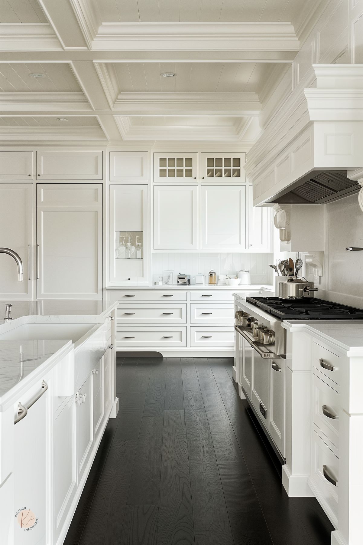
Countertop Options
Light quartz, soft white stone, honed surfaces, and some mid-tone neutrals pair well with moody blue and oak.
They create enough contrast to separate the finishes and keep the kitchen readable.
Very dark countertops can work too, especially with better lighting, though they need more support from backsplash and metal choices.
A wood-heavy kitchen usually benefits from a countertop that adds some brightness.
Backsplash and Wall Finishes
A backsplash with texture can soften the shift between blue and oak.
Off-white tile, handmade-look ceramic, or a muted stone finish often works well.
Wall color should not fight the cabinets.
Warm white, pale gray, or quiet greige usually supports the palette better than strong beige or saturated color.
Hardware, Flooring, and Metal Choices
Brass, aged brass, or brushed nickel can suit this style well.
Brass brings warmth, while brushed nickel and stainless steel keep the look steadier and cleaner.
Flooring should either ground the room or keep it light.
Medium wood, natural oak floors, or a neutral stone finish often work better than a floor that adds another strong color.
Refresh or Replace: Making the Right Call
A good result depends on choosing the right level of change.
Some oak kitchens need only a refresh, while others need a larger rebuild to make moody blue feel natural.
Low-Commitment Updates
If the cabinets are structurally sound, small changes can go a long way.
New hardware, updated lighting, better wall color, and a more suitable backsplash can shift the whole room.
Painting the walls a deeper blue or using blue on just one feature area can also test the look before any larger change.
This is useful when the oak has strong warmth and the room still needs proof before a bigger investment.
Midrange Improvements
Refacing doors, staining oak darker, or painting selected cabinet zones can create a stronger result without replacing the whole kitchen.
These moves are useful when the layout works and the cabinet boxes are still solid.
A new countertop often has a big visual effect.
If the old surface clashes with the wood tone, replacing it may matter more than changing every cabinet front.
Signs a Full Replacement Makes Sense
Replacement becomes the better choice when the cabinet structure is failing or the layout does not work. Water damage, poor storage, and major wear are practical reasons to start over.
It also makes sense when the oak is too orange, too damaged, or too visually heavy for the room. In that case, a full redesign may give moody blue the clean setting it needs.

You May Also Like: