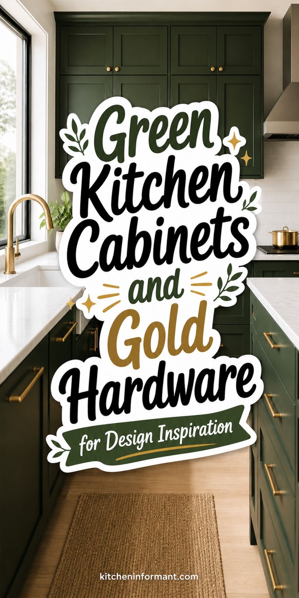
Kitchen ideas with green cabinets and gold hardware can feel classic, current, and practical—if you choose the right shades and finishes.
The combo works best when the green fits the room’s light, the gold matches other hardware, and nearby surfaces keep things from feeling too heavy.
If you balance color temperature, contrast, and texture, the cabinets look intentional, not just trendy. That balance matters whether you’re making small updates or tackling a full remodel. The wrong green or gold can totally change the vibe.
Why This Color-and-Metal Pairing Works
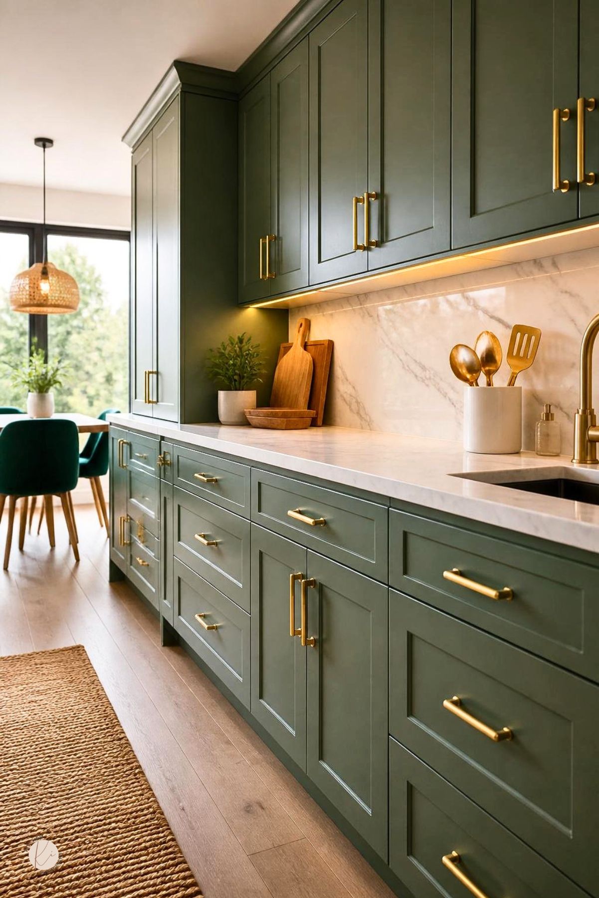
Green brings a natural, grounded look to kitchen cabinetry. Gold adds warmth and a refined finish.
Together, they create contrast without the harshness you sometimes get from black, chrome, or cool gray pairings.
How Green Changes the Mood of a Kitchen
Green can make a kitchen feel calm, fresh, or formal, depending on the shade. Softer greens feel airy and relaxed, while deeper greens bring more weight and structure.
This flexibility keeps green popular. It fits a farmhouse kitchen, a transitional remodel, or a modern space with clean lines.
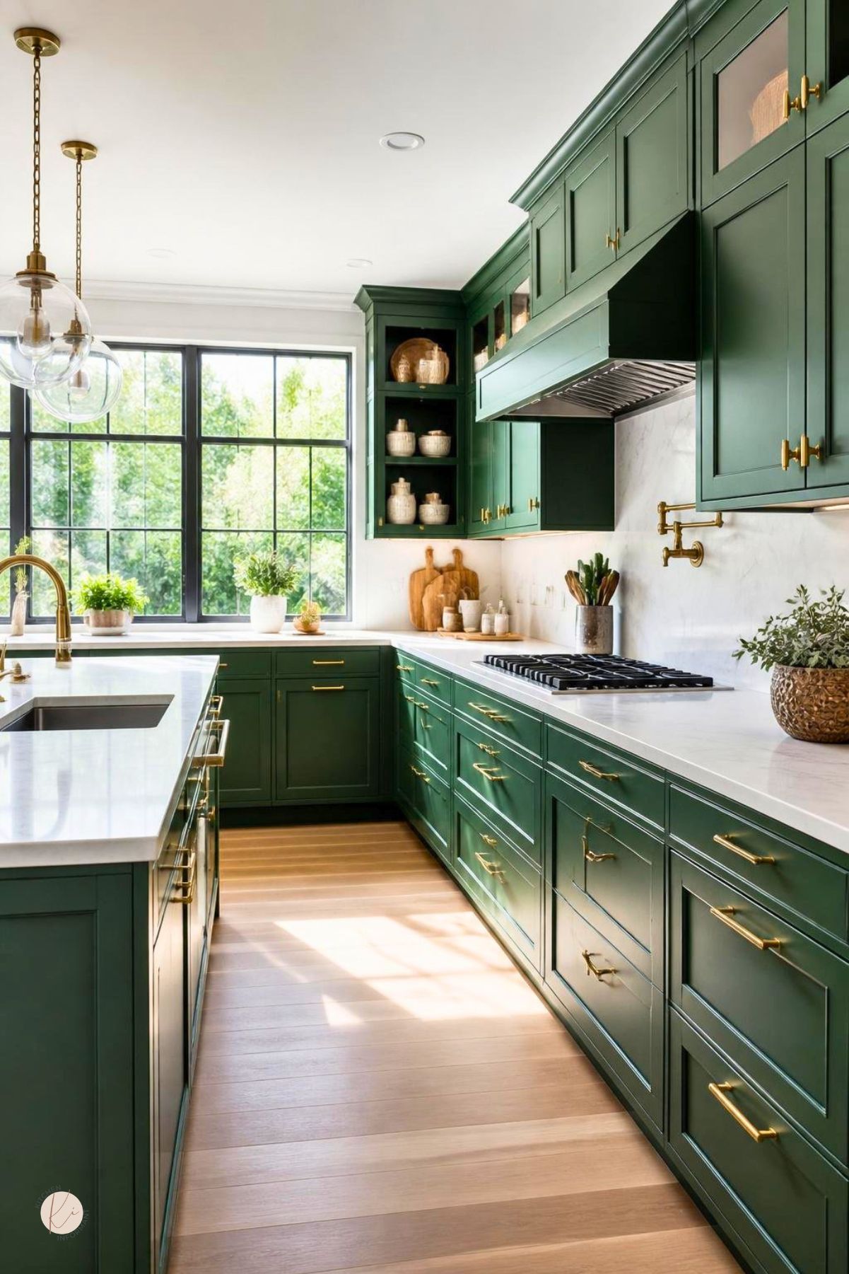
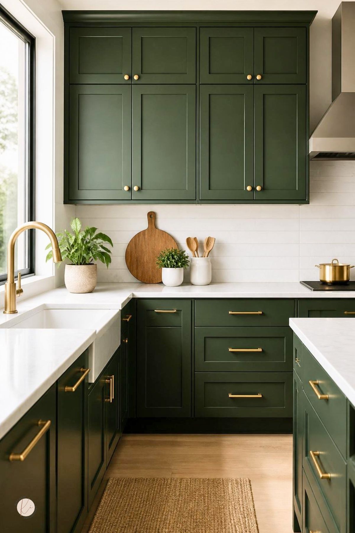
What Gold Adds to Warmth and Contrast
Gold hardware gives green cabinets a warm edge that helps the color feel inviting. It draws attention to cabinet details, making even basic doors look more finished.
The metal works especially well with white, cream, marble, and wood. It adds a clear visual point without feeling cold.
Choosing the Right Green
The best green depends on room size, natural light, and the mood you want. Lighter shades open a space, earthy tones add warmth, and darker shades bring depth and stronger contrast.
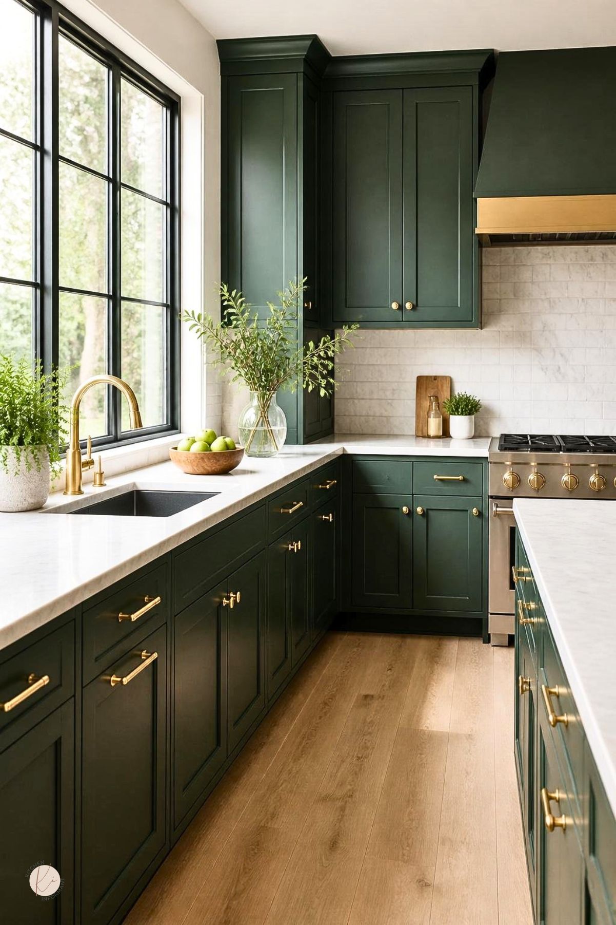
Soft Sage for Light and Airy Spaces
Soft sage is a safe choice for kitchens that need a lighter touch. It works well in smaller rooms, kitchens with limited daylight, and homes that already use white or pale finishes.
Sage also pairs easily with white quartz, light oak, and simple tile. Add gold hardware, and the room gains warmth without losing its soft feel.
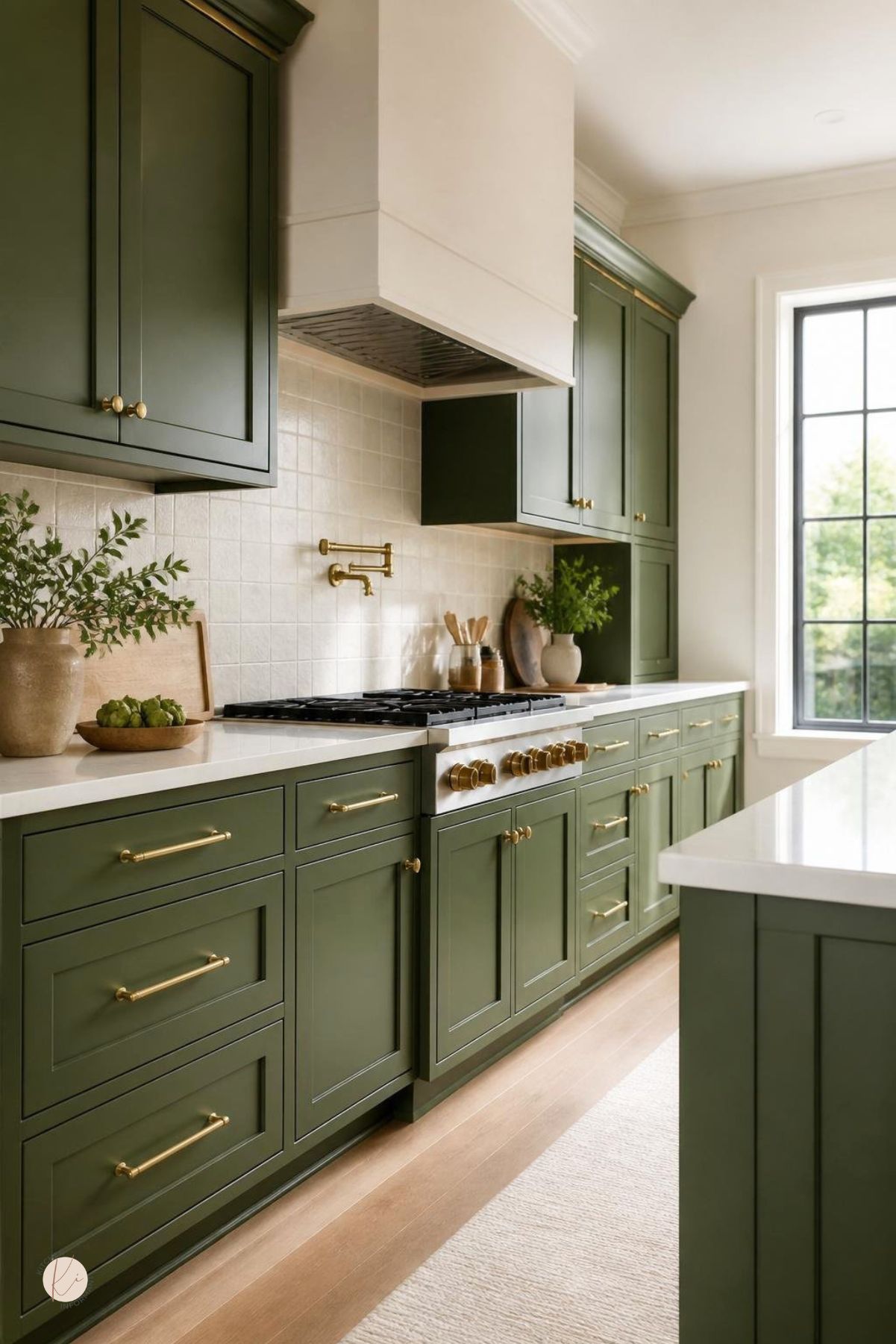
Olive Tones for Earthy Character
Olive green brings a grounded look and works well with natural materials. It can make a kitchen feel collected and lived in, especially with wood accents and textured surfaces.
This shade suits homes that lean rustic, organic, or vintage-inspired. Gold hardware helps olive cabinets feel more polished and less heavy.
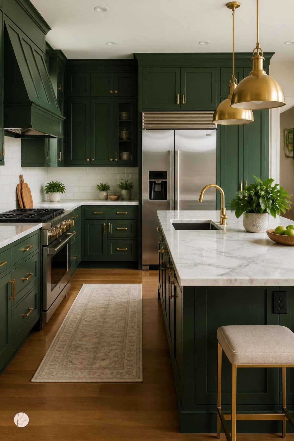
Deep Emerald for Dramatic Depth
Deep emerald creates a stronger visual statement and often looks best in kitchens with good light and balanced surfaces. Pair it with white counters and clean backsplash lines for a tailored, upscale feel.
This choice works well when the cabinet layout is simple, since the color itself carries much of the design. Gold hardware pops against emerald, adding definition and keeping the look sharp.
Selecting Gold Finishes That Feel Intentional
Gold finishes aren’t all the same, and the wrong one can make the kitchen feel disconnected. A good match considers cabinet style, the amount of light, and the finish of nearby fixtures.
Brushed vs. Polished Looks
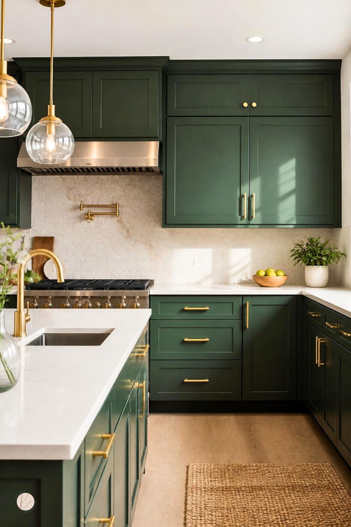
Brushed gold has a softer, more understated finish. It hides fingerprints better and works well in kitchens that lean modern, transitional, or casual.
Polished gold reflects more light and feels a bit more formal. It can look especially strong on Shaker cabinets, glass pendants, and faucets when you want a more defined, upscale look.
Warm Undertones and Finish Coordination
Gold hardware should match the tone of the other metals in the room. If the faucet, light fixtures, and cabinet pulls all lean warm, the space feels more unified.
Mixing gold with cool nickel or chrome can work, but it needs a clear plan. Usually, picking one dominant metal and keeping the others subtle keeps the kitchen from looking pieced together.
Balancing Cabinets With Counters, Walls, and Backsplashes
Green cabinets and gold hardware need the right surrounding surfaces to feel balanced. Light counters, calm backsplash choices, and wall colors with enough warmth can keep things from getting too dark or too busy.
Countertop Materials That Complement Green
White quartz is one of the most reliable pairings because it keeps the kitchen bright and clean. Marble works too if you want a softer, more classic look.
For a warmer vibe, light butcher block or pale stone pairs nicely with olive and sage cabinets. Dark counters can work, but you’ll need enough natural light and a lighter backsplash to avoid a heavy look.
Backsplash Options That Keep the Palette Cohesive
Simple tile is often the easiest choice because it supports the cabinets instead of competing with them. White subway tile, handmade-look tile, and quiet stone slabs all play well with green and gold.
A bold backsplash can still fit, as long as the cabinet color stays steady and the hardware isn’t too flashy. Let one surface lead and keep the others more restrained.
Wall Colors That Prevent Visual Heaviness
Wall color should help the cabinets stand out without making the kitchen feel closed in. Soft white, cream, pale greige, and light warm gray are dependable options.
These shades work especially well around deep green cabinets. They reflect light and keep the room feeling open, which matters when the cabinet color is rich or saturated.
Layout and Lighting Considerations
Layout and lighting can really change how green cabinets look day to day. The same color might look soft in daylight, darker at night, or more saturated in a narrow space.
Making Small Kitchens Feel More Open
In a small kitchen, lighter green shades and reflective surfaces usually work best. Two-tone cabinetry—like green lowers with white uppers—can help keep the room from feeling crowded.
Open shelves, slim hardware, and a light backsplash also reduce visual weight. If you don’t get much natural light, a softer green is usually safer than a deep shade.
Using Natural and Artificial Light Effectively
Natural light shows the true cabinet color, so it’s worth testing samples near windows and in shadowed corners. Morning and evening light can change how green and gold look throughout the day.
Artificial light should support the finish, not distort it. Warm white bulbs usually flatter both green paint and gold hardware, while very cool lighting can make cabinets look flat or harsh.
Styling Details That Complete the Room
The last details matter because they connect the cabinets to the rest of the room. Wood, flooring, and textiles can soften the look and help the kitchen feel finished instead of overly styled.
Wood Accents and Mixed Metals
Wood shelves, stools, and cutting boards add warmth and keep green cabinets from feeling too formal. Pale oak, walnut, and natural finishes balance both sage and deeper greens.
Mixed metals can work if you use them with restraint. Gold should still lead, while any secondary metal—like stainless steel in appliances—should stay consistent and minimal.
Flooring Choices That Support the Palette
Flooring should ground the color scheme without competing with the cabinets. Light wood, medium oak, and warm neutral tile are strong choices for most green-and-gold kitchens.
Very red or very cool flooring can clash with the cabinet tone. A floor with a natural, balanced finish usually gives the best long-term result.
Decor and Textiles With Lasting Appeal
Rugs, curtains, and seat cushions help tie the palette together, and you don’t have to spend a fortune or commit long-term. Linen, cotton, and wool—those classic materials—usually outlast the latest prints.
If your cabinets already pop with color, neutrals in textiles keep things balanced. A little green, cream, brass, or wood here and there can pull the space together and avoid that cluttered vibe.
You May Also Like: