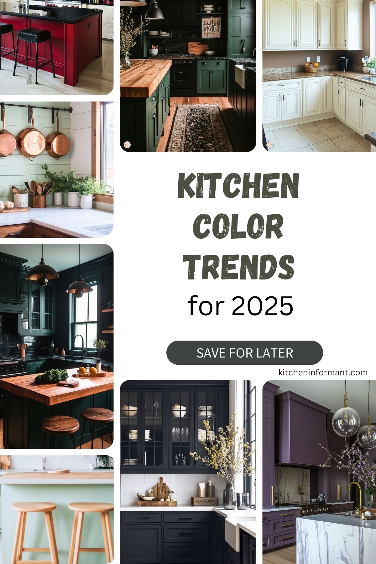
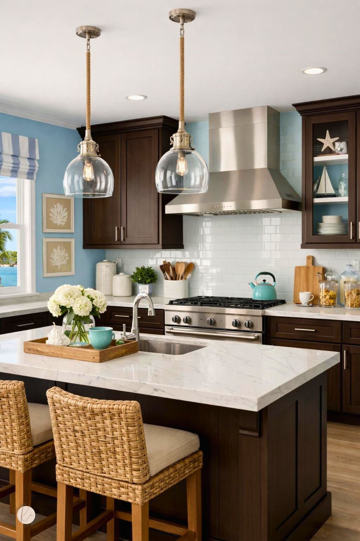
Selecting a paint color for a kitchen can change the look of the space and influence the atmosphere of the home.
In 2025, kitchen designs will lean toward deep, bold shades paired with soft, welcoming neutrals and light, calming pastels. These trends showcase a balance of sophistication and coziness to suit different preferences.

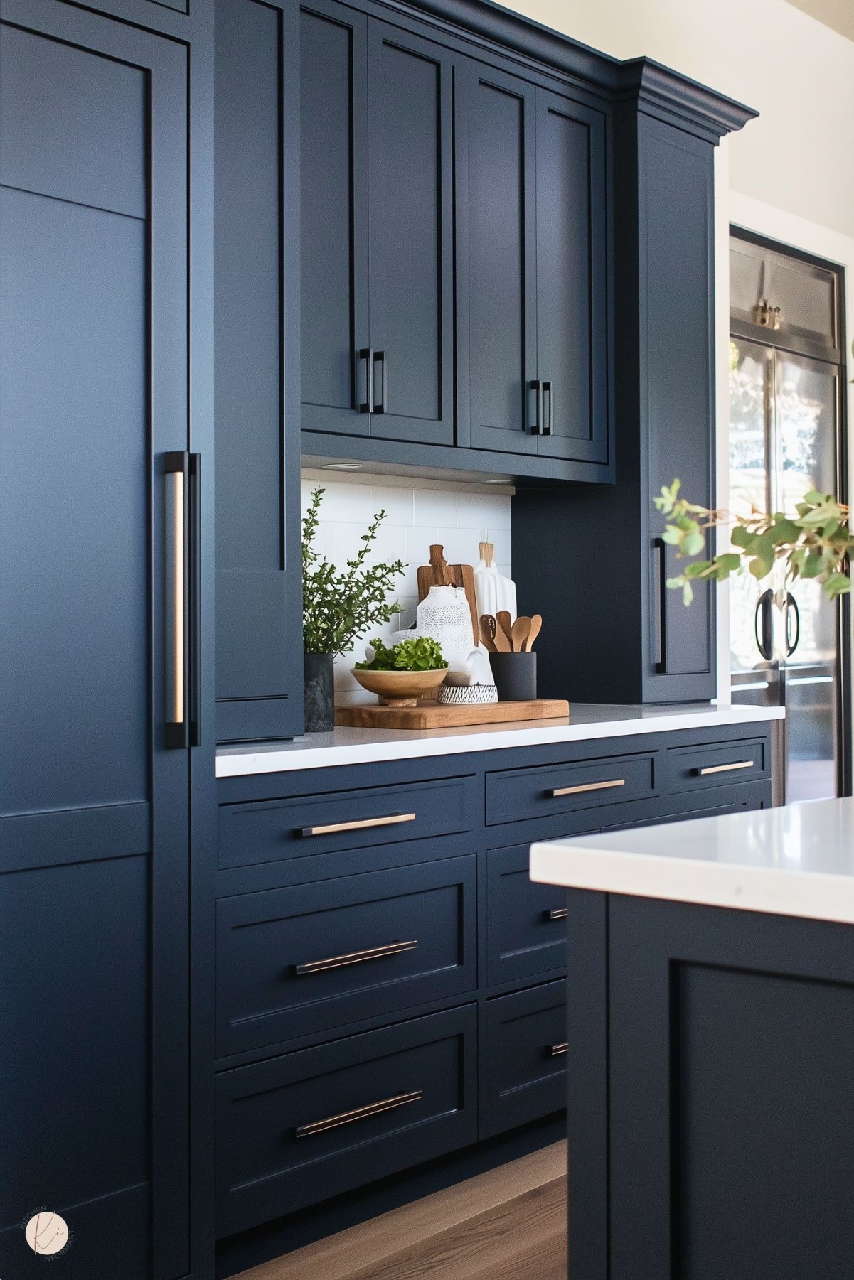
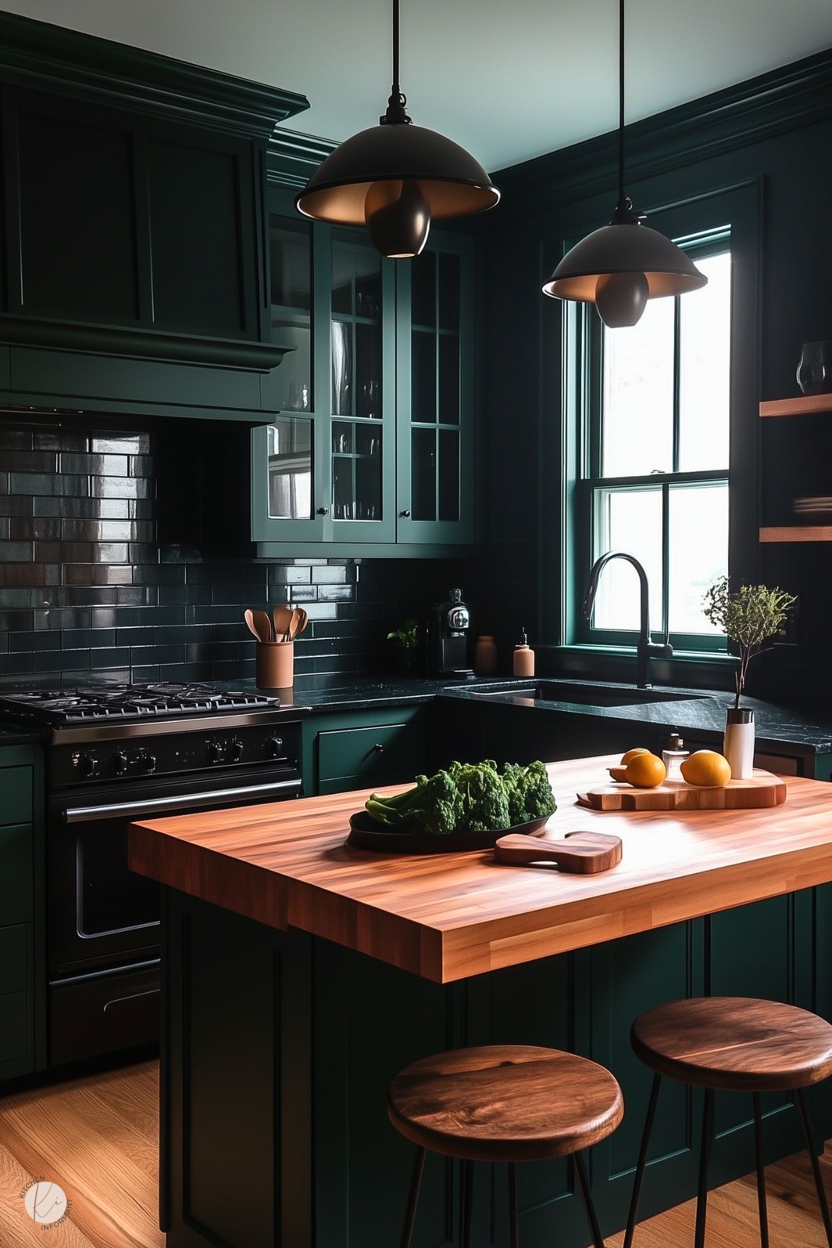
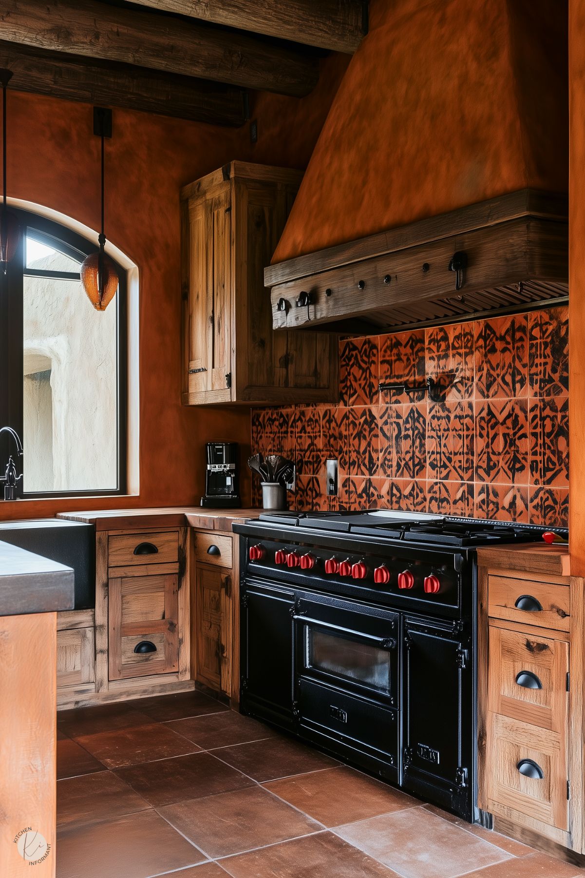
As designers plan for the future, shades like deep navy, forest green, and earthy tones such as terracotta are expected to stand out.
These colors add depth to cabinetry and bring character to the overall kitchen design. Homeowners seeking to update their space will discover that these hues provide a contemporary yet enduring charm.
Exploring current trends can reveal how these colors blend seamlessly within various designs, offering fresh ideas for inspiration.
From timeless tones to striking new choices, 2025 will highlight a diverse palette to complement any kitchen aesthetic.
Emerging Color Palettes
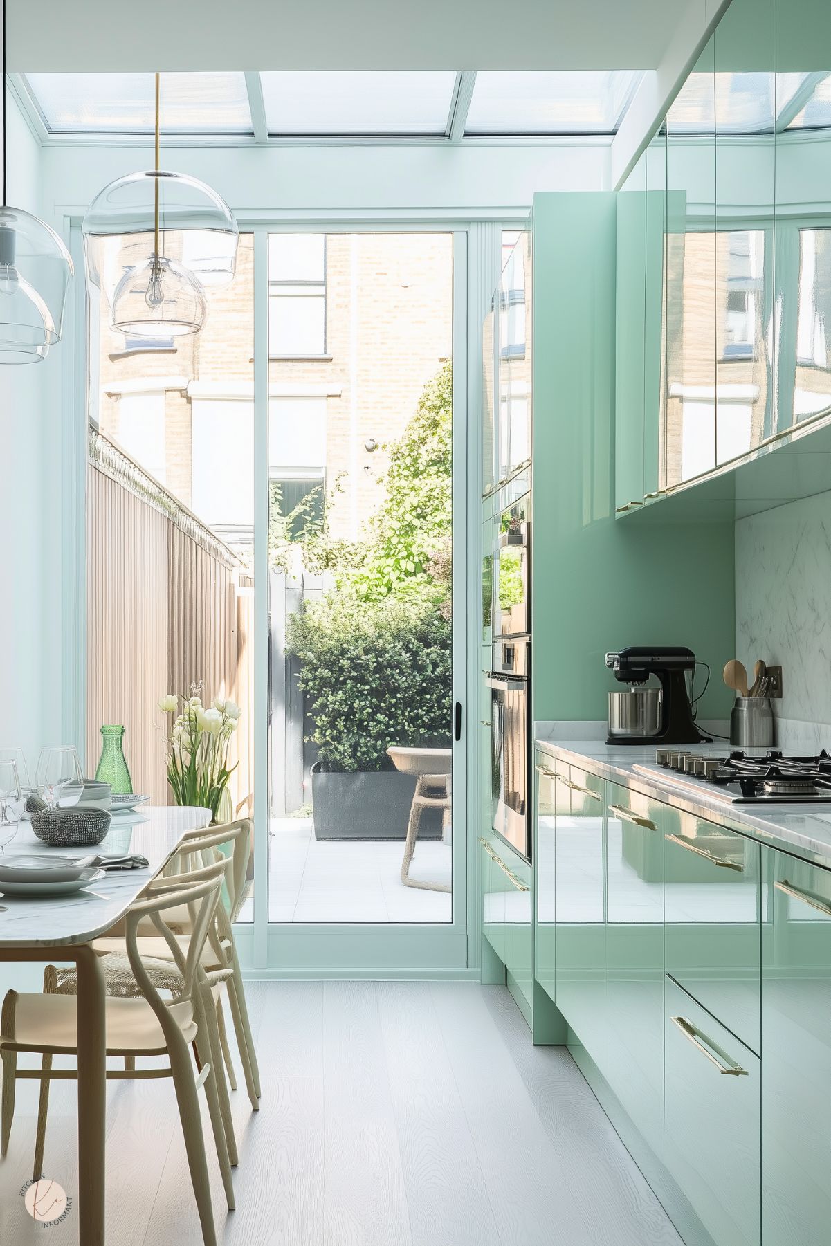
In 2025, a variety of color palettes are becoming prominent in kitchen designs. These include gentle pastels, cozy earthy shades, deep jewel tones, and bold black accents.
Each palette adds its own character to the kitchen, appealing to a wide range of preferences and aesthetics.
Pastels
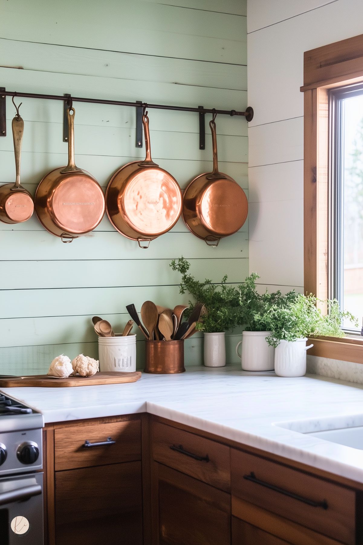
Pastel tones are reemerging in kitchen design, with delicate hues like mint green, blush pink, and light lavender adding a light and refreshing touch.
These colors can create a soothing atmosphere and are especially effective in compact spaces, giving them a more open and welcoming feel.
Combining pastel cabinetry with darker countertops offers a striking contrast that adds depth to the design.
Incorporating accessories such as dishware or wall art in matching pastel shades can further enhance the cohesive look. These tones also complement natural light, keeping the kitchen bright and cheerful throughout the day.
Earthy Neutrals
Earthy neutrals such as beige, taupe, and soft greys are excellent for fostering a welcoming and cozy ambiance.
These tones draw inspiration from nature, providing a grounded and comforting aesthetic that resonates with many homeowners. They serve as a versatile backdrop, pairing seamlessly with wood finishes and organic materials.
A kitchen featuring these neutrals exudes a timeless and comforting vibe.
Adding greenery or wooden accents can further emphasize the natural look. Incorporating layers of beige or textured fabrics can bring depth and character to this soothing color palette.
Jewel Tones
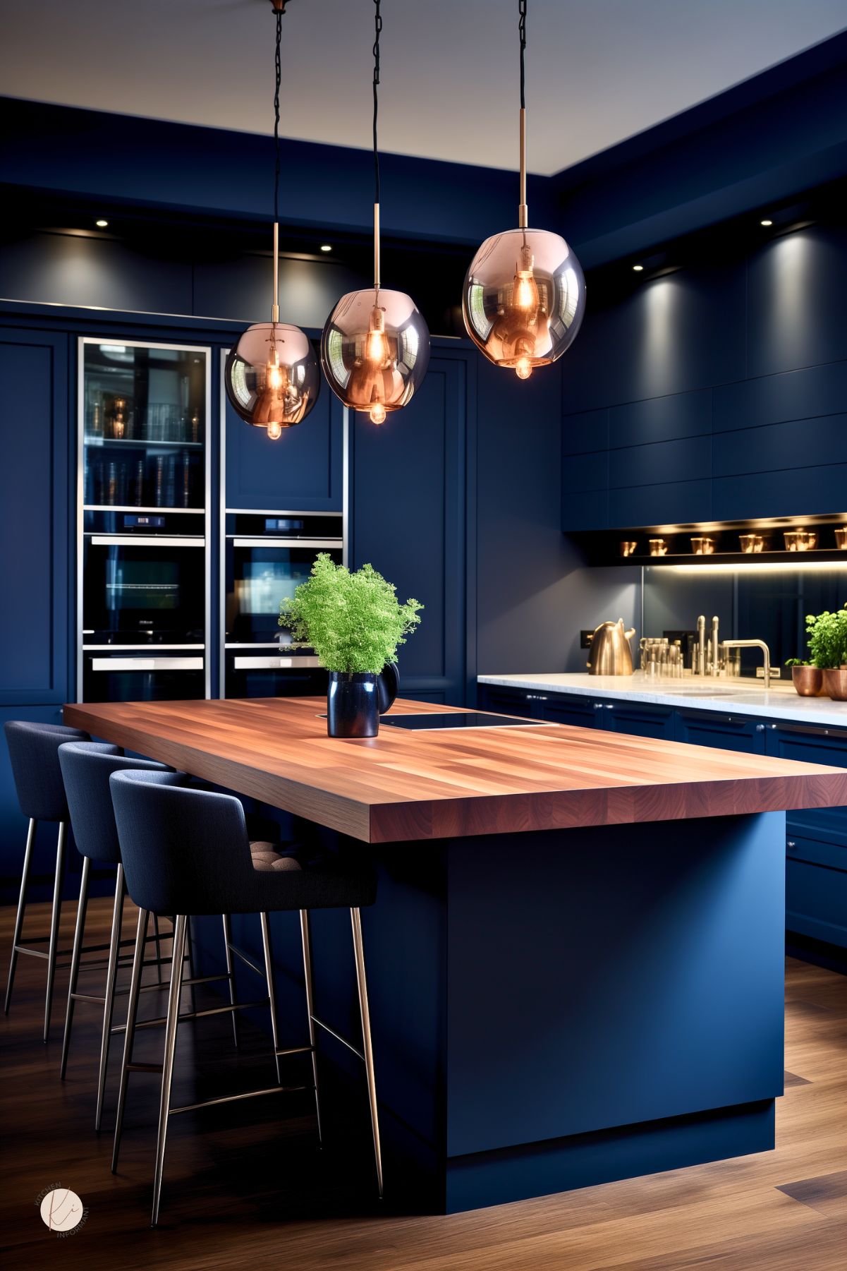
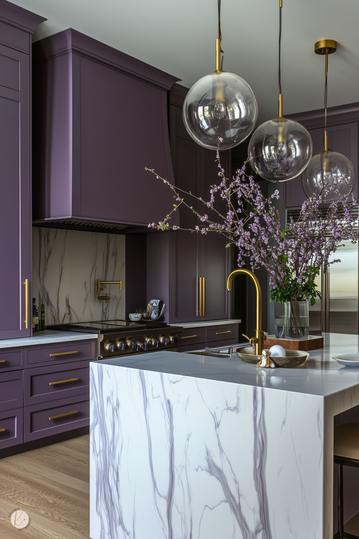
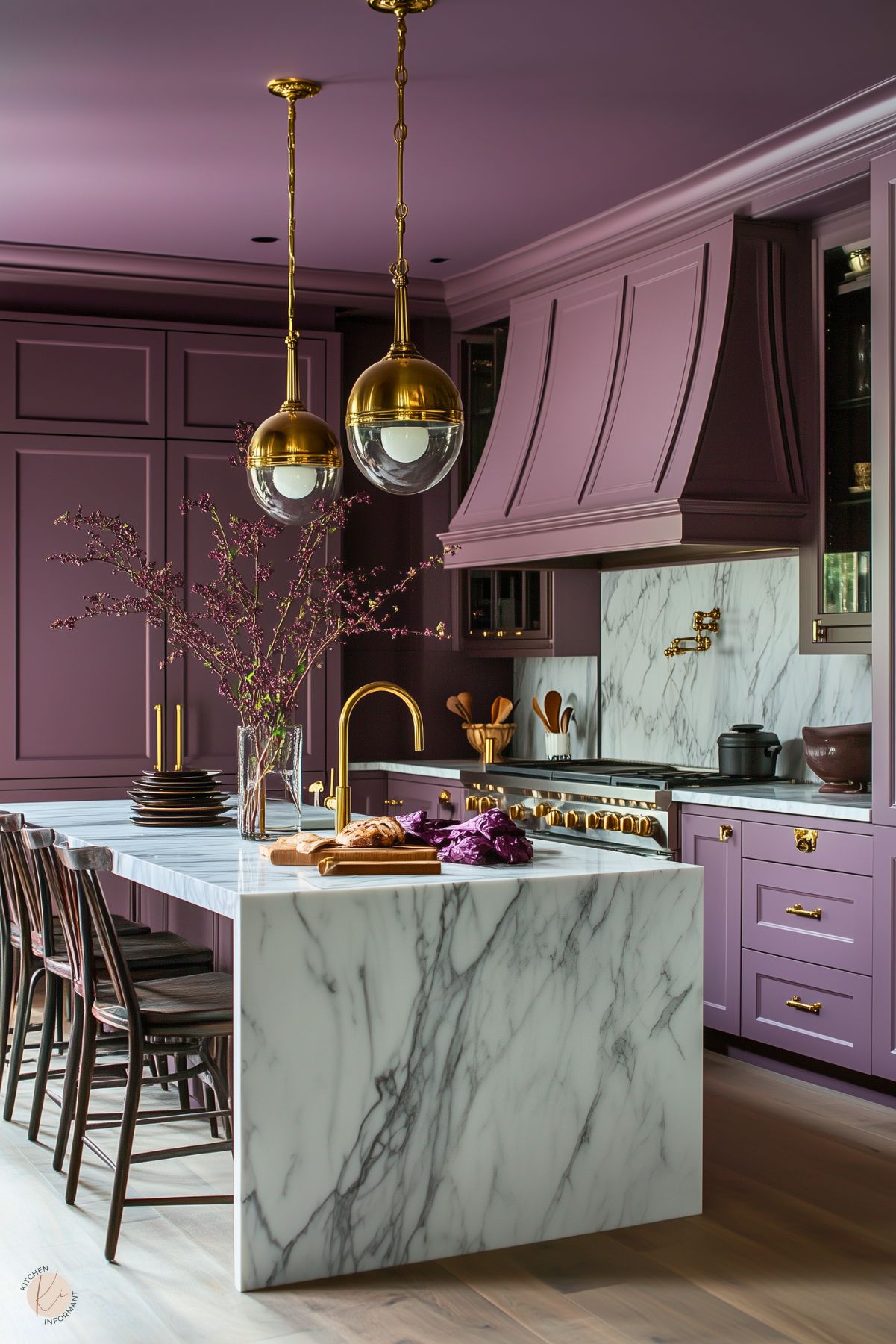
Jewel tones are a great choice for those aiming to create a striking visual impact. Colors like emerald green, sapphire blue, and deep amethyst bring a sense of sophistication and luxury to the kitchen.
These shades can shine as accents or serve as the primary color for cabinetry.
They complement both modern and classic design styles. Paired with metallic fixtures, jewel tones add a touch of elegance. Incorporating a backsplash in one of these hues can enhance the design, drawing attention as a centerpiece in the kitchen.
Black Accents
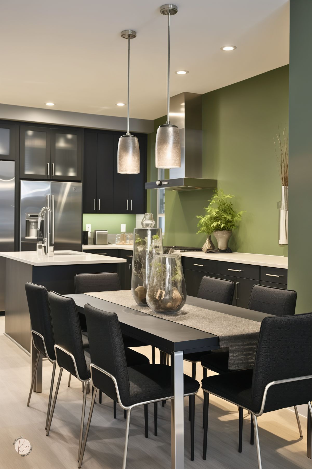
Incorporating black accents into a kitchen adds a sleek and modern touch.
Elements such as fixtures, cabinet hardware, or an accent wall can anchor the design and bring a sense of depth. The contrast between black and lighter tones adds visual interest and energy to the space.
Black accents complement a range of color schemes, from soft pastels to bold jewel tones, offering versatility while keeping the look polished. Thoughtfully placed black details can elevate the kitchen, turning it into a chic and stylish space.
Sustainable Paint Innovations

The kitchen is often a hub for fresh designs and trending colors, but a growing focus on sustainability is shaping the choices we make.
Advances in eco-friendly paints now allow for creating a stunning kitchen while prioritizing environmental responsibility.
Eco-Friendly Formulas
Eco-friendly paint options are becoming increasingly popular, with many brands now offering formulas made from renewable resources.
These paints minimize harmful chemicals and lower their environmental impact.
Using ingredients like plant-based oils and resins, they provide durable finishes and rich color choices while being more sustainable.
Homeowners can create a stylish kitchen without concerns about toxic emissions or ecological harm.
Brands like Benjamin Moore and Sherwin-Williams are recognized for their environmentally conscious offerings. When selecting paint, look for certifications or labels that highlight sustainable practices.
Low-VOC and Natural Pigments
Low-VOC (volatile organic compounds) paints are an excellent choice for creating a more sustainable kitchen. They release fewer pollutants, promoting healthier indoor air quality.
Natural pigments used in these paints offer rich color while avoiding harmful toxins. Derived from minerals and plants, these pigments make them a safer option for households.
Many brands now provide an extensive selection of colors in low-VOC formulations.
These paints can deliver the same level of coverage and finish as conventional options. Brands like Clare and Earthborn are known for their low-VOC ranges, combining aesthetic appeal with environmental mindfulness.
Practical Considerations

Selecting a kitchen paint color goes beyond just appearance. Considerations like durability, ease of upkeep, and the interplay between space and lighting are essential for making a well-informed choice.
Durability and Maintenance
Durability is a key factor when choosing kitchen paint. As a high-traffic area, kitchen walls need to withstand spills, splatters, and regular cleaning.
Look for paints labeled as washable or scrubbable, as they resist stains and are easier to maintain.
Acrylic and latex paints are excellent options, offering durability and lower VOC levels. These paints provide a smooth finish and are well-suited to the demands of a kitchen.
The finish also matters—satin or semi-gloss finishes work particularly well. They brighten the space by reflecting light and make cleaning up simple.
Space and Lighting Interplay
Lighting plays a significant role in how paint colors are perceived, as different light sources can dramatically change their appearance. Kitchens often combine natural and artificial lighting, making this an important consideration.
For spaces with plenty of natural light, warm tones can create a welcoming and comfortable vibe.
In kitchens with limited natural light, cool tones can brighten the space and make it feel more open.
Lighter shades are ideal for smaller kitchens, helping to create a sense of spaciousness. Darker colors can add depth but should be paired with effective lighting to avoid making the area feel confined.
Always test paint samples in various lighting conditions to see how the colors will look throughout the day. This ensures a better match for the overall ambiance.
Color Psychology in Kitchen Designs

Colors impact mood and behavior, especially in spaces like kitchens. Understanding color psychology can help create a welcoming and efficient environment.
Warm colors like red and orange can stimulate appetite and conversation. These vibrant shades often make a kitchen feel lively and energetic.
Cool colors, such as blue and green, promote calmness and relaxation. They can create a soothing atmosphere ideal for family gatherings or quiet meals.
Neutrals offer balance and versatility. Shades like beige, gray, or white provide a clean backdrop that works with various styles. They also allow appliances and decor to stand out.
Popular Kitchen Colors for 2025:
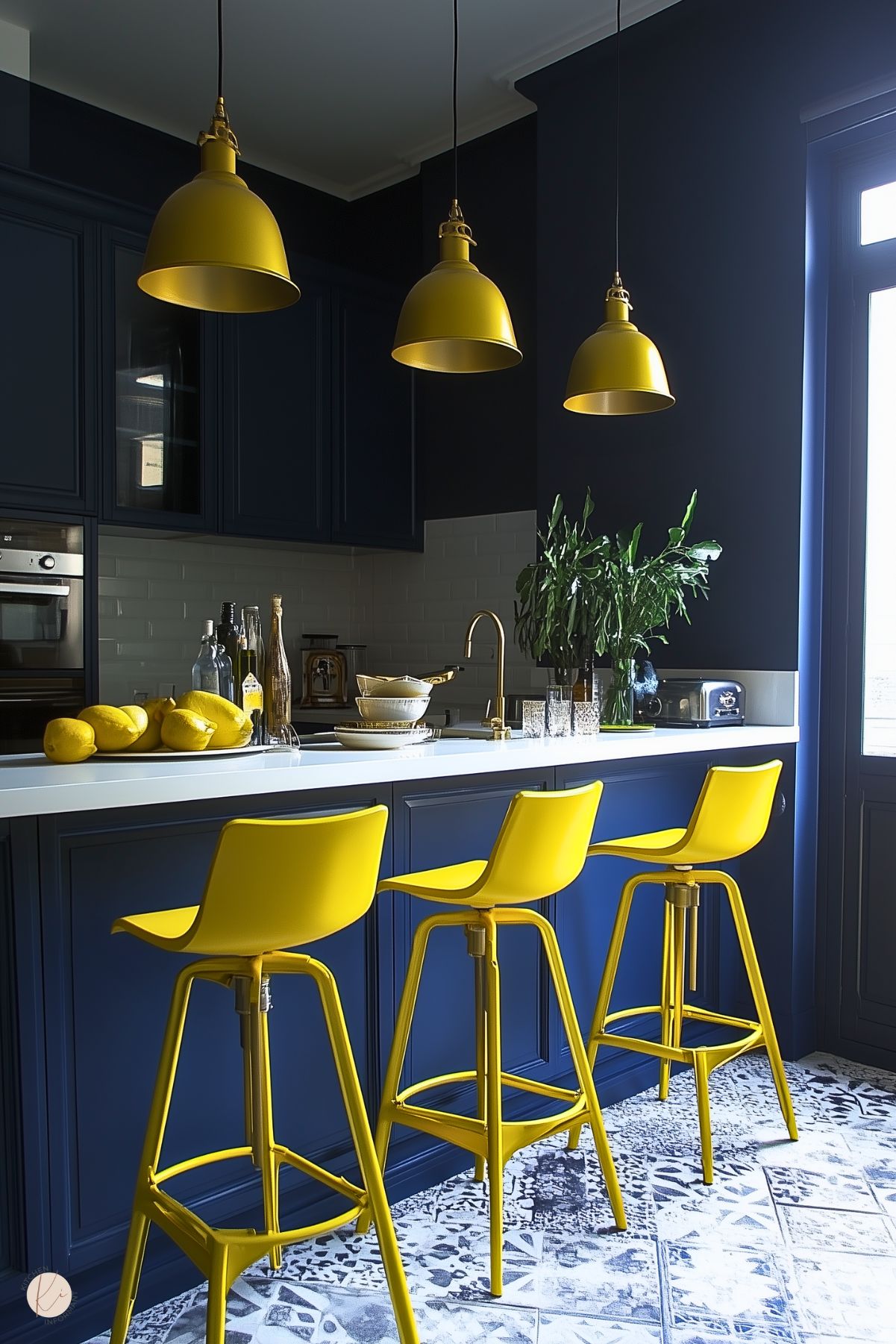
- Dark Moody Shades: Colors like dark blue add richness and sophistication. They contrast nicely with lighter accents and create a modern feel.
- Earthy Tones: Colors such as soft browns and ochre evoke nature. These shades create a warm and inviting space.
- Bold Accents: Bright colors, like emerald green, can add drama and visual interest. They can be used in small areas, like cabinets or an accent wall.





You May Also Like:
